Anyone who travels understands the excitement when a product that defines a region or country makes its way into the home. Tate’s Bake Shop, for instance, sends the Southampton beachgoer on a pilgrimage for fresh cookies. Its crispy and delicious chocolate chip cookies always spark a take-home purchase that, let’s be honest, never really makes it home. What a sweet surprise when I spotted their green packaging on my grocery store shelves right here in Iowa.
More often than not, I try to push sugary confections to the back of my mind and put eye candy at the front. It was a thrill when I received a sneak preview from fabric manufacturer Fabricut. The American fabric house now represents Liberty London, whose cheerful floral designs in home accessories and fashion I wrote about in Wednesday’s post.
The Liberty London emporium is always a must-stop for inspiration when I travel to London. This new fabric line is now available in the U.S. market. The decorative fabric collection is saturated in color, nostalgia, and style. But this collection has taken an aesthetic spin to appeal to the American market. As the new textiles were unveiled to me, I was intrigued to see how a beloved brand adapts as it leaps onto the global stage.
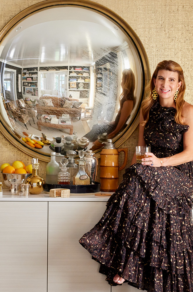
To wrap my design mind around this collection’s aesthetic, I spoke to Genevieve Bennett, the current head of design for interiors for Liberty London and the vision behind the new collection.
It must be so exciting to work for this beloved brand. What led you to this role?
Liberty London is an incredible brand with an archive, history, and rich identity. That’s what I was excited about it. I came on board a year and a half ago. I was given the task of rethinking the fabric collection, which needed rejuvenation. The collection that we just unveiled took an entire year to create.
I am a textile designer. I trained and studied at the Royal College of Art in London, where I graduated 25 years ago. My specialty is working with heritage brands that boast a rich history and have a beautiful archive. I love the process of bringing archive documents alive so that they reach a contemporary appeal.
I worked for Wedgwood at one point. They had a range of bedding that was specifically manufactured for the Far East. I worked on developing the archive patterns with the fine bone china team to create textiles that would be suitable for bedding. I’m a big believer in color and pattern and working across the board on rugs, cushions, wallpaper, upholstery fabric, stationery, and office accessories. Bringing pattern alive through disparate surfaces and techniques is something that I am passionate about.
People tend to think of color in the modern, fashionable sense. But bold color plays a significant role in history. What did you discover?
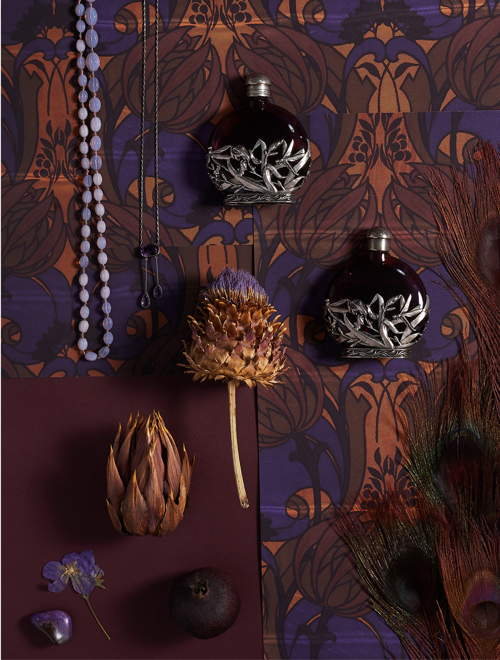
The color palette that Liberty London uses is interesting. We looked back over the archive of 120 years. Modern-day design clients tend to shy away from color or allow it to intimidate their choices when it comes to their homes. But historically, people were unafraid of color and used it with courage. Even though the colors we reviewed were from the 1890s, there was nothing dowdy about them. On the contrary, they were quite electric. Every decade has had a strong color identity, and the boldness of them would surprise.
What would you teach clients about color so they aren’t so afraid of the commitment?
People have a fear of color because they think they are going to be stuck with that color or palette forever. They don’t know if they will love something long-term. I believe that people shop by color. That’s where they make their decisions. Research shows that it takes 45 seconds to buy something, and it’s oftentimes based on color. But it’s not just about creating for Liberty London. People don’t want to buy one brand only. The store sells other brands, too. When I set the palette for this collection, I looked hard to make sure that our colors balance with other key players in the field.
So how did you land on the palettes for the new collection?
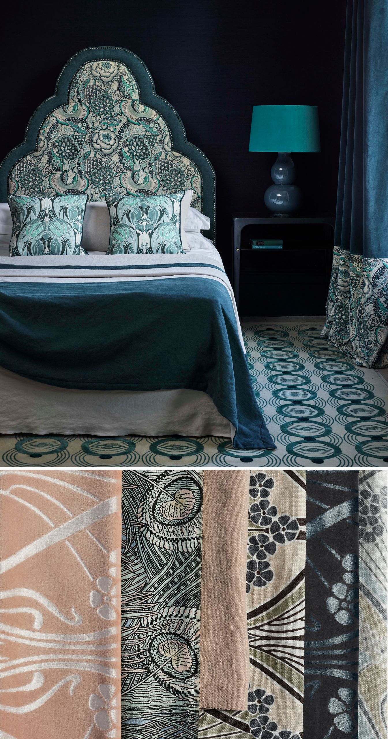
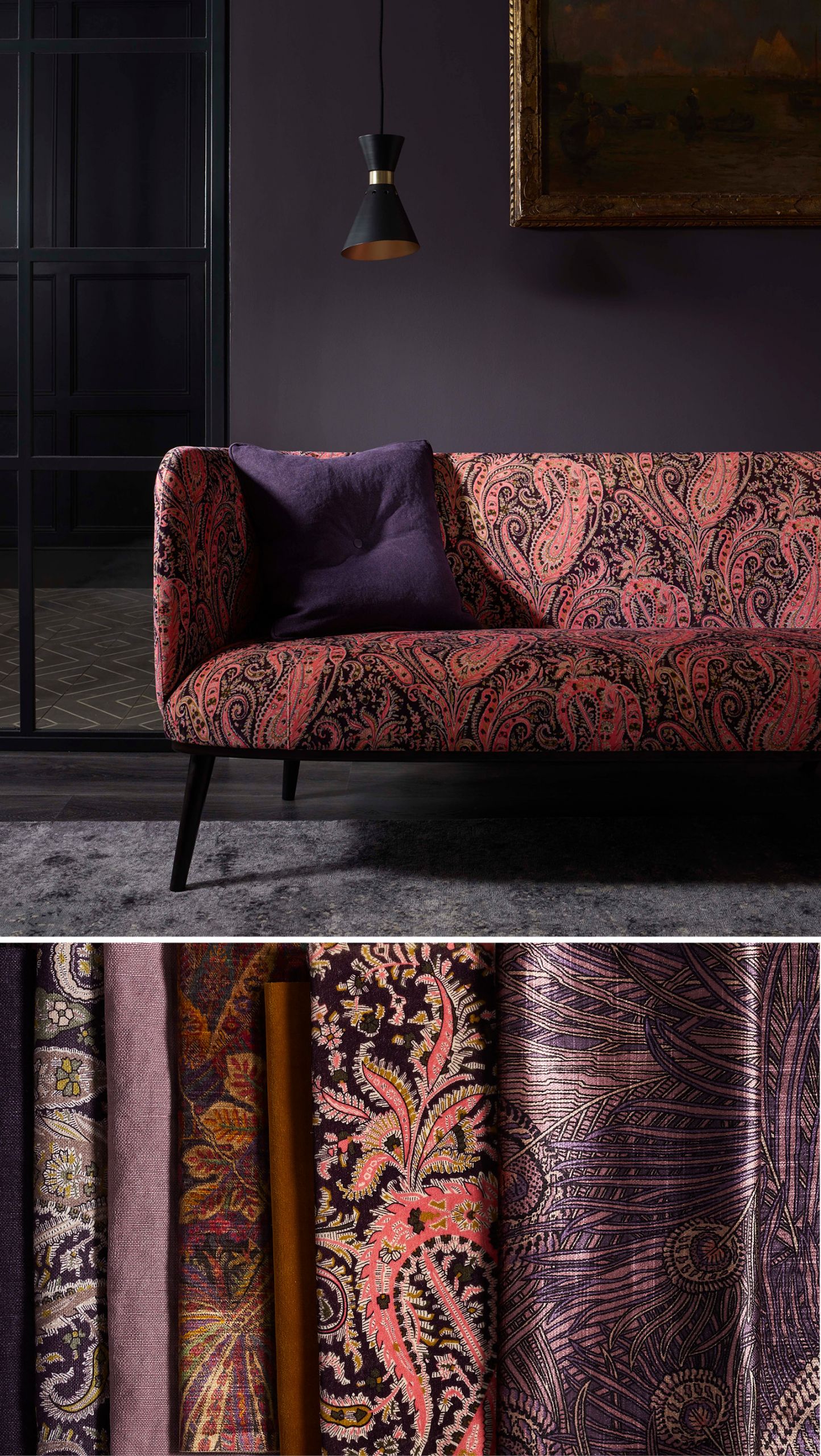
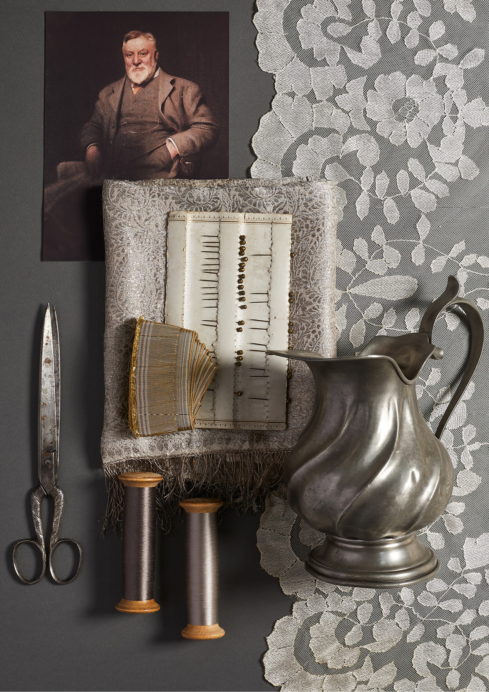
I built six color stories around six different decades. In essence, it was already contemporary. We took inspiration from the origins of the Liberty London store, once called The Great Cloak Shawl Emporium. It had a lace, silk, and haberdashery feel to it. I used this as a basis for the neutral story. Pale satin or pale grosgrain ribbon that is well-suited for contemporary interiors.
Also, the original emporium offered collected items. We often talk about the Liberty customer being a collector. She travels. There was a lot of pewter sold in the original emporium, so I used that.
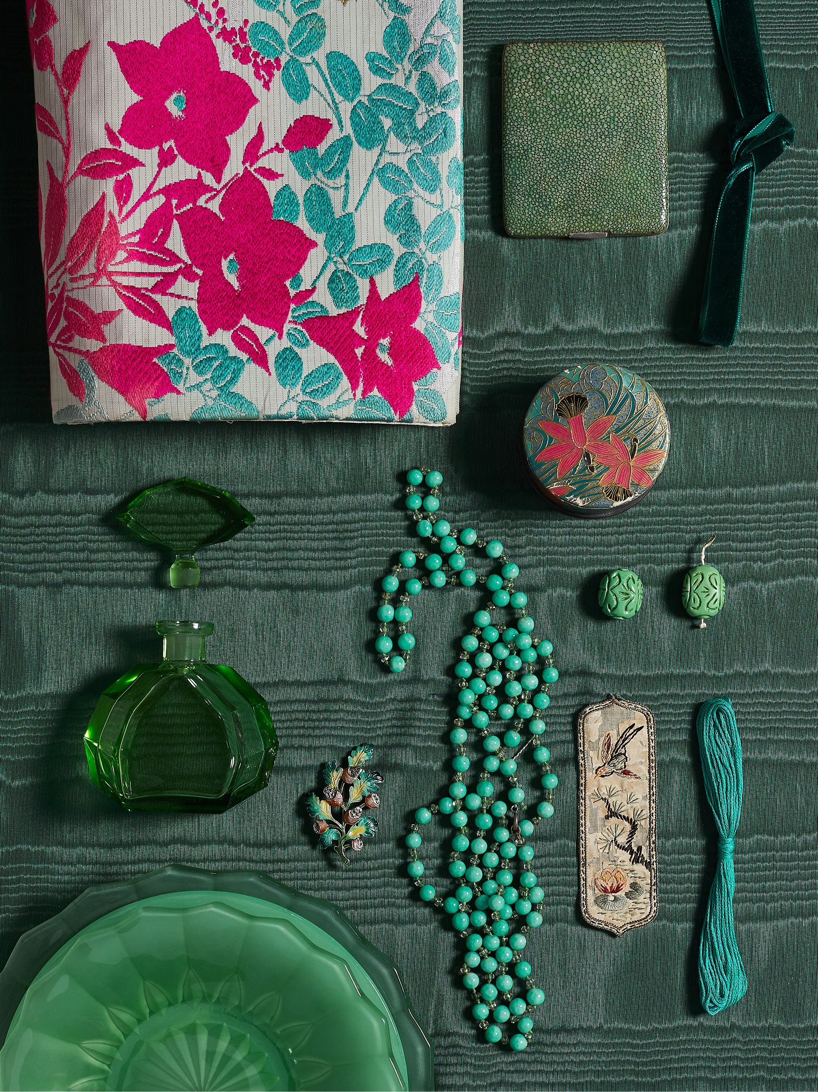
A lacquer story targeted a time when the store had a lot of lacquerware, silks, and objects from the Far East. It became important to build this narrative and a snapshot of what would have been relevant in the time.
The way Liberty London brings a paisley, stripe, and floral together so that they mix within the same room or the same garment is successful. The way to make patterns blend is to have one clean palette. And it was important to me to create palettes that were distinguishable.
Liberty London patterns are steeped in florals. What is it about flowers that people find to be so appealing in interiors?
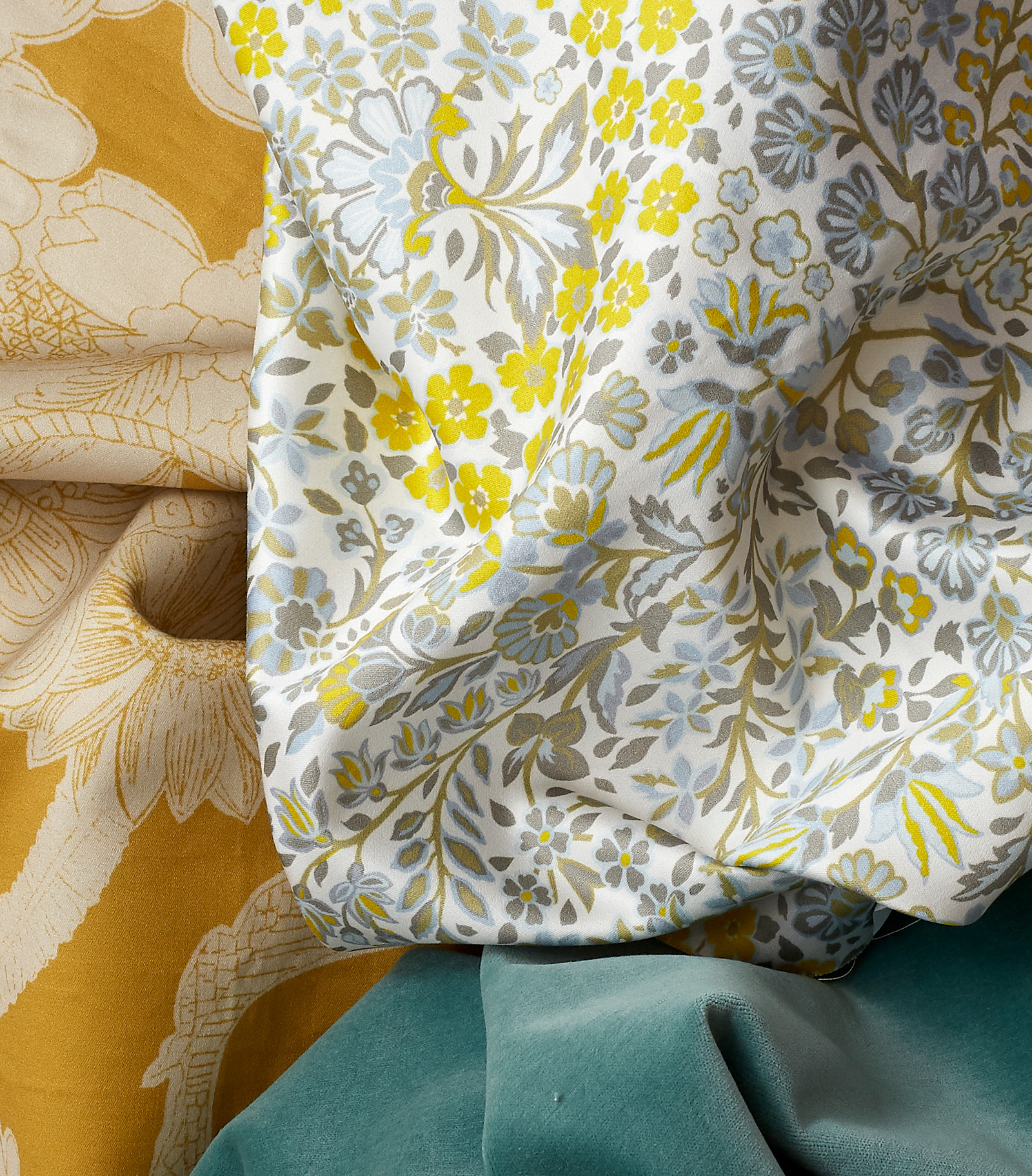
Flowers are oftentimes nostalgic and evoke a memory for people—something that they had in a garden or a scarf that their mother wore. There is a rich history of reference that comes from flowers. Clients tend to want to create fresh, exuberant interiors within their homes. The best way to achieve that is through botanicals and florals.
How does Liberty London approach flowers to maintain that fresh, current vibe?
Our studio designs, paints, and draws. We see ourselves as pioneers of pattern-making and don’t rely solely on the archive. We create flowers that are multicolored. You will see 12–18 colors in our designs, which adds a special richness. Our linework is also particularly youthful. It’s not watery. When the flowers are outlined, they feel bold and contemporary.
At the moment, we see bold, overscale flowers and hand-draw them to increase their scale. Those patterns tend to be simply rendered with a contemporary, monotone coloration. With other floral patterns, we reduce the scale. Contrast is always important. We’ll create a hero pattern but understand there needs to be a ditzy, small-scale coordinate.
Why is lifestyle so important to the Liberty London story?
Liberty was a destination for interiors and fashion right from the start. It’s always had these two arms, and I think that it is in the DNA of the brand to think broadly.
It’s a strength to have a lifestyle brand. You get the opportunity to buy into it and build your repertoire of style. Liberty does it well because you can buy something like a small pouch or scarf or, on the other side, 50 yards of fabric for upholstery. We connect with other parts of the design team so the brand is consistent across the board. Something that might be used for ready-to-wear may be tweaked slightly so it will work in interiors as well.
What does it mean to you that Liberty London and the new collection are launching in the United States?
It’s so exciting, and we are thrilled to be launched in the States. The idea that you can step off a plane anywhere in the world and know a brand like Ralph Lauren, well, we would like to join that club. We, too, have patterns that are icons in their own right. It will be interesting to see how they translate in America. It’s a fun challenge to create what is right for a variety of markets and isn’t too tailored to one. Each collection has to be versatile. In the United States, you have much larger homes, and it will be fun to see how our patterns are executed.
Take a moment to explore the color-forward Liberty London collection.