If I had to create a theme for this week, it would be “Let’s keep it going.” The end of summer is upon us, and days are getting cooler and shorter. I am feeling anxious about not being able to pop outside at any time to absorb sunshine and vitamin D. Now, outdoor time requires thought and strategy to catch the warm golden rays before the days turn crisp and we are indoors regularly.
However, we still have time to eke out alfresco fun during the golden days of September. Especially on weekends, we can harness that warmth. One of the best ways to bask in the September sunlight is outdoor dining. When it comes to eating outdoors, the verdict is unanimous. My tribe is all in with an enthusiastic, “yes!”
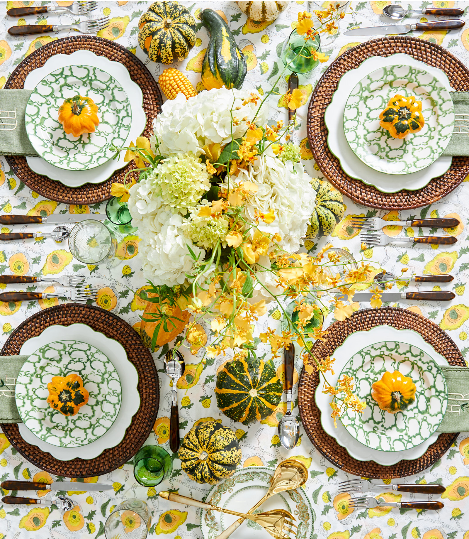
Because summer is welcome to stay as long as it wishes, the hostess in me invited the season to an outdoor luncheon with close friends. I immediately turned to a happy tablecloth that’s made its way into my dining accoutrements. This design by India Amory, aptly named the “Buttercup” makes my heart sing. The print focuses on a spectrum of sunny tones. Each flower is enriched with deep golden yellow and bits of crisp orange. The colors are a precursor to the showstopping hues we’ll see when fall foliage entertains us.
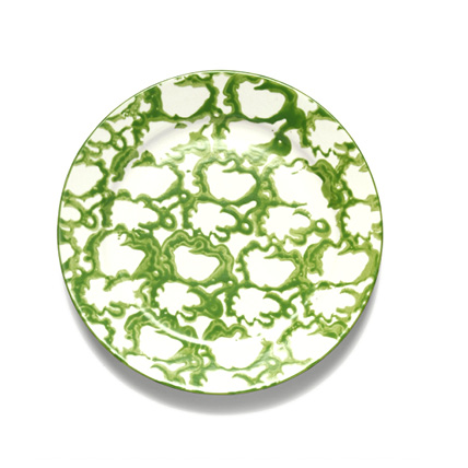
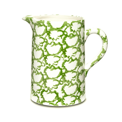
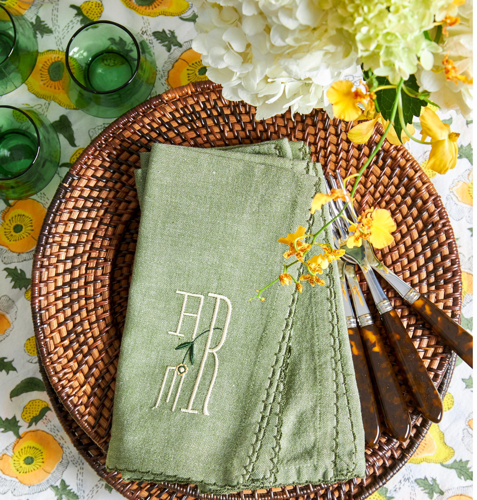
If you know me, you know I love all shades of green, which is the obvious accent color for this tablescape. I couldn’t resist adding to my tabletop collection with the latest iteration of my favorite spongeware tableware from Tory Burch. I have used the blue-and-white version for several years, so I jumped for joy when Tory Burch added green and white to the collection.
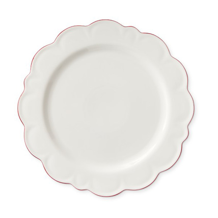
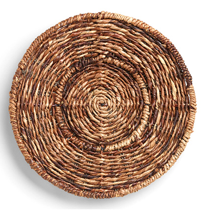
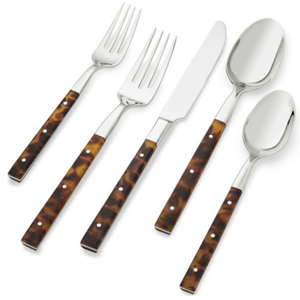
This pattern recalls classic English spatterware in an airy updated version. White scalloped dinner plates edged in green extend the palette and add playful movement with a nod to the flowers on the cloth. With a mix of yellow, green, and white, I realize that it’s not completely clear what season I’m addressing. I wanted to ground the sunny palette with deeper tones. I added cool dark brown woven chargers for an autumnal look, which acknowledges the upcoming season of shorter days and chilly nights. The wicker is seasonless, but in a dark color, it sits everything down. I also used tortoise flatware to complement the wicker and contrast the bright tones of the scheme. It’s important to me that my tables are inviting with that easy and effortless look of mixing shapes and materials.
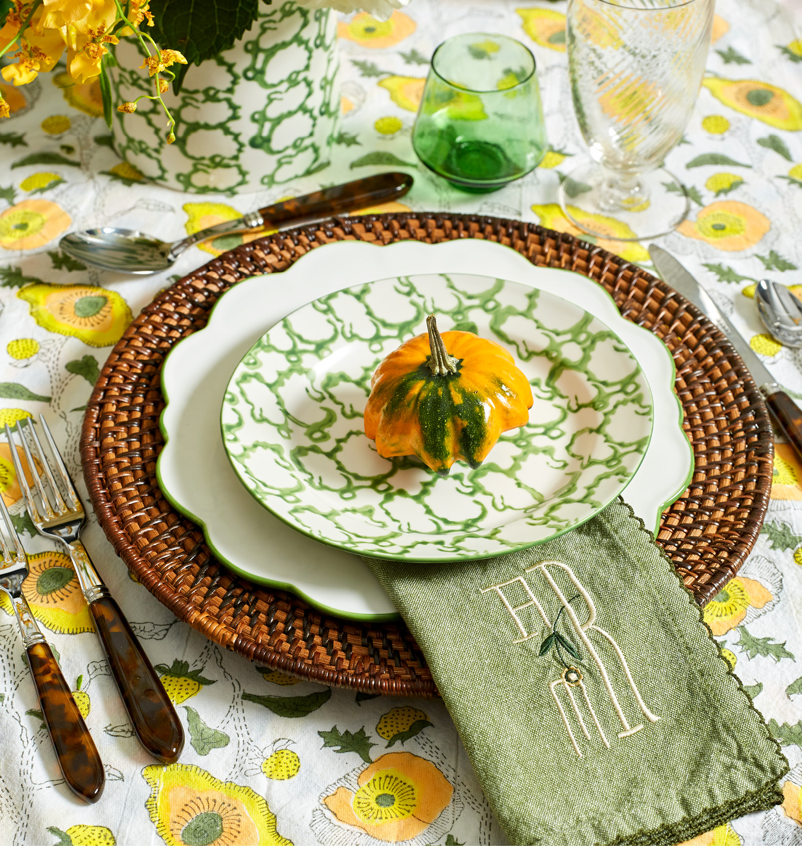
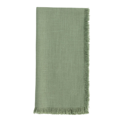
If you’ve visited this blog before, you’ve probably picked up on my affinity for personalization. There is so much out there to choose from, and often it’s nice to create something one of a kind. I joyfully experienced a lightbulb moment when I found these mossy green scalloped napkins at a local World Market. They are a soft heathered green in a muted tone that quiets some of the brights. The charming scallops led to a custom monogram planted in a similar dose of delight.
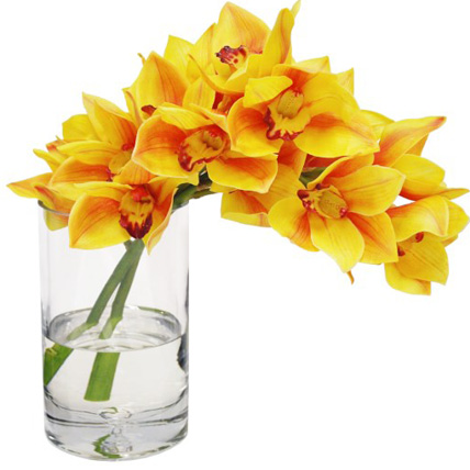
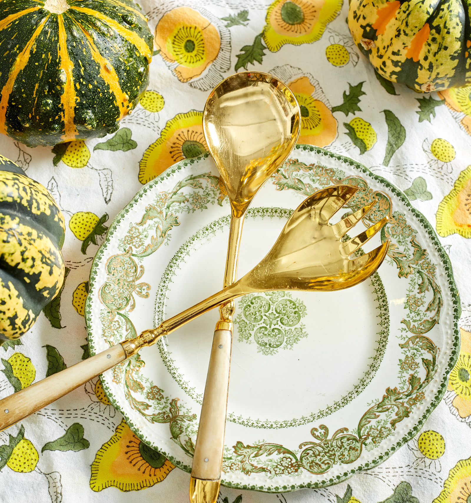
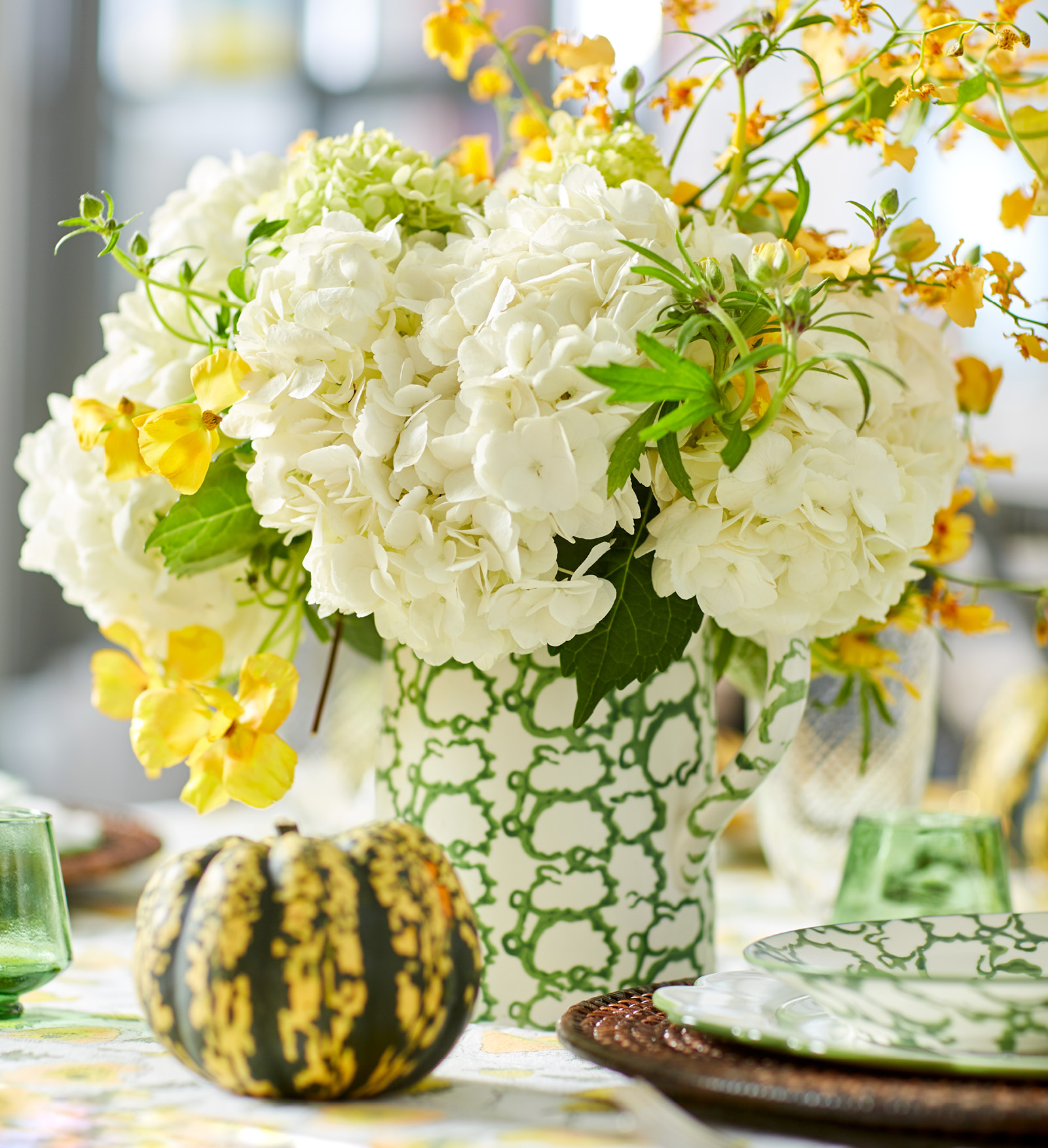
Finally, the centerpiece. It’s funny how even when you don’t plan ideas exactly, they somehow just work. I love the simplicity of a vessel, such as a pitcher, to make a tablescape less formal. Huge, crisp white hydrangeas and dainty Oncidium orchids balance each other and worked well with the setting I had planned. I stumbled upon perfectly coordinated gourds in the produce area at Whole Foods. I could not resist scattering them on the table to leave no doubt that fall is approaching.
We know what’s coming sooner rather than later. I’ll take the dog outside for a walk and hear the crunch of dried leaves underfoot. I know that before leaving the house, I’ll bundle up in a puffer. I know I’ll turn up the oven, step away from the grill, and start cooking root vegetables and roasts indoors. But until then, I’m keeping it going.