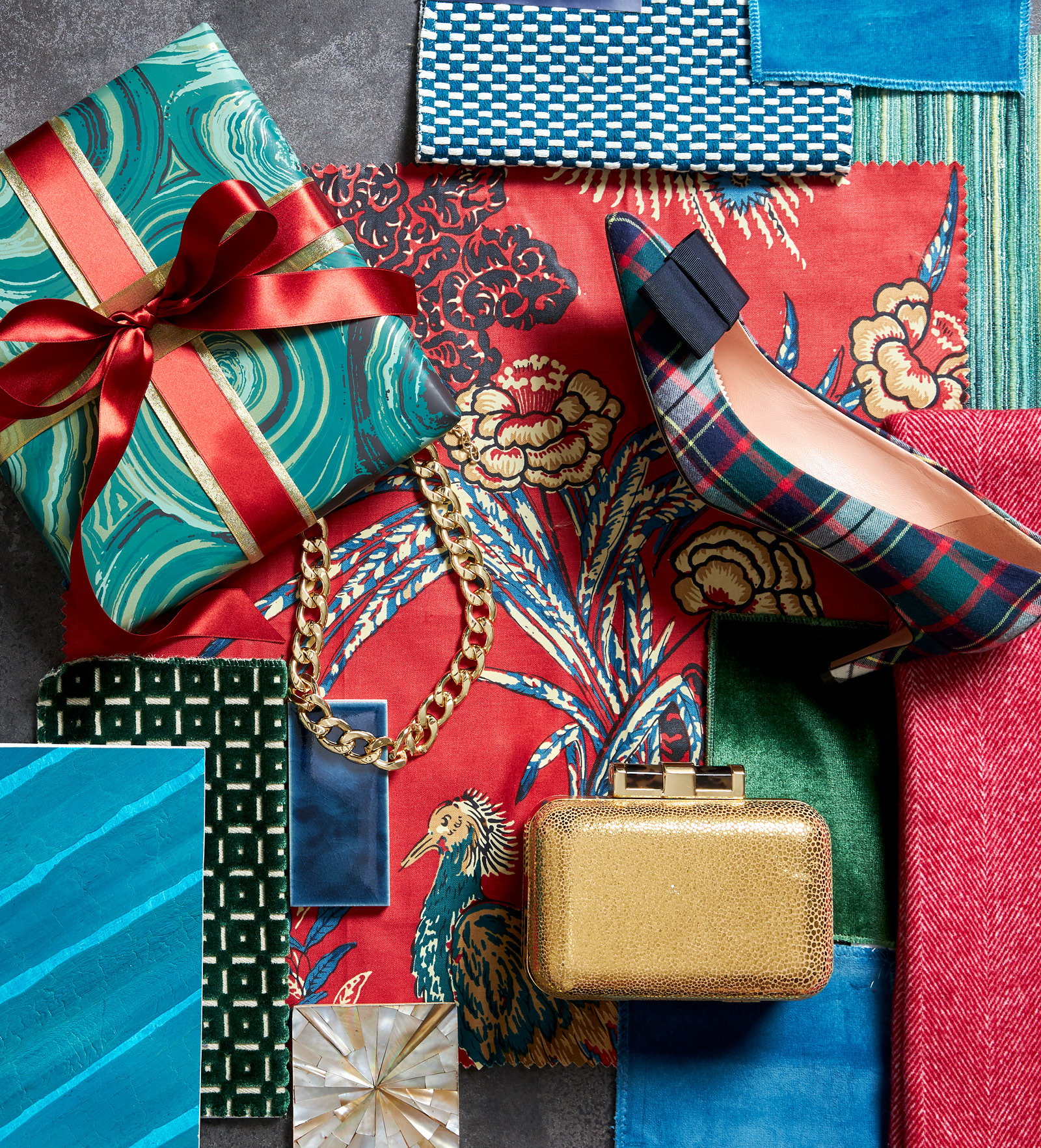
Tartan always gets it right. It has a “more the merrier” attitude when it comes to color and frankly, so do I. We have Scotland to thank for the many plaids of crisscrossing colors that we now associate with the holiday season and classic style. This year, a tartan heel in delicious jewel tones sparked my inspiration for a palette that taps into tradition but invites a complementary layer of glimmer for additional panache. Most festive cocktail parties have been eliminated from the schedule, so my sparkly tops and velvet jackets might not get a lot of play. But I’ve found plenty of ways to use jewel tones during the daytime.
Red is a classic and feels especially fresh and cheerful right now. I found two textiles that are both intense, but with separate purposes: The first is a simple tweed that might land itself on a classic sofa frame. Second is a statement chintz that’s grounded in ruby with accents of sapphire, peacock, and tan. I’d consider this bold classic for a valance and curtain panels or a rolled arm English sofa, where the full repeat can stretch in all its grandeur. This “main event” pattern establishes the palette and allows the intensity of additional layers to appear in solid form. After all, a vibrant scheme like this one requires well-thought placement of fabrics and materials so each element can do its part.
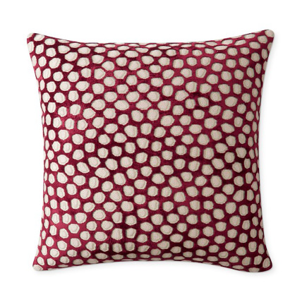
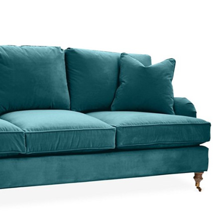
Next comes a touch of luxury that is easily achieved with velvet. I found a silky solid and a square-and-dot cut version in emerald green that would catch the light beautifully on a pair of chairs. But let’s be honest, luscious velvet pillows are necessary, too. We’ve all been seated next to one, only to find ourselves stroking its soft pile like our favorite pet (in my case, our newest family member, Minnie).
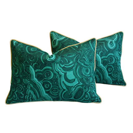
There’s no real surprise with red and green when you are speaking of Christmas, but I always like to throw in unexpected accents. Here, I’ve injected shades of aqua, peacock, and teal. Some of this part-blue-part-green color shows up as solids. Others are subtle patterns such as mini checks and a tonal strié that I might apply to hallway walls. Then there are the wrapping papers that I search for. I select them to coordinate with the room that showcases the Christmas tree. The swirl pattern that covers this box nods to malachite, and likely, something equally precious inside.
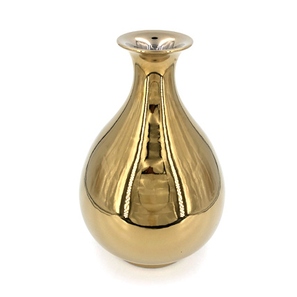
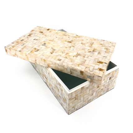
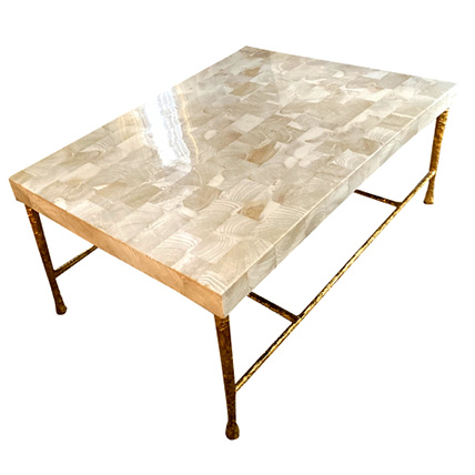
Regardless of the specific colors, no holiday palette is complete without the shimmer of metallics. Come Christmastime, fashion’s jewelry boasts a few more facets. And clutches beg to star with their shiny outer forms. In interiors, I’ll corral a group of brass candlesticks with tall ivory tapers to achieve the same idea. Then there’s mother of pearl. Its origins are shells that perhaps, make the iridescent material seem more seaside than Santa. But imagine a tray in this elegant material. It might be propped to serve bubbly champagne and savory caviar. Or a bowl clad in mother of pearl might be the spot that is used to collect this year’s holiday cards for easy reading.

There’s been a trend in recent Christmases to avoid color in design and instead rely on decorations that are all-white. But this year everything traditional is sure to comfort. Here, color evokes merriment. Color brings us cheer, and that’s what this season is all about. Whether you are exchanging neutral sofa pillows for ones that sing the Christmas spirit, or are filling your dining table with china, silver, and crystal, add color. Add bold color. And watch the joy unfold among your family and friends.