May is the month when nature shows its beautiful spectrum of color. The trees fill in with fresh green tops, flowering branches bud with delicate petals, and the sun shines both brighter and pleasantly warmer. May is also the month when our azaleas bloom to the most beautiful shade of blindingly bright blossoms. The saturation and vibrancy of the purplish-pink azaleas are hard to put in words. I found them easier to create a mood board that is layered in expressions of the joyful ease of springtime living.
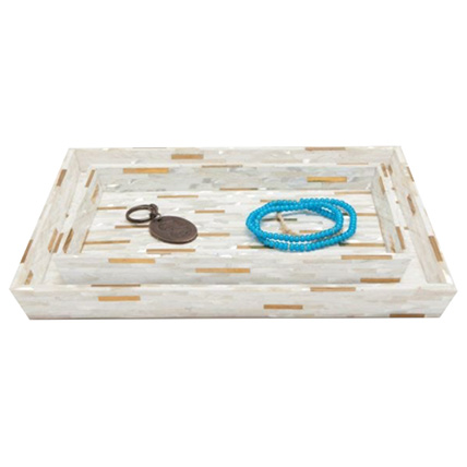
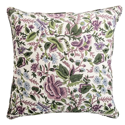
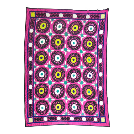
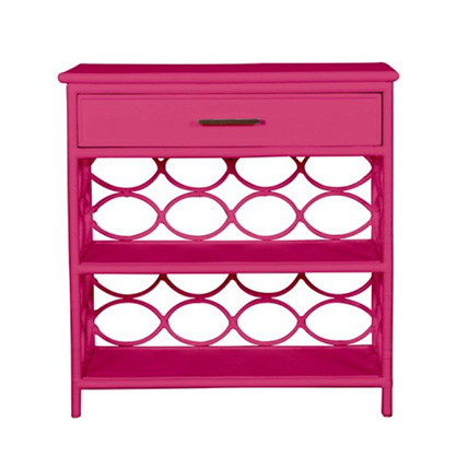
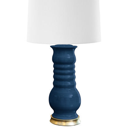
The first swatch that I pulled for this scheme was a favorite floral, batik-inspired print of mine from China Seas. Its ground color is the signature azalea pink, but the blooms that top it are in fresh accents of blue and tangerine. I love purplish pinks and navy blues together, so I added a blue paisley print, a woven blue tweed-like carpet, and some additional lavender textiles. It’s an unexpected color combination that I use occasionally because the navy compliments the warm bright lavender so nicely. I also introduced natural wicker and walnut wood to bring an earthy and natural vibe to the scheme. In addition, the ivory tray and brass turtle give a little shimmer and shine to the palette. Consider using these colors on a sun porch or in a family room. The floral print would give instant personality to a pair of chairs, while the chevron print is still spirited, but a more tempered pattern that’s ideal for a sofa. Then add in a light-colored coffee table, a navy pair of lamps, and some wicker accent tables for a lovely and springy azalea-inspired room.