Think of a paint deck, or a wallpaper book, or fabric samples. Have you ever passed up all of the other colorways—the powerful reds, the cheerful yellows, the serene greens, crisp whites, or soft blues—for brown? Probably not.
But that doesn’t mean that brown doesn’t lend a sense of chic style to design. That’s why I used a charming brown-and-white fabric with markings that almost dance across the linen as the base for three table settings.
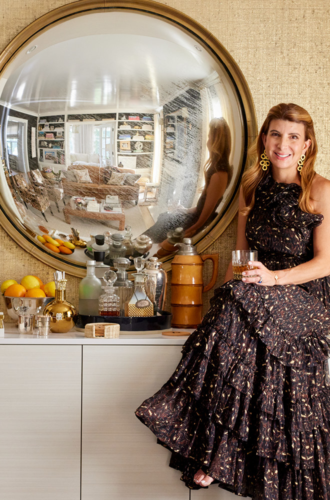
Don’t shy away from brown. It’s a softer neutral than its urban cousin, black, and beautifully serves as the base for all sorts of colorful accents. For a tabletop enthusiast like myself, I make strong attempts to tap into a new version of creativity each time that I set the table. But that doesn’t mean all new wares for every dining moment. It’s all about finding new ways to mix what you already have in your storage cabinets.
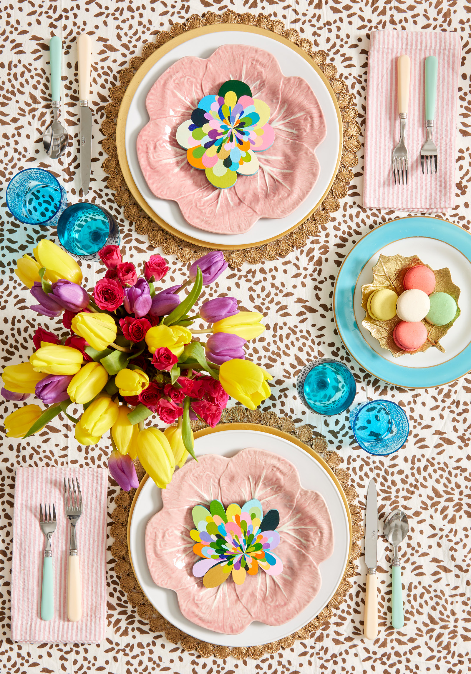
Think Pink
This sweet color is not going away. Once devoted entirely to all things girly and feminine, pink is now a staple that’s used to show courage and sophistication in design. Here, I used my vintage, pink lettuce plates to top a base of white plates that rest on scalloped placemats. Pink-and-white striped napkins and pastel flatware furthers the scheme. But I didn’t want this to solely be a story of pastels, so I added bright colors, too. Turquoise appears not only on a plate used to anchor a leaf object that neatly corrals macaroons, but on drinking glasses, too. And the flowers—purple and yellow tulips with red mini roses— are a combination that’s not an immediate go-to for me, but one that layered in interest.
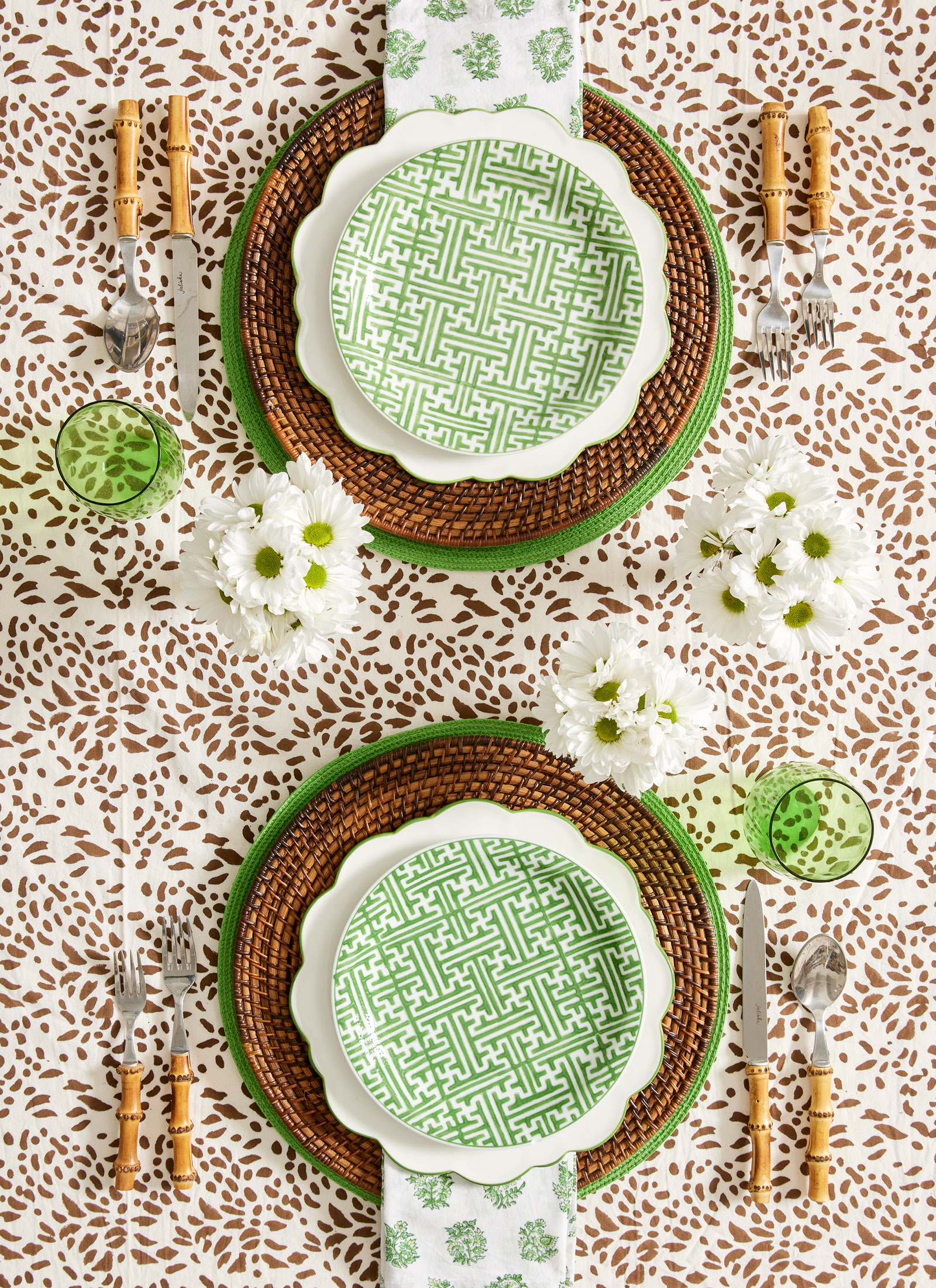
Fresh from Nature
Green and brown are naturals together, literally. They show up in nature in the form of trees, where trunks in earthy browns are contrasting with leaves that in their current budding stage, are electric in a wonderful chartreuse. For this setting, I kept the palette simple and relied on texture and pattern. The tablecloth’s theme is furthered with rattan placemats and bamboo flatware. The neutral base lays the ground for green accents. Most notable are the patterned pieces: A geometric salad plate and a hand-blocked napkin. For a bit of playfulness, I added a dinner plate with green to outline its scalloped edges. Green-and-white daisies are sweet and offer a crisp touch to the tablescape.
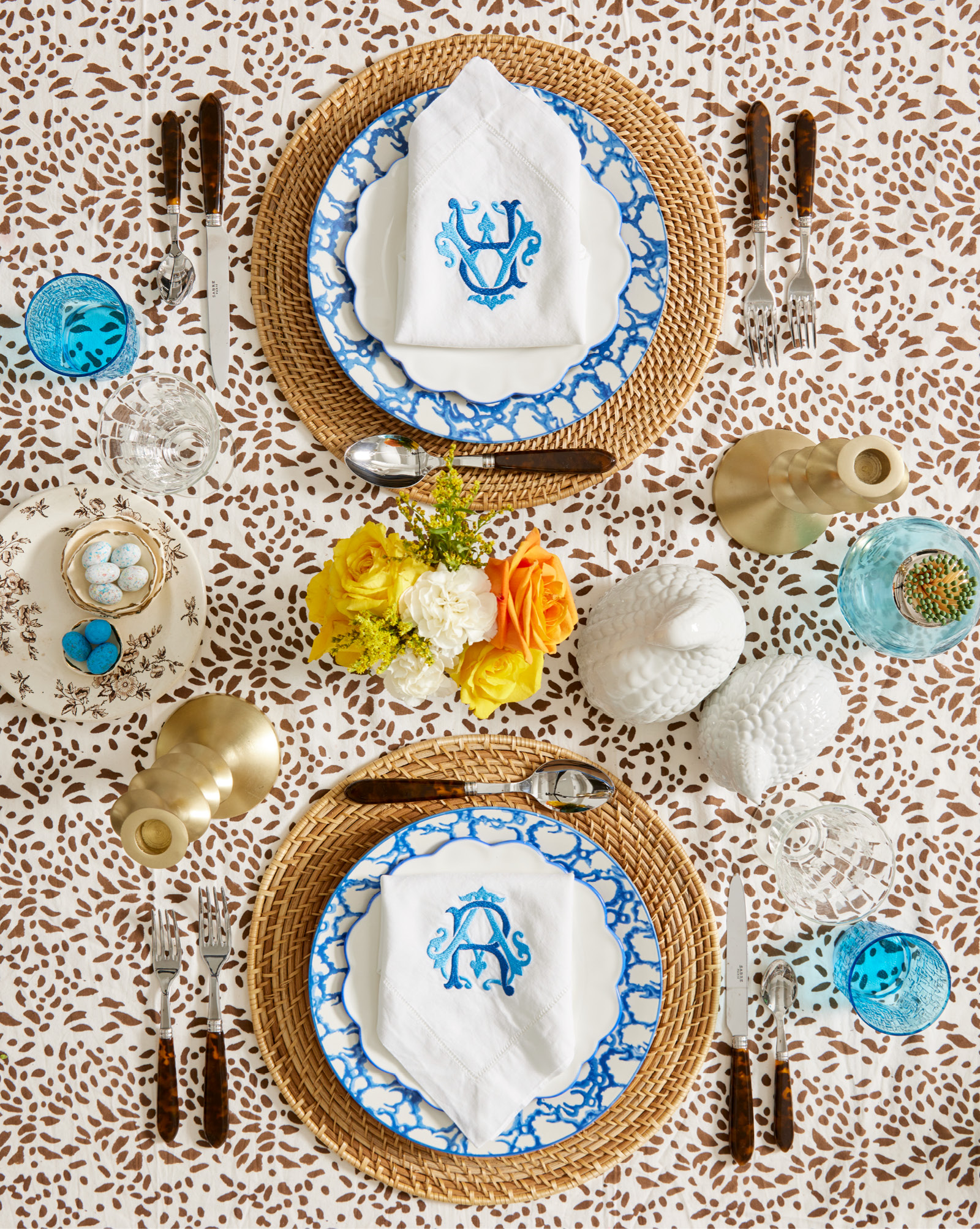
Blue and Blissful
I like this combination of blue-and-brown for its masculine appeal. Yet, I find it to be sublimely pretty. I used rattan placemats again, but this time I went with a natural coloration. Blue-and-white plates in a pattern that resembles vintage spongeware are topped with those scalloped plates, but with a blue edge. I’m attracted to all things monogrammed when I’m setting my table. In this case, I pulled napkins that bear my initials in two tones of embroidered blue. Faux tortoise flatware pops in a dark shade of brown. And remember the glasses from the first table? I’ve used them again here and I know you’ll agree that they look completely different. Gold candlesticks, a pair of white ceramic pheasants, and my turquoise match strike complete the table.
When it comes to setting the table, it’s not about how much you have in your storage cabinet. It’s about how you imagine and execute it. So have fun, and remember nothing is set in stone. If you don’t love what you’ve done, try something new next time. There’s only one rule that matters. And it’s that you have fun and find joy in what you’ve created.