There are plenty of examples of blue-and-white design both current and historically. The beloved color duo’s first stab at decoration with centuries-old ceramics was all the inspiration needed to launch an entire genre of visual beauty. And while it’s undeniably a timeless pairing, there’s another that I find to be a tried-and-true success story in my interiors. That is blue and green. Blue and green are the colors of the sky and grass and the ocean and the trees. They are the colors that we see outside every single day, whether on a mountaintop or in a grassy field.
You may have seen my post on this blog a couple of weeks back, where I styled a vignette around a delightful blue-and-green, large-scale floral pattern. Well, that wasn’t the first time I incorporated blues and greens into my schemes, and it certainly won’t be the last. In fact, I use this duet of nature so often that I want to share the many ways they can embrace a design without being repetitive. Hopefully, one of these ideas will spark your interest in the two colors that I think are always winners, especially when they are working together.
Airy and Bright
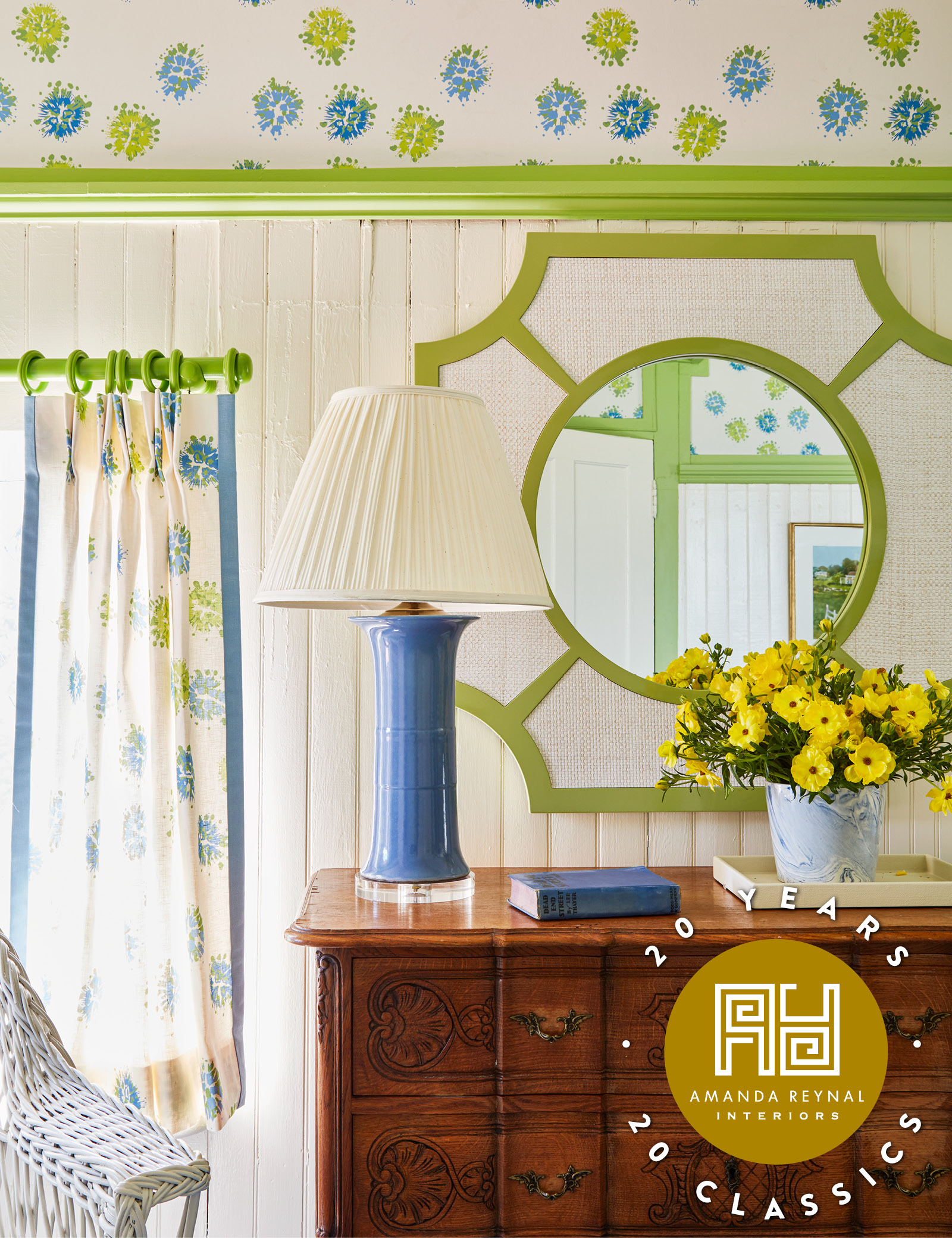
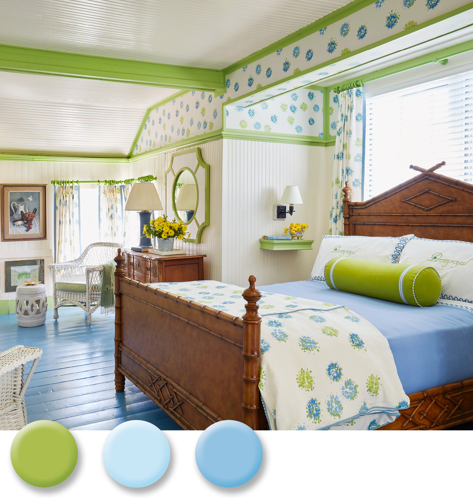
Color can be intimidating. So, my first tip is to step past the fear and embrace what is beautiful! However, if you must tiptoe into color, start by painting your foundation white. Then you can add accents in phases. Architecturally, I painted the floor blue and the trim apple green. The pattern that I used on the walls, windows, and bed splashes blue and green on a white ground to keep the vibe airy and light. Solid color comes in small doses: on a blue ceramic lamp, a roll pillow, and a small shelf that’s hung next to the bamboo bed in lieu of a traditional bedside table.
Favorite Find
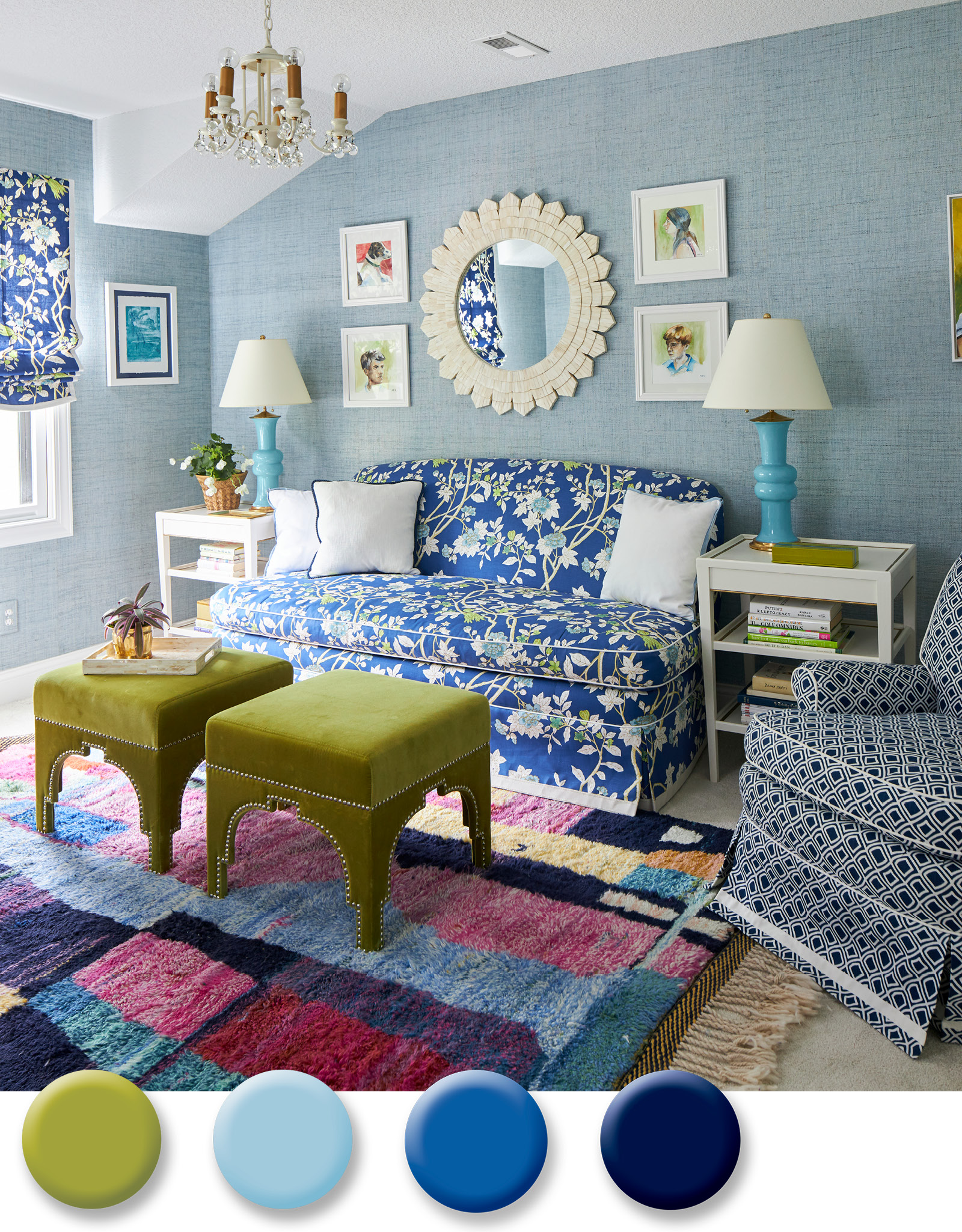
There are so many dynamic pieces of design out there, so when I’m in my moment of selection, I make it a point to find my favorites. For me, that means a great pattern in a great color. In this space, a floral motif with a royal blue ground is what I chose to dress the sofa and the window. Matching everything perfectly wasn’t the goal here. Creating layers was. I did that with coordinates that appear to be collected over time. A chair in a navy geometric, apple green ottomans, turquoise lamps, a light blue papered wall, and a rug with moments of purple and azalea listen to the direction of the sofa and window pattern without repeating it.
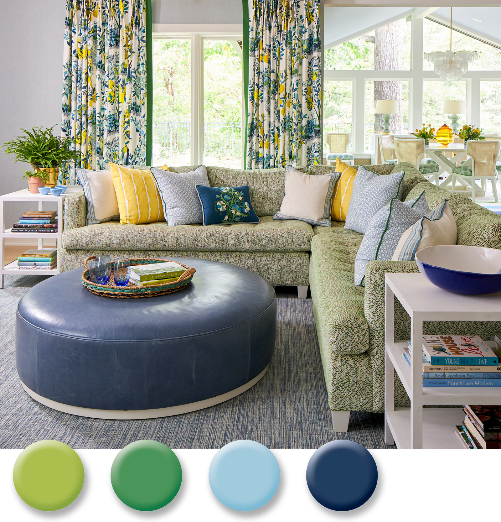
Mix it Up
I can always find room for another pattern. The key is to avoid too many that compete with one another. This family room blends blue and green with a subtle beginning. A leather ottoman rests atop a strie blue rug. A mini pattern similar to an animal print on the velvet green sofa makes it almost appear as a solid. Then the fun begins! Stripes, geometrics, trim, and applique mingle joyfully in the pillows on the sofa. The big surprise comes from one statement fabric. Pick an element in the room and make it the one that takes charge. Here, it was a sunny and iconic garden print depicting lemons and flowers that I used for window panels.
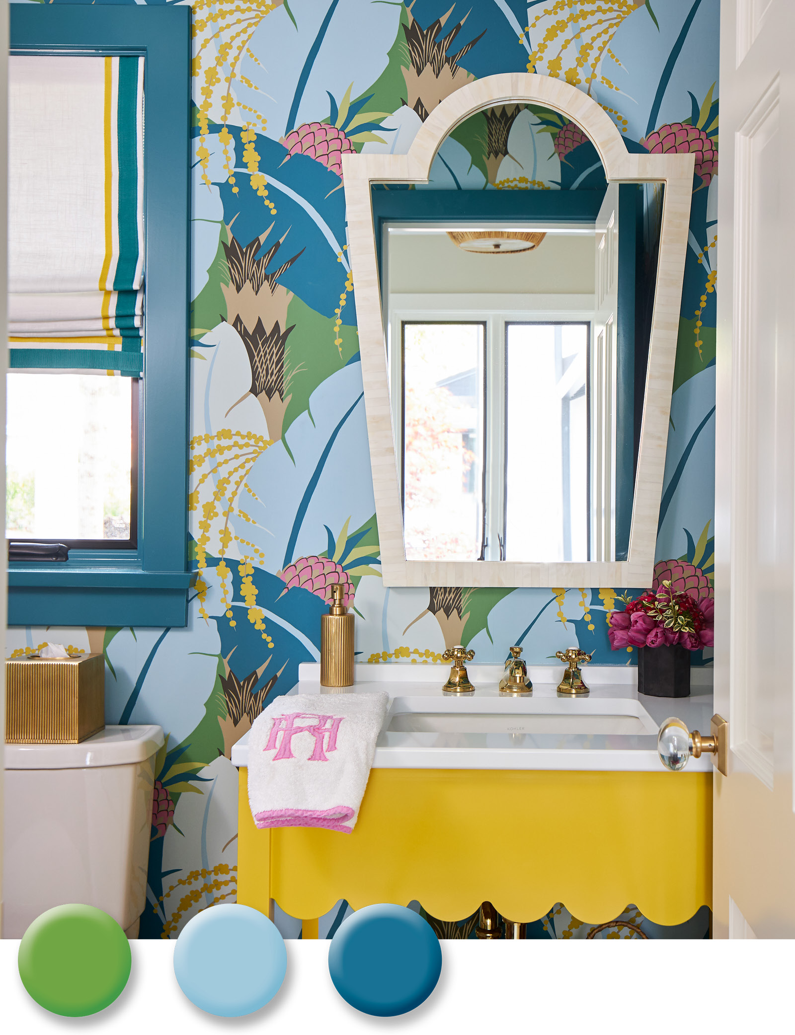
Small but Mighty
When you have small dimensions, go big in style! Powder rooms are the perfect spot to create a moment, and if you are still a little timid about using color in the first place, a small powder room like this one is a great room to dabble in bold hues and an even bolder pattern. This little jewel box of a space is wrapped in an oversized botanical in blue-and-green with pops of pink and yellow. And in a small space like this, if you’re going to go bold, do it across the board. Case in point. I custom-colored a sunflower yellow vanity with scalloped edges that challenges the powerful punch of the wallpaper.
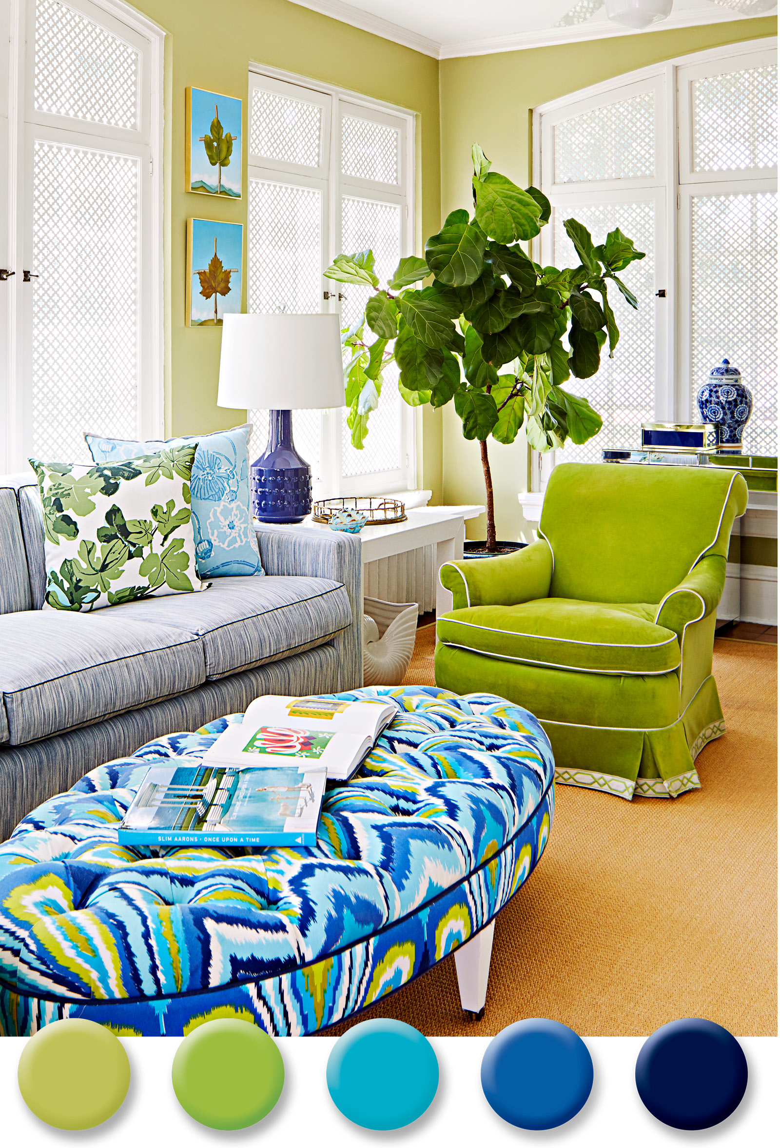
Need for Neon
When it comes to color, I always consider adding an electric vibe that requires no flip of a switch. In this family room, the shell is fairly quiet with celadon walls and a sofa that wears a tonal blue fabric. But when it came to accents, I went bold. A classic chair that’s upholstered in bright apple green velvet paves the way for the “wow” factor printed ottoman. Even in spaces that are more subdued, I always introduce a piece or two that wakes up the environment with attitude.
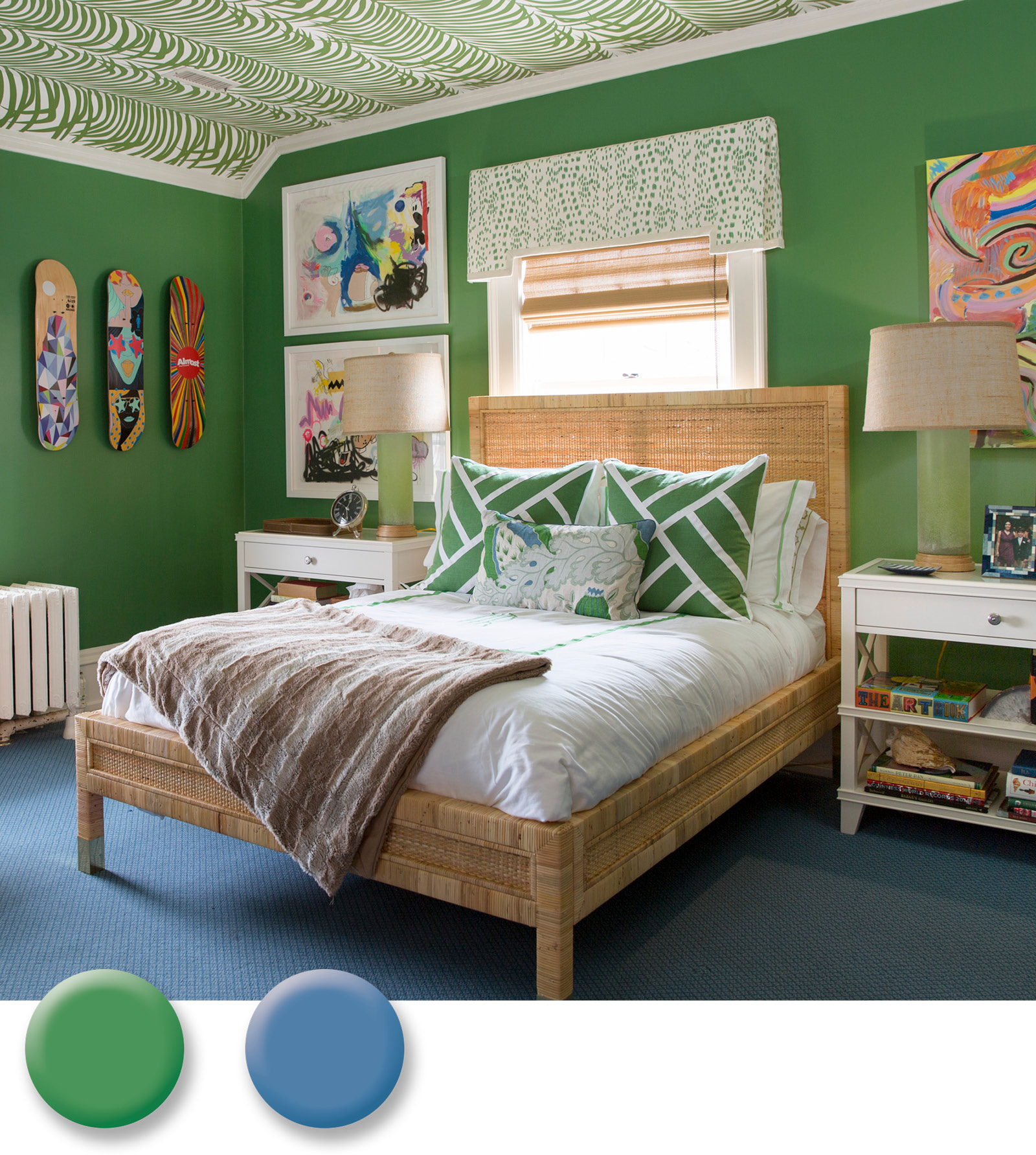
Floor to Ceiling
I flipped nature upside down in my son’s bedroom. The color of the sky all of the sudden made sense as wall-to-wall carpet after I discovered a graphic palm pattern that would canopy over him as the trees do in a jungle. Crisp accent patterns including an oversized geometric used for accent pillows and a random dot used on the windows support the groovy vibe set by a trio of skateboards that I hung to elevate the teen factor. Always consider a found object to hang on the walls and contrast framed pieces. Whenever you need to soften a space, try natural materials like I did here with rattan and bamboo on the lampshade and the bed frame.