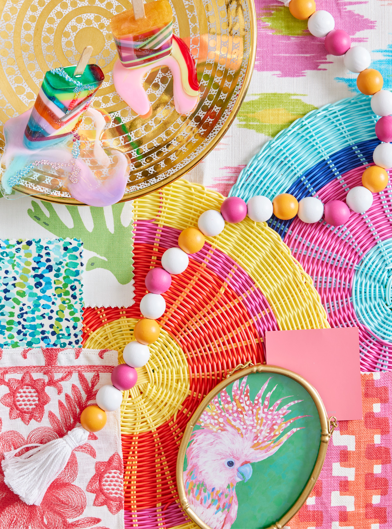
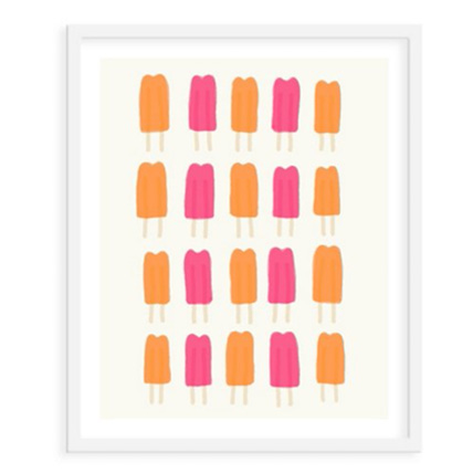
Summer heat and bright long days have me stocking the freezer with cold treats and passing out icy popsicles to family and friends. As a child, it was the basic popsicle that sent me (and likely all kids across the land) into a color frenzy. After all, purple was grape-flavored, orange tasted like orange, green gave hints of lime, and red quenched my taste buds with cherry and strawberry notes. The lesson is to choose your color (and ultimately, flavor) wisely.
This led me to create a colorful “tutti frutti” mood board inspired by the tasty frozen desserts and the intense colors that embody them. The popsicles shown are art pieces, sculptures by Los Angeles artist Betsy Enzensberger (Liz Lidgett Gallery). They won’t melt away and can sit on top of a shelf or table for a bit of whimsy in an art collection or display. Here I used them to inspire my color pop mood board that screams Summertime.
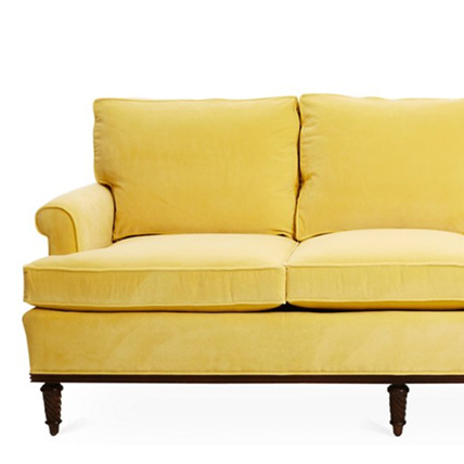
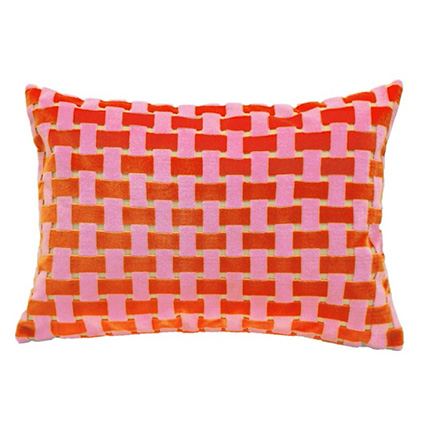
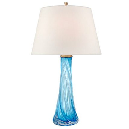
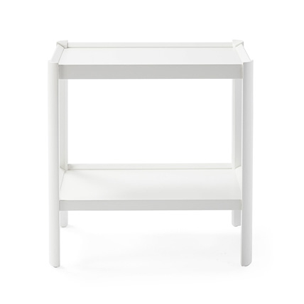
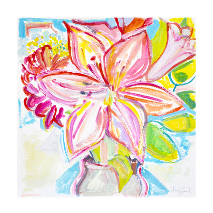
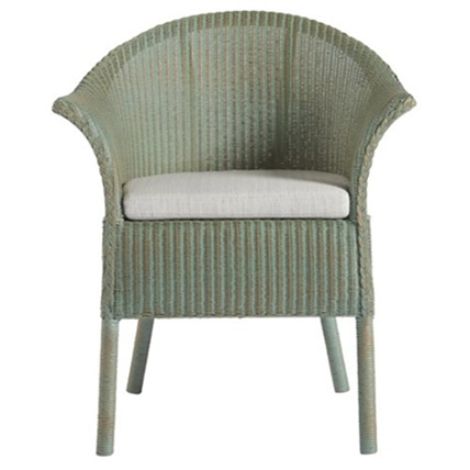
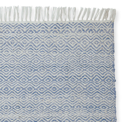
I also imagine a room dripping in watermelon pink, banana yellow, lime greens, and blueberry blues inspired by the rainbow of fruits that can be made into popsicles. How to distribute these colors without it being too bright? I suggest color-blocking the large forms and keeping patterns to a minimum. A sunshine yellow sofa flanked by a pair of green wicker chairs and accented with pink pillows is a great start. Then add some icy blue clear glass lamps and the colors are all there. Now, to ground the scheme and keep it from looking too colorful, flank the sofa with a pair of white end tables. I also suggest keeping the rug a simple solid color as well. Sisal or a creamy wool is all that is needed here. Add a piece or two of colorful artwork and the room will feel like a summer fruit pop.

It’s summer! As you engage in all of the casual leisure activities that the months ahead encourage, relax the attitude about everything, and that includes color schemes. It’s a happy time, so happy colors and the right flavor of popsicles are bound to make this summer a joyful one.