Social media has been a godsend during this quarantine. It’s enabled us to connect with strangers, friends, and colleagues (thank you, Zoom). And it’s how we’ve kept our businesses relevant and active while we’re confined to the parameters of our homes.
Social media makes us all our own life editor. And our life, our work, our editorial vision can gain approval with every like on a post. Instant gratification, multiple times a day.
And then there is print. Oversize saturated images dappled with elegant light pop from slick pages. As a designer, creating results that merit inclusion on that type of real estate is validation and acknowledgement of my professional achievements. Social media “likes” require no editing. Infinite space means everything can be shared. But print editors pick, choose, and unfortunately distribute far more rejections than acceptances. So, having my creative vision in a magazine stamps an extra layer of honor onto my design résumé. It is always a “pinch me” moment when the culmination of the design process is accepted by a magazine and shared on high-gloss paper.
When Traditional Home magazine invited me to collaborate on an entertaining feature for the spring issue, I immediately considered my favorite aspects of celebrating with guests. The invitation emerged from images of a client’s Tudor home that I had submitted to the editorial team. More than 100 years old, the gracious center hall home is filled with original millwork and classic architectural details—elements that make Traditional Home’s audience swoon. The dining room is especially attractive for an event well-suited to their enticing entertaining column.
I have worked with the homeowner for years, and we had recently completed an update to the dining room. That dining room is an elegant space doused in creamy ivory. For a ladies’ spring luncheon, I imagined an injection of feminine forms and colors to juxtapose the Tudor woodwork and dark ceiling beams. My goal was to make the hostess’ experience as visually special as the time spent with her friends.
I have always entertained at home and, therefore, spend a lot of time thinking about tablescapes and the experience hosts create for their guests. I imagined and considered loads of palettes and dinnerware patterns before finally landing on a scheme of pink and blue. I know what you’re thinking—baby shower. Think again. My direction yanked these sweet shades out of infancy and into grown-up sophistication.
I am naturally drawn to mixing and not matching. I instinctively choose pattern, texture, and color when creating schemes. I love the combination. Like photo-ready makeup that’s applied with a heavier hand so it reads well in pictures, the densely outfitted table needed to trigger ideas. The feature also allowed for a level of risk-taking that the average reader may not attempt. I learned that Traditional Home’s affluent audience prefers a layered presentation that demonstrates the art of mixing. Luckily, that is what I did.
We were in sync from the get go. Blue and white is beloved, familiar, and a favorite of mine. But I wanted think outside the box. I wanted a version of the classic blue and white scheme that wasn’t already ingrained in the vocabulary of tabletop fans like me.
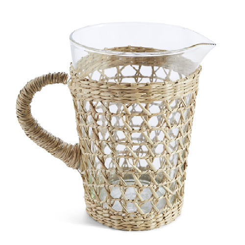
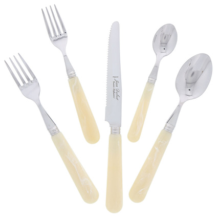
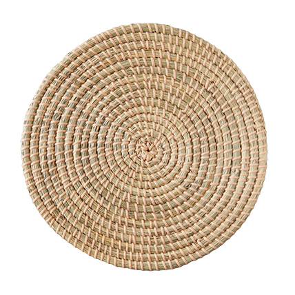
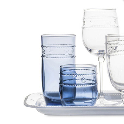
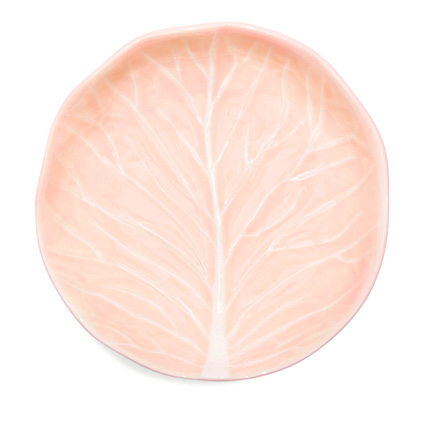
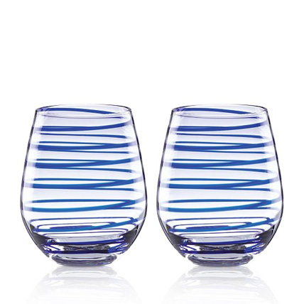
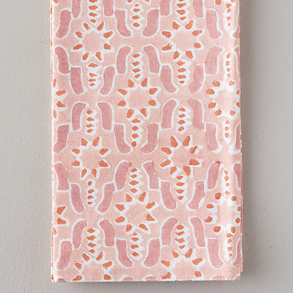
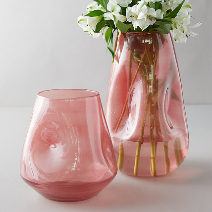
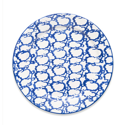
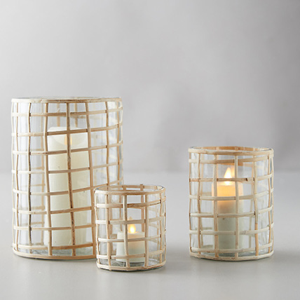
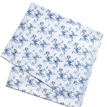
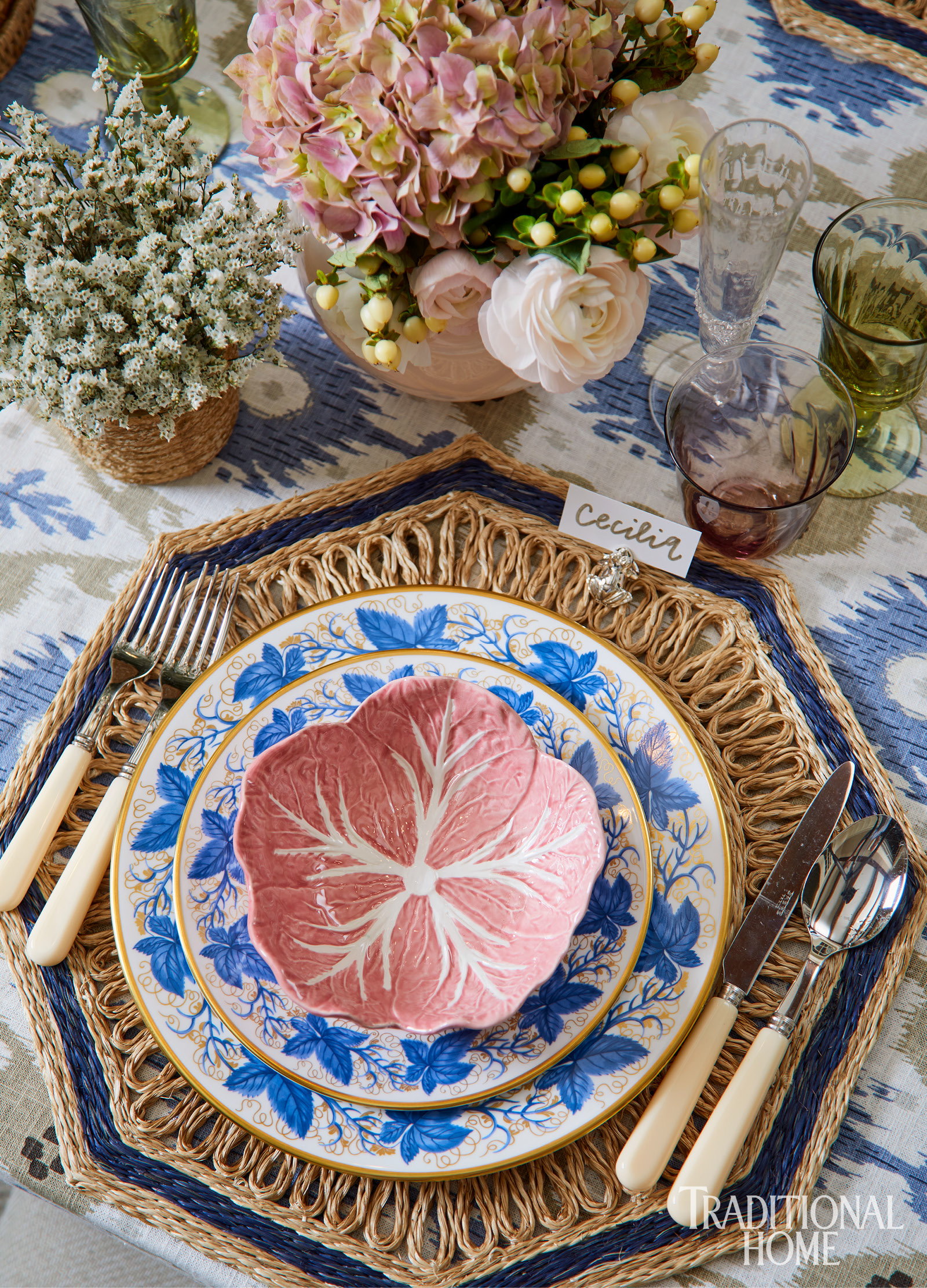
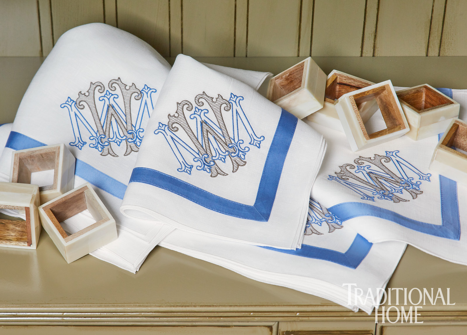
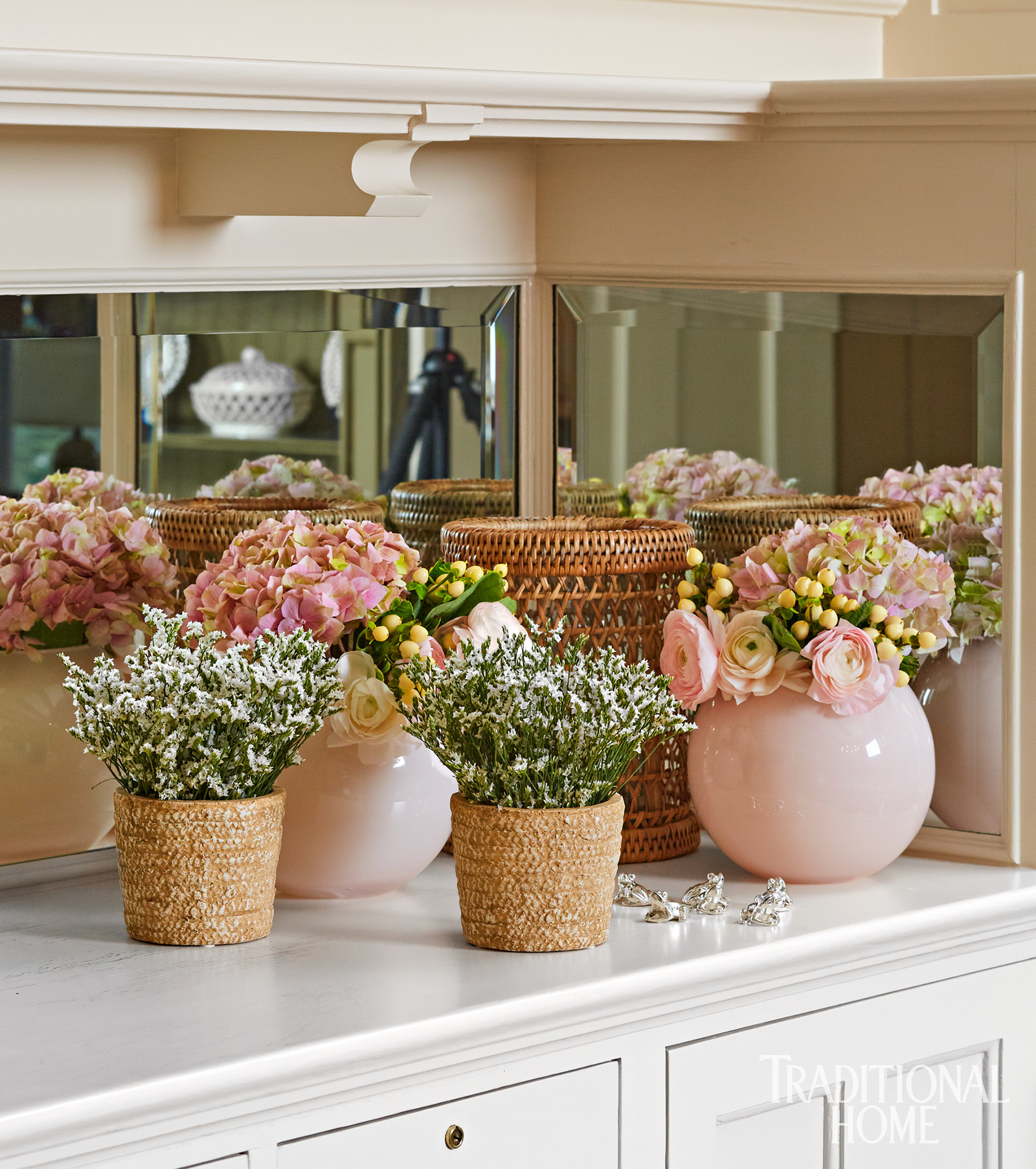
Tablecloths made with statement fabrics…yes, please! An ikat linen in blue and khaki covered the table with a worldly vibe. It begged for wares that were equally unexpected. Cabbage-ware itself isn’t anything unusual, but my vintage pink bowls are not common. The casual nostalgic tone of yesteryear was poised to partner with something a tad more formal like the blue ivy that dances over proper English china. The motif is rendered in a brighter and lighter blue that contradicts the cobalt ceramics that resonate with most people. Abaca plates contrast the shine with a rough quality. Glassware mixes colors, too—pink and olive green to be exact—with pink repeating on flower-filled glass vases. As a gift for my client, I had a custom monogram created and embroidered on white napkins.
Visually welcoming is always my aim, and I achieved that. The table was the perfect foundation for the delicious menu created by the Trad Home food team. Stay tuned for my next post—a visual feast of mouthwatering spring fare.


