Design for me is a constantly evolving discipline, one full of contradictions and, sometimes, the unexpected.
Pull up my website, for instance, and the first image you’ll find is of a living room wrapped in fuchsia grass-cloth walls. Armchairs covered in a shocking pink-and-mustard tribal geometric pattern make no apologies for an affinity for bright and bold. Scroll down to find crisp and graphic green wallpaper that invigorates a simple office space with dimension and life. Next, you’ll stumble upon items from my shop: throw pillows in a peony pink geometric print, cheerful dots in blue, and an animal pattern in an unconventional yet chic combination of green and brown.
The point is that I embrace color. It’s a part of my world in interiors and how I dress. It inspires confidence in me and makes me feel joyful. So, it could throw you off to learn that when my own living room was on deck to be designed, I set color aside and happily settled on a palette of black, brown, and ivory.
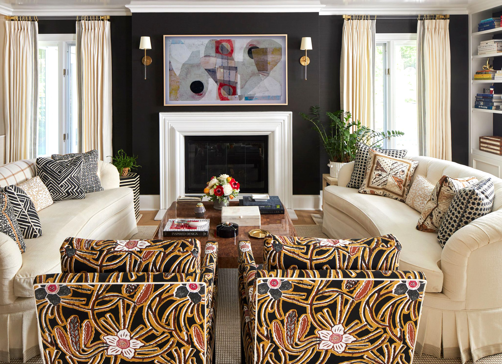
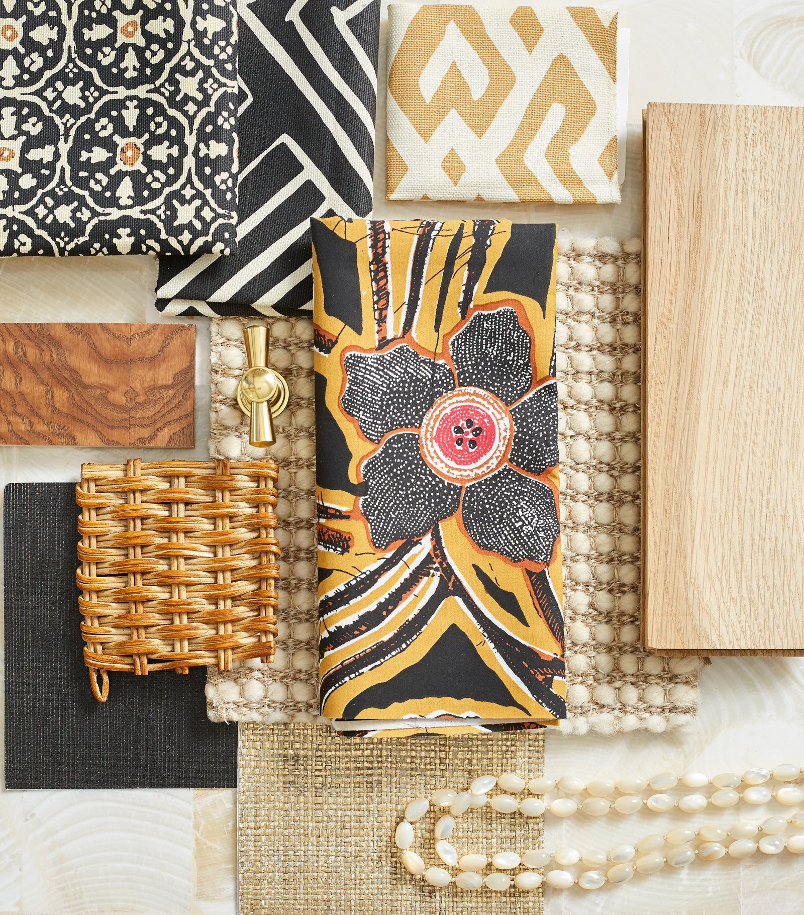
In the fashion world, black is suggestive of formality and the foundation of great style. Whether it’s a chic dress in a head-turning silhouette or an expertly tailored tuxedo, black is at the ready to support whatever elements come into the concept. In my living room, a large-scale batik floral in black, brown, and ivory with pops of red pulled me to a scheme that was polite yet polished, simple but warm.
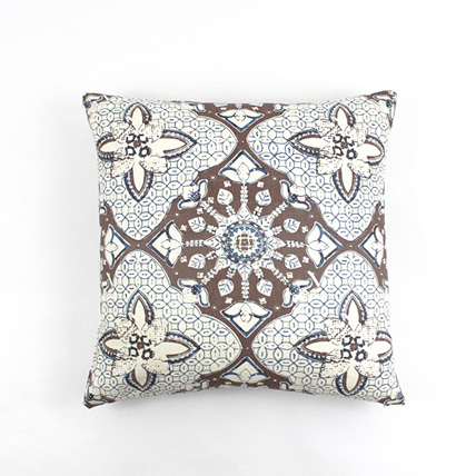
A neutral scheme of black and ivory may be basic, but don’t think of it as boring or cold. I used the curvilinear statement print on a pair of armchairs to add interesting movement next to a pair of matching sofas. The curved tufted sofas are ladylike and inviting. Four people live in my house, and I’m the only female. I met my husband and sons halfway with edgy geometrics that give the room a modern spirit. And the truth of the matter is the scheme needed the complex graphic patterns to layer interest on top of the black walls and creamy rug and sofas. With the geometrics on the pillows, plenty of florals, both traditional and modern, imbue the palette with a pretty veneer.
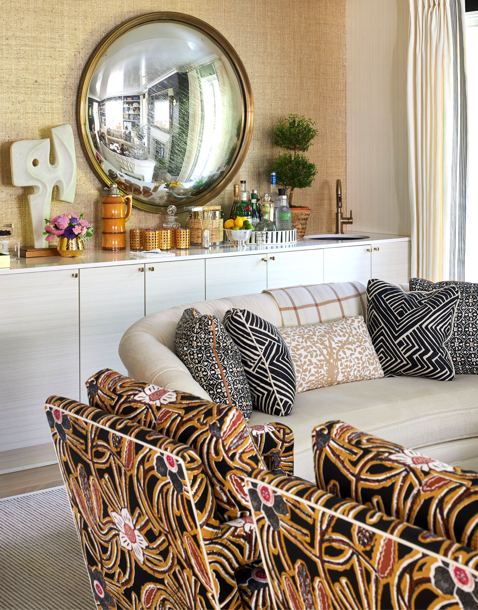
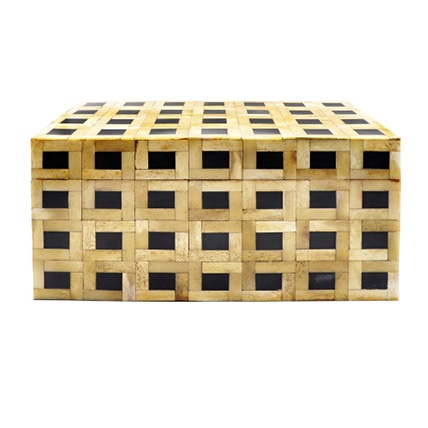
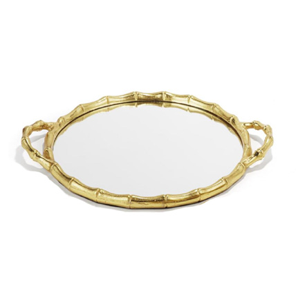
I intentionally chose the color ivory, and not white, to be soft and restful. True white can be intense and bright—feeling as if it’s best-suited to house a modern art collection. Ivory, however, implies coziness, especially when used in varying textures. The wool-and-sisal rug is also a study in contrast. The two natural fibers, one soft and one rougher, mix well to keep the look tailored. I lean upon glamorous materials such as gold woven grass cloth, shagreen, mother-of-pearl, or capiz shell for a box or tray to top the cocktail table. The black walls absorb a lot of light so metallic accents add sparkle and reflect light on surfaces.
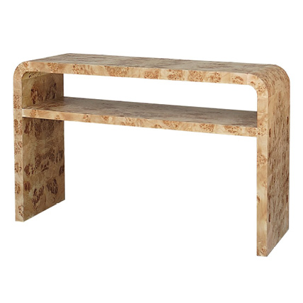
As I tiptoe into the cooler months, I yearn for layers, both in my wardrobe and in interiors. I added browns and caramels to my living room for yet another point of interest. I centered the seating arrangement around an olive burlwood cocktail table finished in a warm medium tone with a high gloss. But blonde or bleached tones could work just as well. This is also the perfect opportunity for a touch of wicker.
Black and ivory are the basics that invite myriad textures, prints, and materials to complement them and bring them to life. This combination works for a reason. In my wardrobe, in my design portfolio, and even upstairs in my home, you’ll find color dappled throughout. But for our open-plan house and main living room, I chose the chic tonal classics of black, ivory, and warm textural browns to ground the space and invite colorful conversation. The finished space is nothing close to basic, and I find it beautiful every day.


