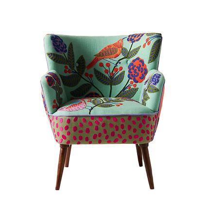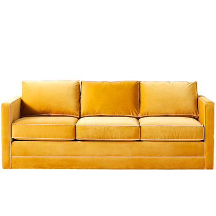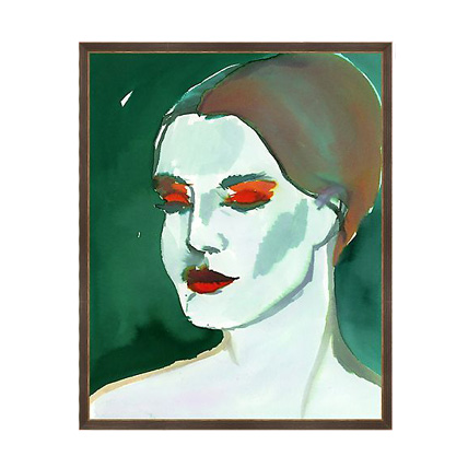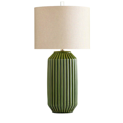
There is no place like the outdoors, our natural environment, to learn lessons on color.
Winter, for instance, demonstrates the effect of negative space. It comforts the earth with a blanket of snow. Cardinals pop off its colorless background like an Old Masters painting does from a crisp gallery wall.
Then, the calendar ushers spring into its glory. In spring, sharp chartreuse borders on neon, and shocking green buds punctuate bare tree limbs. The result is similar to that of a throw pillow adorning a sofa.
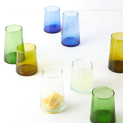
Summer focuses on the cool side of the color wheel with blue water and green grass. As it basks in heat, summer transports me to leisure life. Its soothing colors feel like home no matter where we are. Jumping into a refreshing swimming pool and walking the verdant hills of a golf course always remind me that I love blue and green together.
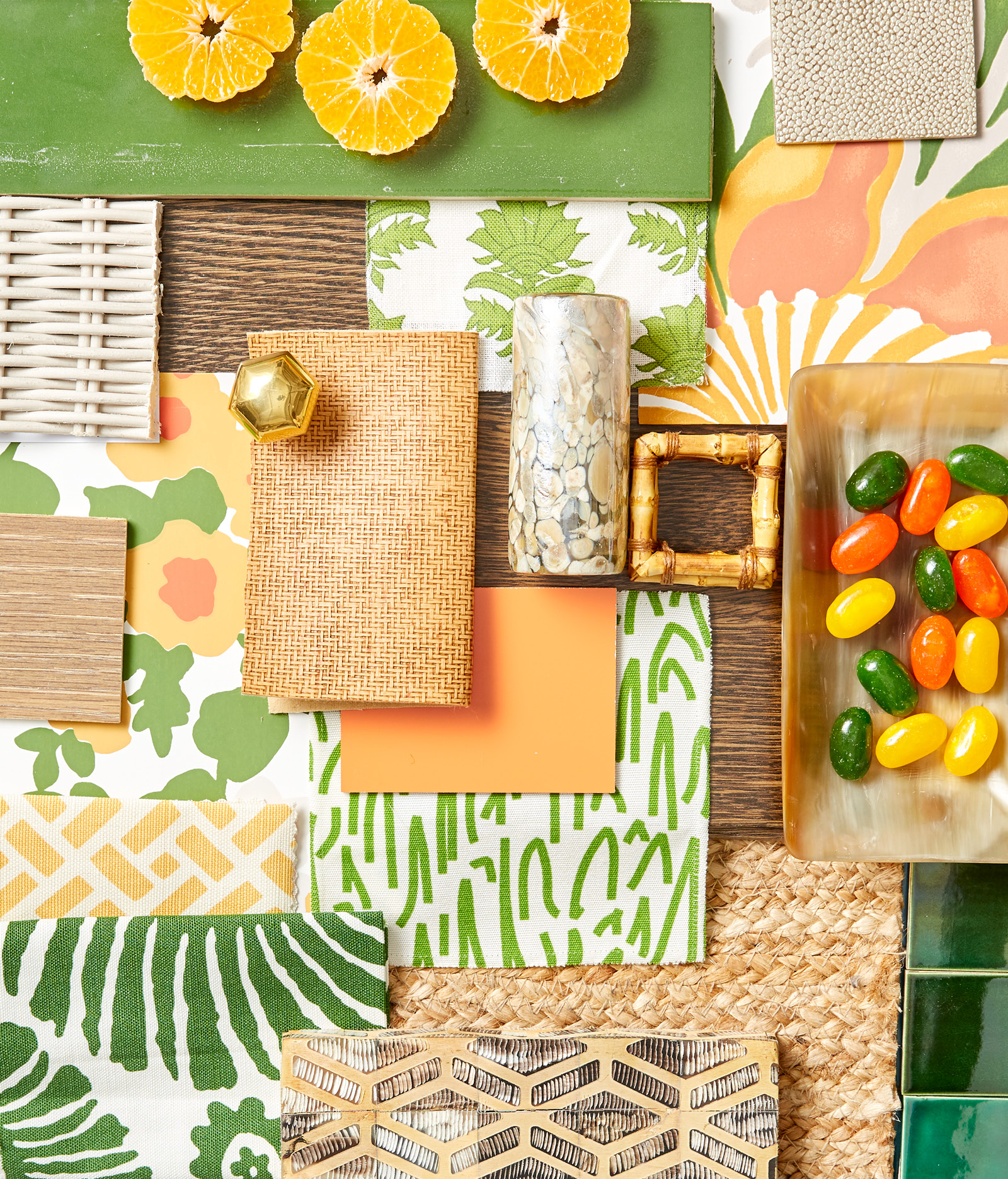
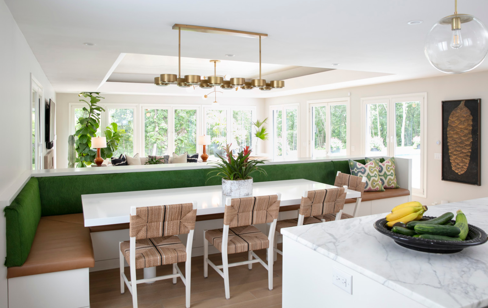
The year ends with what I refer to as the “ombré effect.” It’s dictated by the gradation that occurs as foliage entertains with a fiery show of color magic. This evolution starts in greens that have darkened throughout the warm-weather months before they meld into burnt orange, rust, and golden yellow. While each hue imbues its own level of special, the combination makes for a pretty palette. It’s one that I share in the scheme I created to celebrate this month.
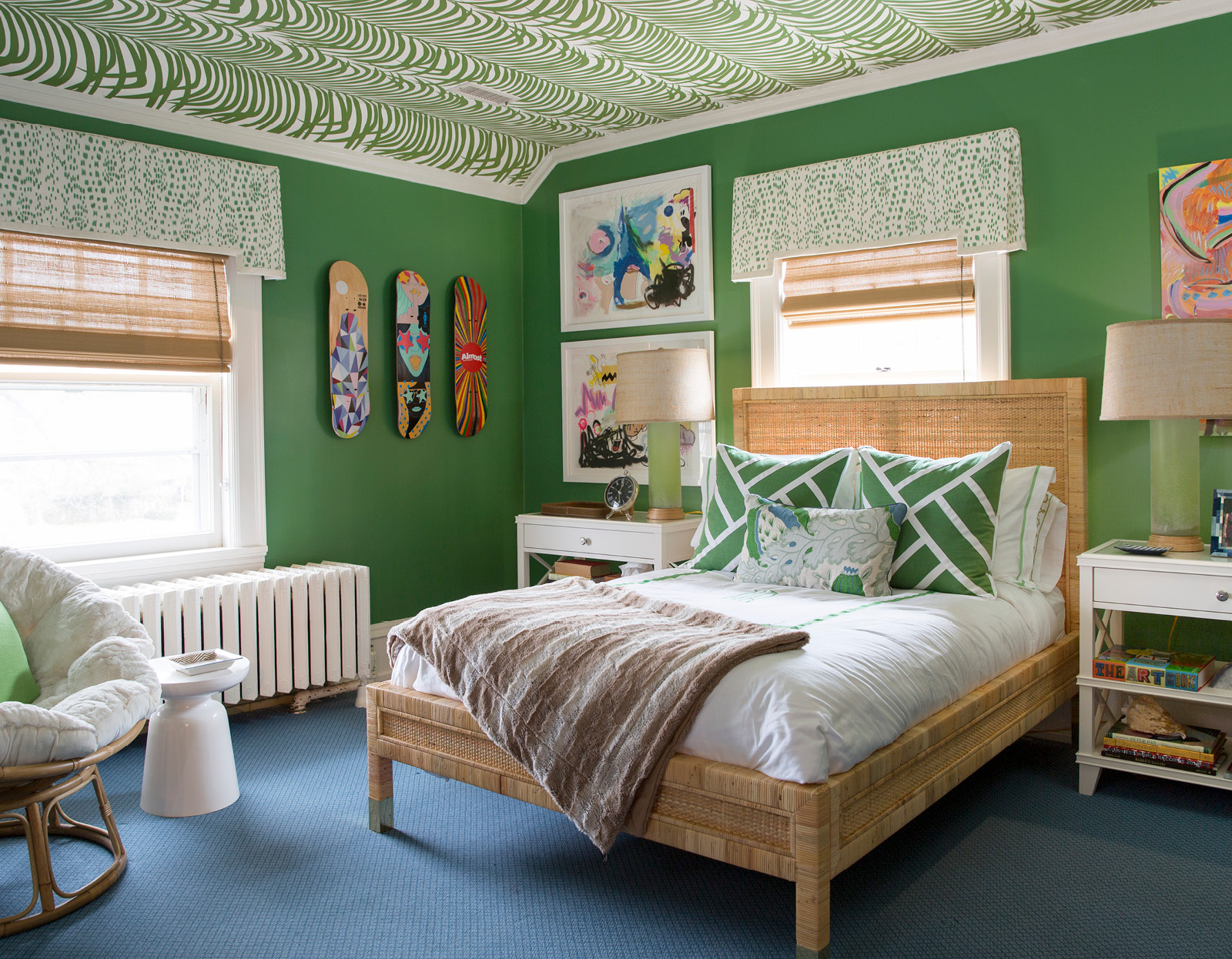
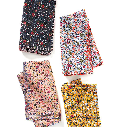
I adore green. Throw in an intriguing pattern, and I am happy. Depictions of palm fronds and the leaves of bold flowers always make sense. It’s natural, after all. I’m especially drawn to a pattern from CW Stockwell that hints at retro 1960s design with its simple but exaggerated flower forms. But mini abstracts and plain solids sell the look of freshness with the same level of success.
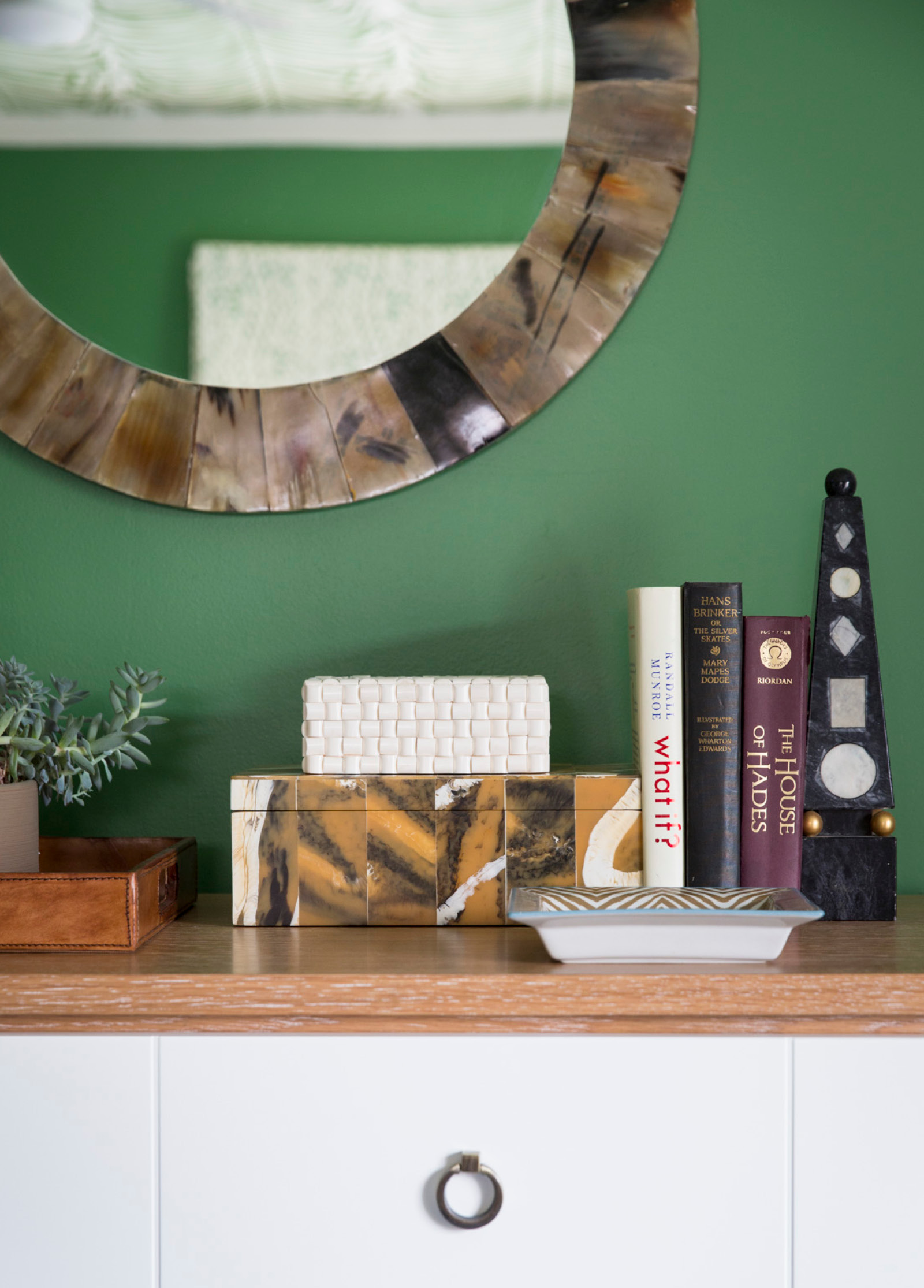
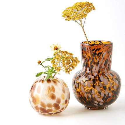
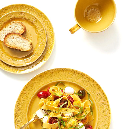
Next, I like to softly introduce foliage’s autumnal vibrancy. Come fall, the aromas of pumpkin bread in the oven and butternut squash soup simmering on the stove permeate my kitchen. I look forward to using a golden yellow-orange with green. I specify the toasty shades in both literal form and as one-offs that suggest the color in natural materials like textural raffia, bamboo, or seagrass.
Speaking of texture, this is my last chance for outdoor lounging and dining in wicker furniture on my patio. And as nights become longer, my schemes yearn for colors that reflect the approach of another winter. It’s then that I lean on gorgeous wood grains stained in rich tones. Now that brown furniture is making a comeback, following through with this strategy will be an easier-than-ever feat.
We’re on the cusp of a new season. But that doesn’t mean that I’m willing to close the screen door on summer quite yet. And as the trees parade one color after another in front of my eyes, I will sit back and watch the beauty with a smile—and probably a sweater and lightweight jacket too.


