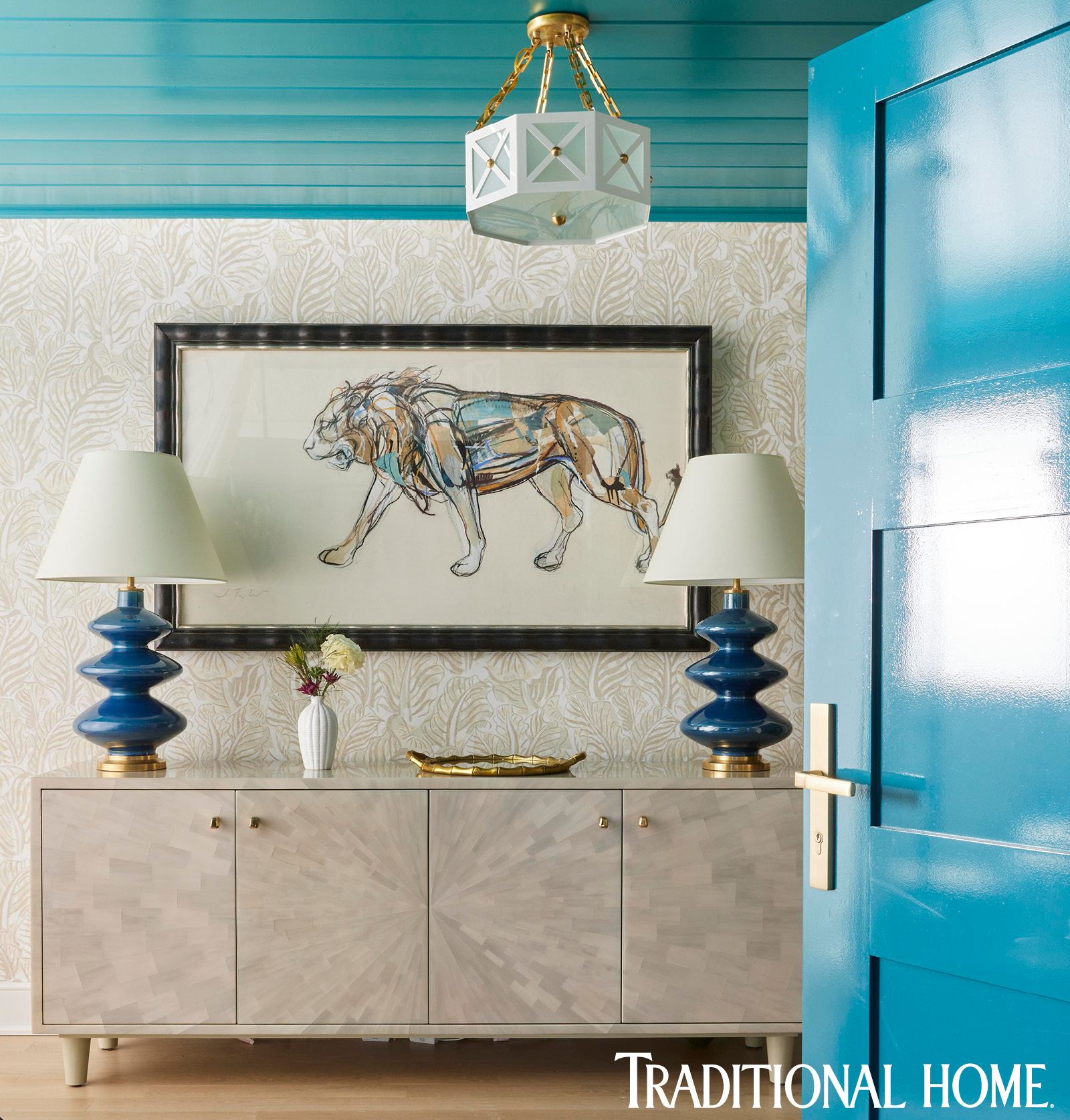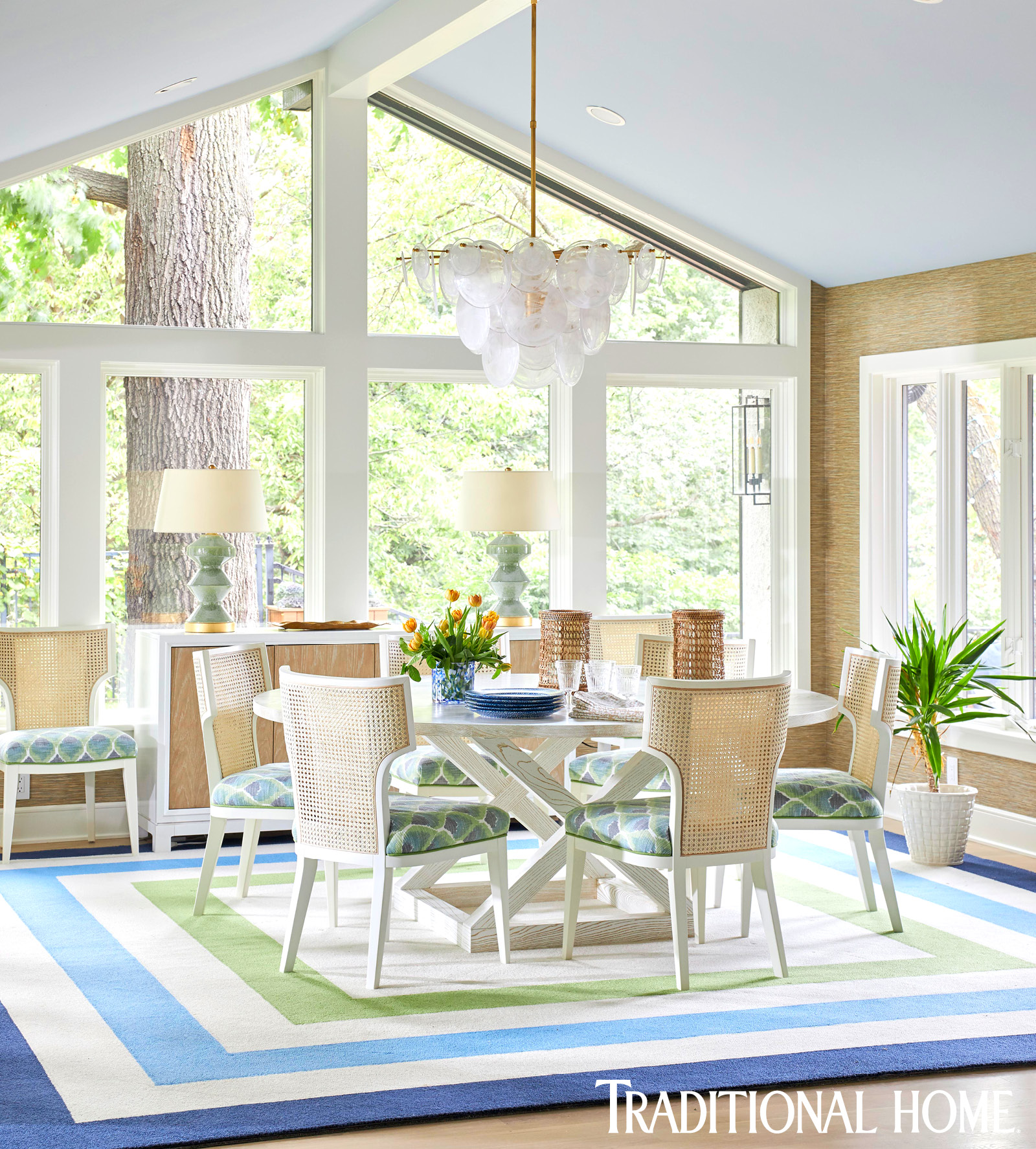
I am so grateful every time my work is recognized and published. I was honored the first two times that Traditional Home recognized me and my designs. My first appearance was years ago, soon after I launched my business when the magazine named me to their exclusive New Trads list of designers to watch. Then in mid-2020, before our world forever changed, Traditional Home asked if they could photograph a table scheme I created for a lovely client’s luncheon. The third time, as they say, is the charm, and one that is truly overwhelming. This time Traditional Home selected the dining room image from our project that they photographed to grace the cover of the 2021 Summer issue!

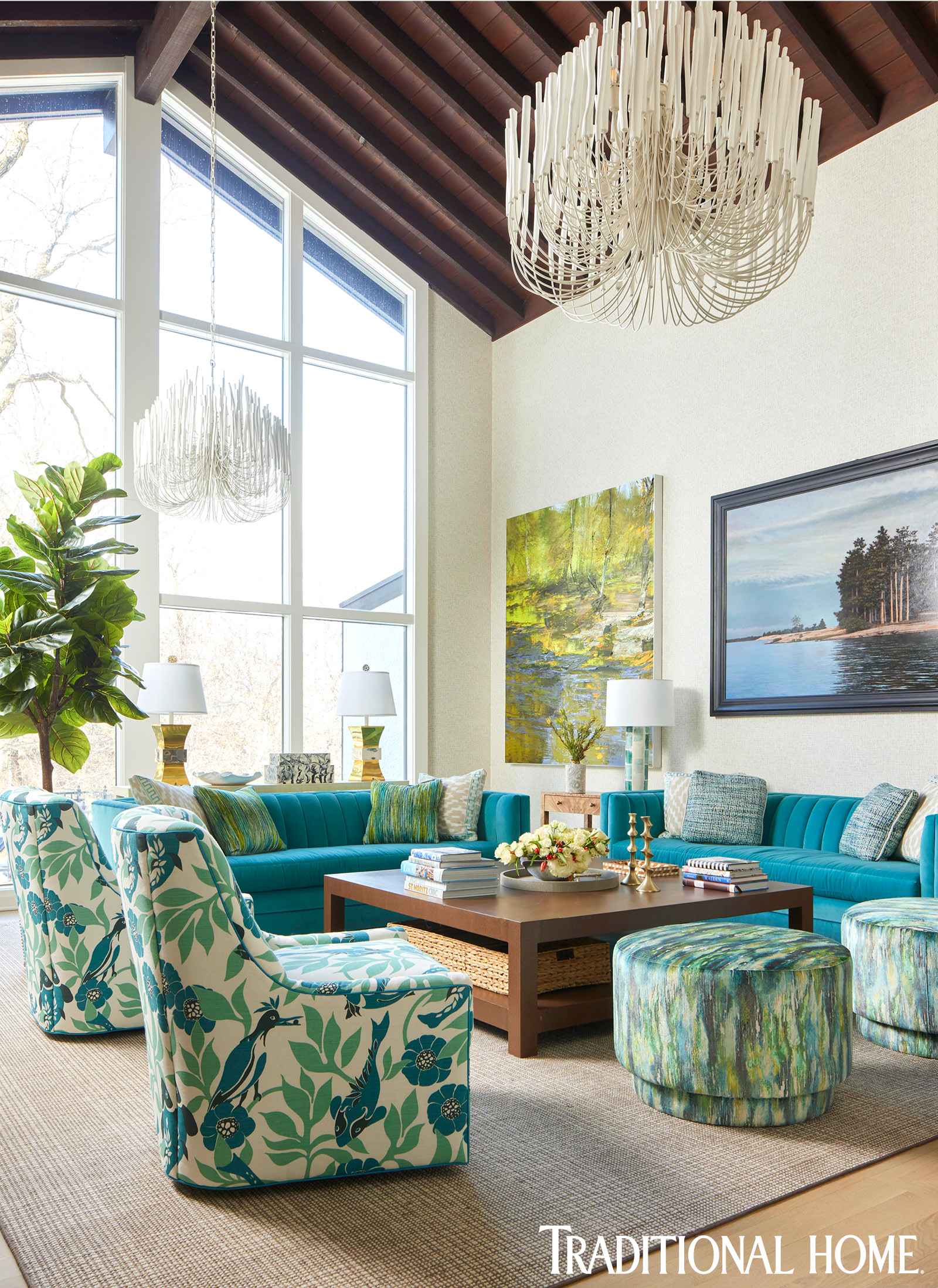
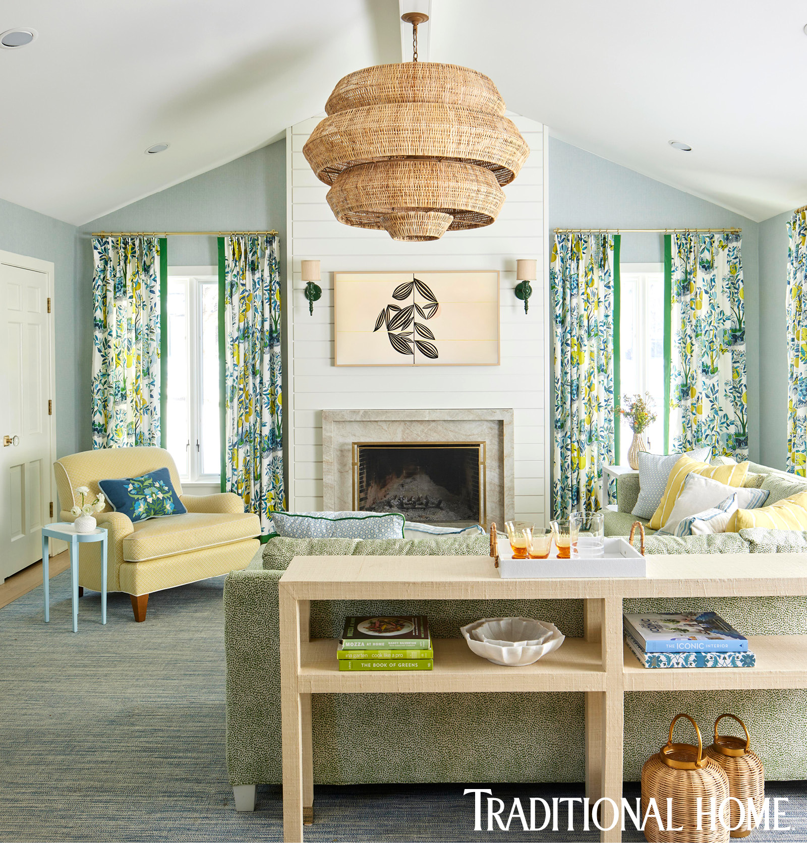
You can find it on newsstands now, an issue filled with elegant interiors, lots of color, and many beautiful projects by creative and talented designers. It also features my project, which I completed in Des Moines for a terrific couple with a growing family. In a design world where neutral palettes usually reign, the team at Traditional Home noted what attracted them to this project was the fresh color scheme of aquas, greens, blues, and sunny yellows just as summery as a tall glass of lemonade and bushes bursting with hydrangea.

The process of a magazine photoshoot is so intriguing. Designers want to showcase the overall flow and message of their work, but there are so many details that editorial photography must consider. Where I might hang another piece of artwork on a wall for design layering, the art director will remove it so they can reverse a caption out of the photo knowing that a particular room might end up in the layout as a full-spread bleed. A collection of objects can be reduced by several pieces so that on paper, the room has an uncluttered appearance. There are so many styling tricks that take a beautiful project and transform it into a magazine-worthy story.

And then there is the cover try. Not only are the editor and art director thinking about what moments of a project will attract readers at the newsstand, but they are also thinking about the placement of the graphics: Logo, blurbs (they help sell issues I’m told), and that oh so attractive UPC code is stamped on just about everything we buy.

Magazine editors will tell you that to have a house project approved for publication, so many stars must align. First and foremost are our clients whose trust and confidence allow me to accommodate their needs and wishes for their home while exercising creativity. In this particular house, our clients came with a solid collection of original artwork. As we designed this gut renovation (the house was a ranch built in the 1970s), I knew that I wanted to lay a foundation of colors that would complement their artwork without competing with it. With a young baby, youthful attitude, and a penchant for creativity, my clients embraced the cool and colorful overall palette. I was thrilled when the magazine also found it appealing. I reimagined the layout of the home so it could serve efficiently for the family’s everyday and entertaining needs. I spent countless hours together with our client to ensure that the kitchen is well-equipped to support their love for cooking, and we specified products throughout that were not only joyful and pretty but would also handle the wear and tear of a toddler, dogs, and any other family members that may come along.

I’m still over the moon to see the culmination of two years of designing and remodeling gracing the pages of Traditional Home. I am thrilled about the whole story, not just the cover image. It’s an honor to have my work validated and know that when people look at and dream about beautiful interiors that this project might be included in what they see. I hope that you’ll get a chance to read it, too.

