Powder rooms are one of my favorite rooms and are not to be overlooked. I adore the opportunity to design these tiny spaces because even with limited perimeters, I can fill them with surprise elements that I love.
I like to approach every powder room that I work on with dramatic energy. The goal is always to transform it into an experience that will dazzle guests who visit briefly with theatrics that might not make their way into the other parts of the house.
For those who love color, pattern, and a smattering of visual dazzle, appointing the most statement elements to this space will come second nature. But for those who tend to shy away from anything bold, powder rooms provide a chance to wow. As you tackle your own powder room, I offer you tips and inspirations so your design will shine and steal the show.
Ceiling Matters.
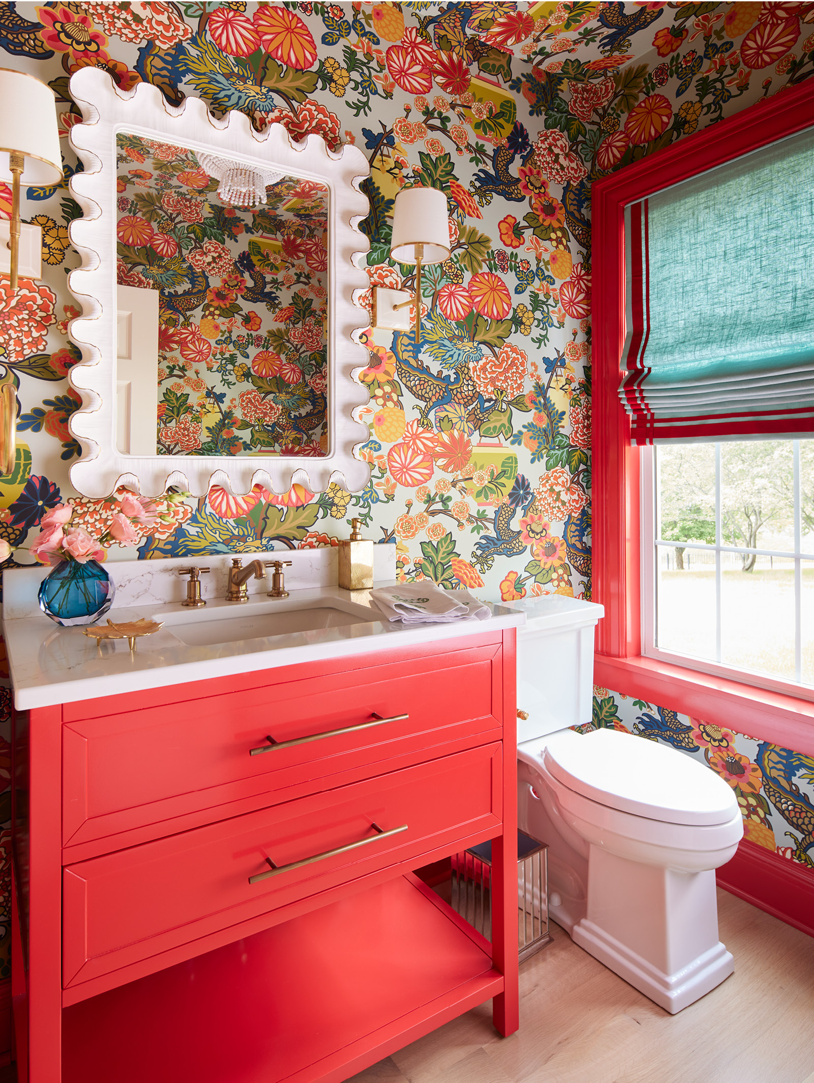
Powder rooms are a place for an interesting wallpaper, one perhaps, that might be too dramatic to use elsewhere. I will oftentimes apply pattern not only to the walls, but to the ceiling as well. There’s no reason to leave it white. If you paint it with a coordinating color in a high-gloss finish, the ceiling will boast design just as the other room components do. The same is true for window dressing. Make them count by choosing a coordinating fabric and contrasting trim to add more layers. Here, we also painted the window trim to match the vanity. And by the way, a powder room is no place to be timid with the mirror. Choose something that has personality like this curvy white frame.

Soft Meets Striking.
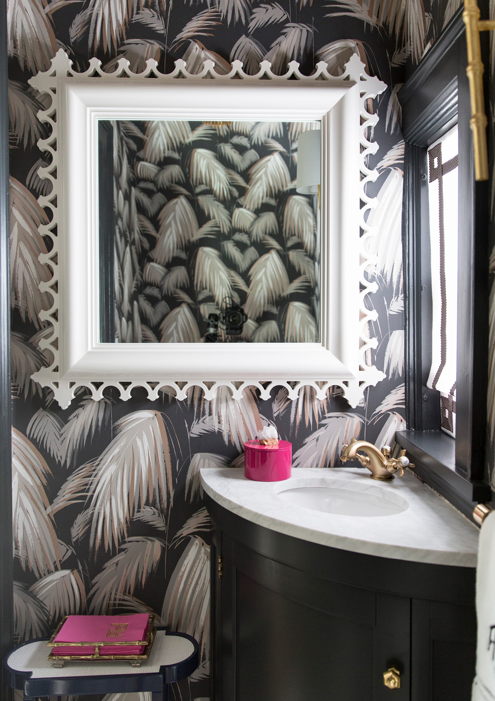
I know what you are thinking. Black and white means modern and graphic. That’s not the case with this black-and-white space. First, let’s talk about the pattern on the walls. The tropical fronds depicted in this covering are feathery in a style that softens the room. Plus, instead of selecting a pattern that’s only black and white, find something like this one that adds gray and caramel to the palette. The effect is two-tone, but the reality is a neutral scheme that is anything but hard. I always recommend a moment of fashion in powder rooms. Here, shocking pink accessories and a mirror frame that resembles a statement chain necklace complete the look.

Space for Storage.
There are so many shapely vanities out there that impress with interesting silhouettes. In this petite powder room, I pulled a goldenrod yellow from the mostly blue paper and installed a washstand with a whimsical scalloped edge. Since this space did not allow for a cabinet-style vanity, I placed a pair of baskets with an oversized cane weave on the shelf below. The two baskets live underneath the sink and house extra rolls of toilet paper and hand towels. Remember my trick of painting trim to match the wallpaper? I did it here, too, but this time in timeless Prussian blue.

Subtle and Chic.
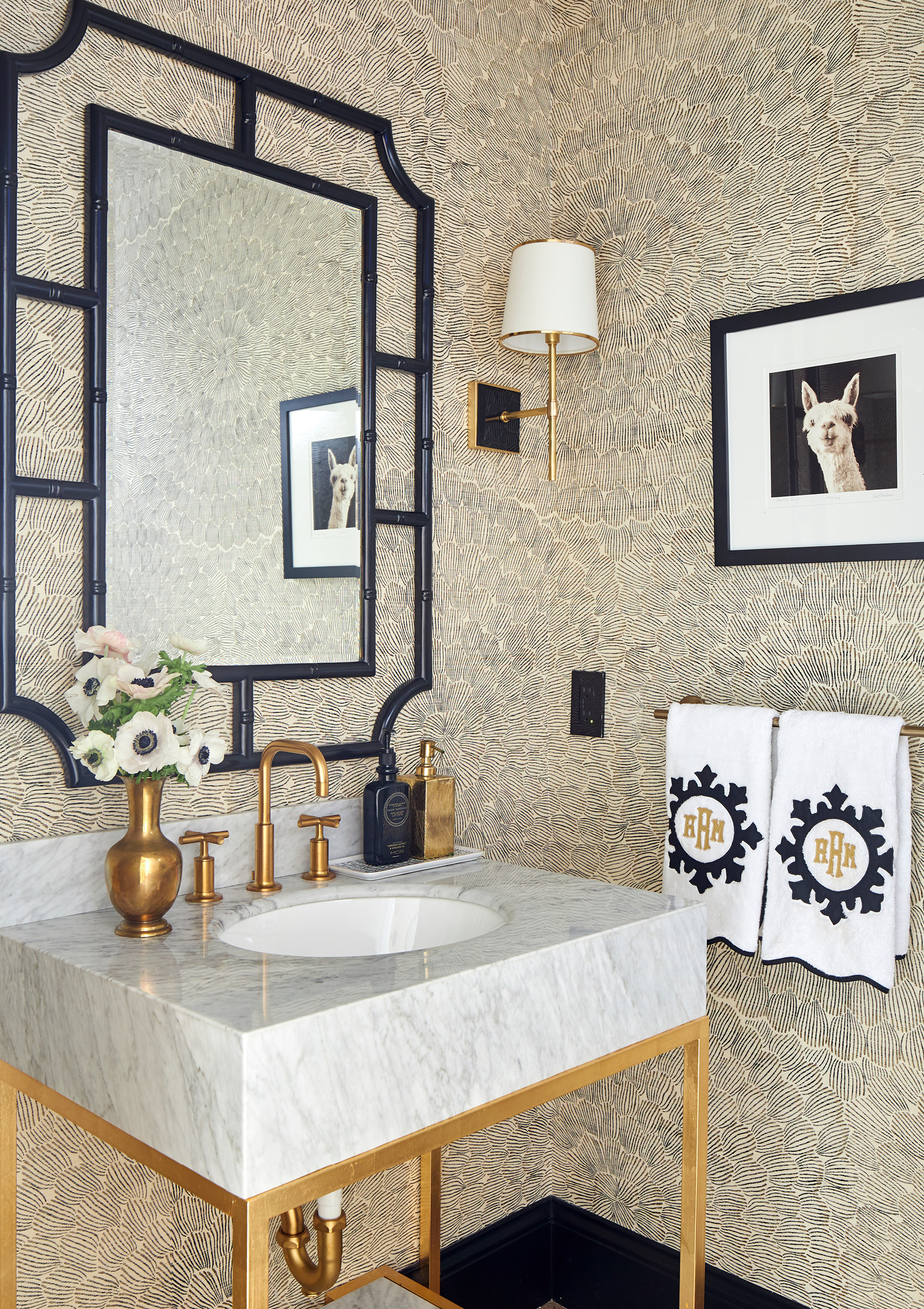
Yes, I tend to be drawn to statement wall coverings. But I can still make a dynamic mark with something that is quiet and more subtle, too. In my own powder room, a black-and-ivory pattern looks like petals of a giant flower bloom (think dahlias or gerbera daisies). It reads almost as a tone-on-tone solid, but its movement is just the right dose to keep the space interesting. In other powder rooms, I might choose a mirror with a frame that is fanciful and fun, but here, I aimed for something traditional with a faux bamboo frame that’s painted classic black. A sleek marble vanity may be basic in form but is plenty glamorous with a gold base and plumbing fixtures. Make sure that lighting and accessories are equal priorities. Tailored sconces are good-looking but don’t compete with the framed art (yes, artwork goes in the bathroom, too).
When it comes to design, powder rooms are the place to go big. Remember, it can grab attention. It should have a voice. And if that oversized paper is too much for all day, every day, just shut the door. I think that the next time you open it, you’ll be delighted and joyful all over again.

