Everyone is guilty of rewriting history just a little. We tend to romanticize—ever-so-gently manipulating facts and details to support our altruistic memories.
But let’s face it. It’s difficult to get excited about the look of old-school paper or plastic dinnerware or, more accurately, picnic-ware. We all grew up with no-nonsense shrink-wrapped packs of 50 white paper plates (the only color choice that existed) and red plastic cups. Our best hope for vogue was the wicker charger that hugged the pinched plate for a stable outdoor food-carrying experience—and that was a stretch.
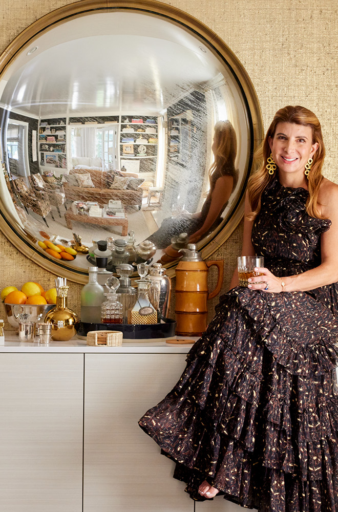
In the current-day tabletop ethos, paper and plastic have materialized—pun intended—into design merriment. Melamine, acrylic, or paper patterns and colors rival those of the inspiring textiles I peruse when I make selections for client interiors. Quarantine life has encouraged me to play around with table settings and tableware to reimagine the aesthetics for dinners with my husband and two sons. Every dinner’s tablescape is a new visual experience, a laboratory if you will, that’s augmented home life with beauty. Layers, and lots of them, breeze their way onto my tables the same way they do in the interiors I create.
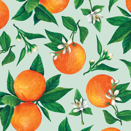
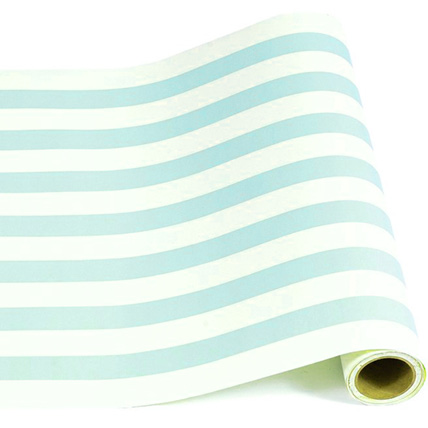
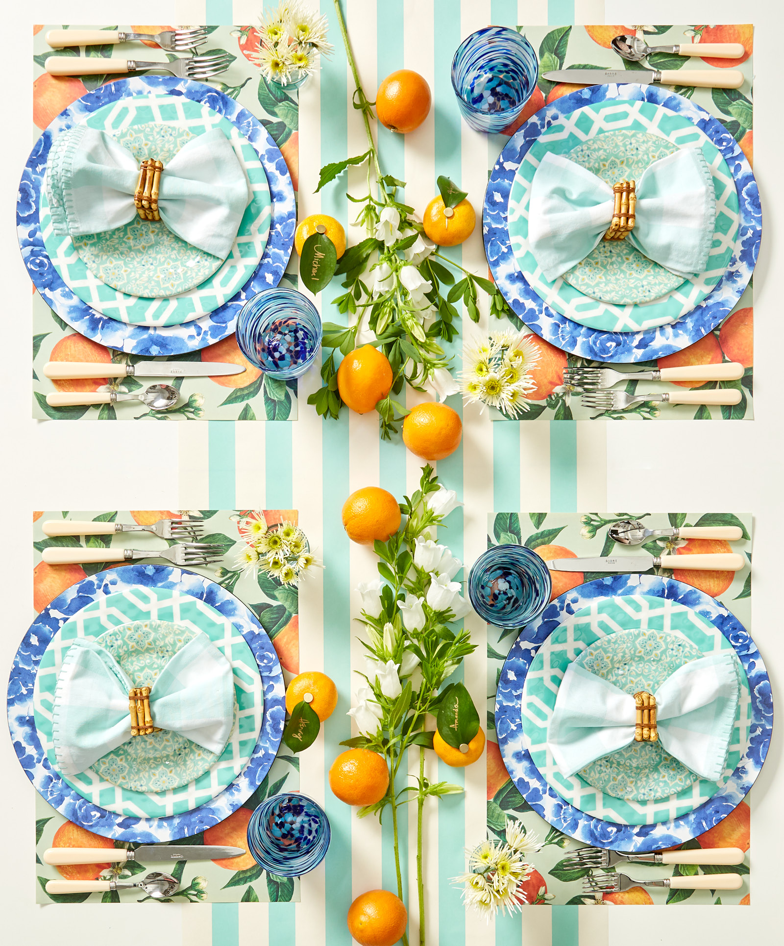
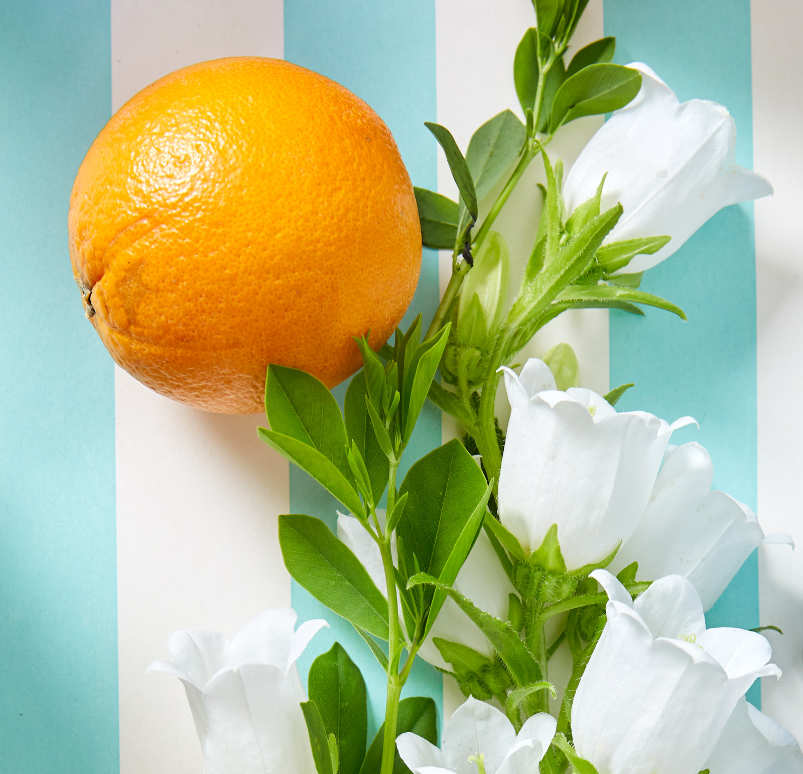
In this case, paper placemats depicting oranges on pale aqua attracted me to a palette as fresh as the bounty of seasonal produce. Instead of letting the placemats float on the sleek surface of my white table, I started with a coordinating striped paper runner down the middle to ground each setting and define structure. That was the foundation for more patterns, more color, more style—a concept that I should probably add as a tagline to my logo.
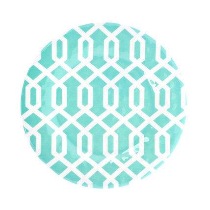
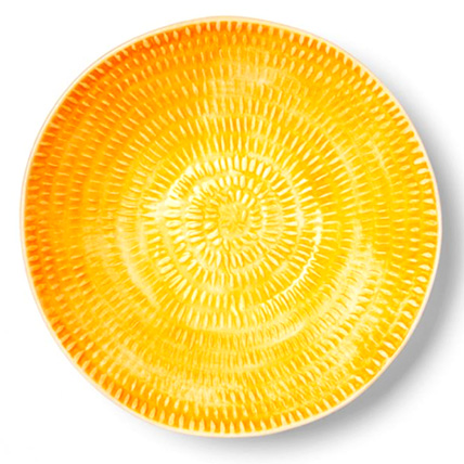
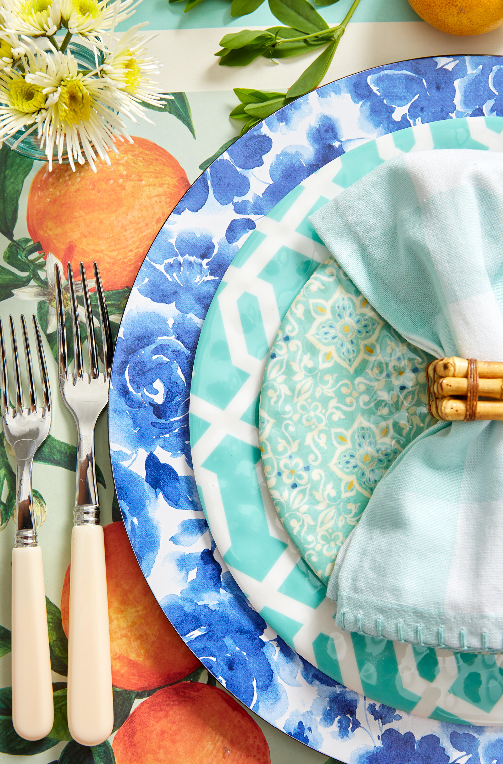
Good-looking melamine is ubiquitous now. Pick a big-box discount store. It will provide you loads of options at temptingly low costs. Do you long for toile that dances around the look of your collected blue-and-white ceramics? No problem. Does trendy ikat make you visually giddy? You’ll find that, too. For this outdoor meal, I chose two patterns in fact. A fretwork-like dinner plate nestles beneath a contrasting floral salad plate in similar hues.
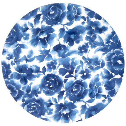
Blue-and-white is basically a neutral. I adore it—just as many people do. I always end up weaving it into a scheme when I can. As I visualized this fresh aqua-and-orange scheme, I knew my plastic blue-and-white floral chargers were the perfect pop of contrast. They make the look more interesting than a matched-to-perfection color presentation.
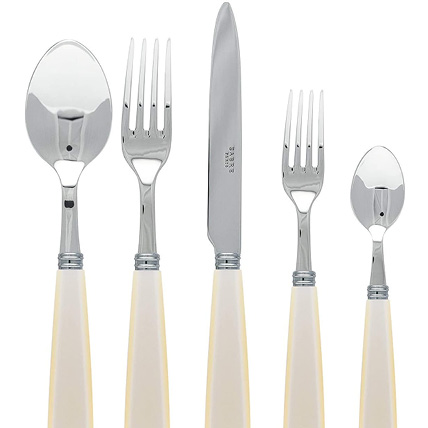
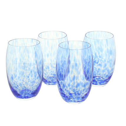
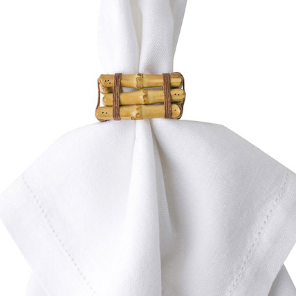
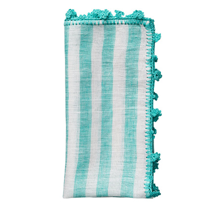
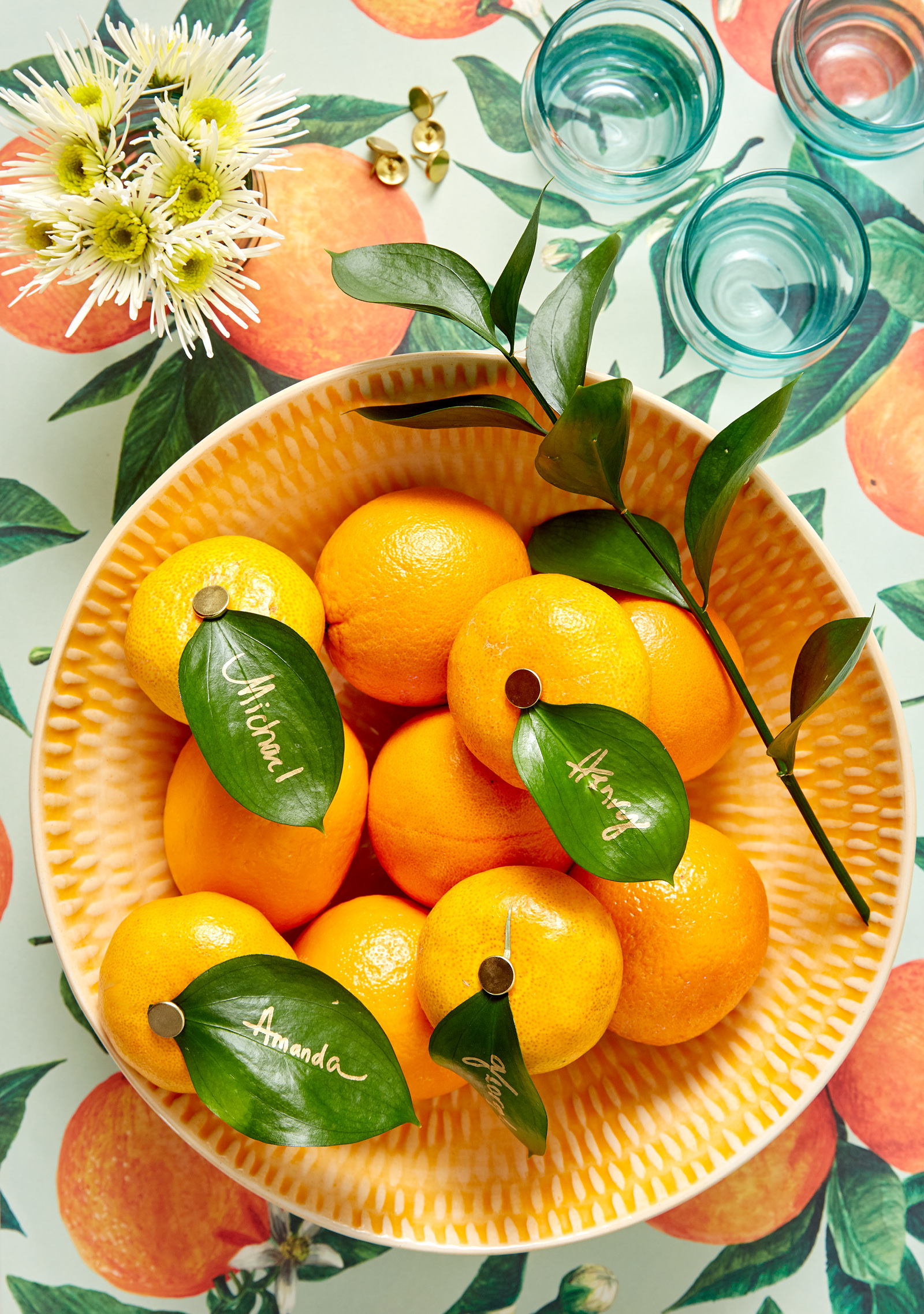
Silver can feel formal, but this casual table proved just the right spot for my ivory-handled flatware. And while I like the idea of a casual paper-and-plastic theme, every element doesn’t have to be those materials. Handblown glasses with a swirl pattern (a travel find from a trip to Mexico), checked aqua-and-white cotton napkins, and bamboo napkin rings add layers to the dynamic table. As cost-effective as the tableware is the centerpiece of scattered oranges and white flowers from my garden. For a thoughtful finishing detail, I crafted simple place cards from garden leaves that I pinned to small mandarin oranges. A gold marker inscribed the names.
Pretty tables no longer culminate only the preparation of a formal multicourse meal. Style has trickled into tabletop products that are friendly—for budgets, for kids, and for outdoor living. So, if the words paper and plastic make you question the sophistication, think of it in terms of practical and pretty. Your guests—whether they live in your house or not—will appreciate the effort for everyday meals, not solely the celebratory ones.


