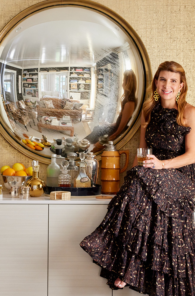
I’m a designer who sees color as the gateway to cheerful style, and I can’t help pushing past classic, seasonal palettes to schemes that are unexpected and vibrant.
A pre-Thanksgiving occasion with my husband and our two sons led me to wonder about this holiday that is specific to the United States; why do we not incorporate red, white, and blue into its scheme? I saw an opportunity and started building my autumn dinner table to include a visit to my summer stash of entertaining favorites. Its festive and informal result made us all happy.
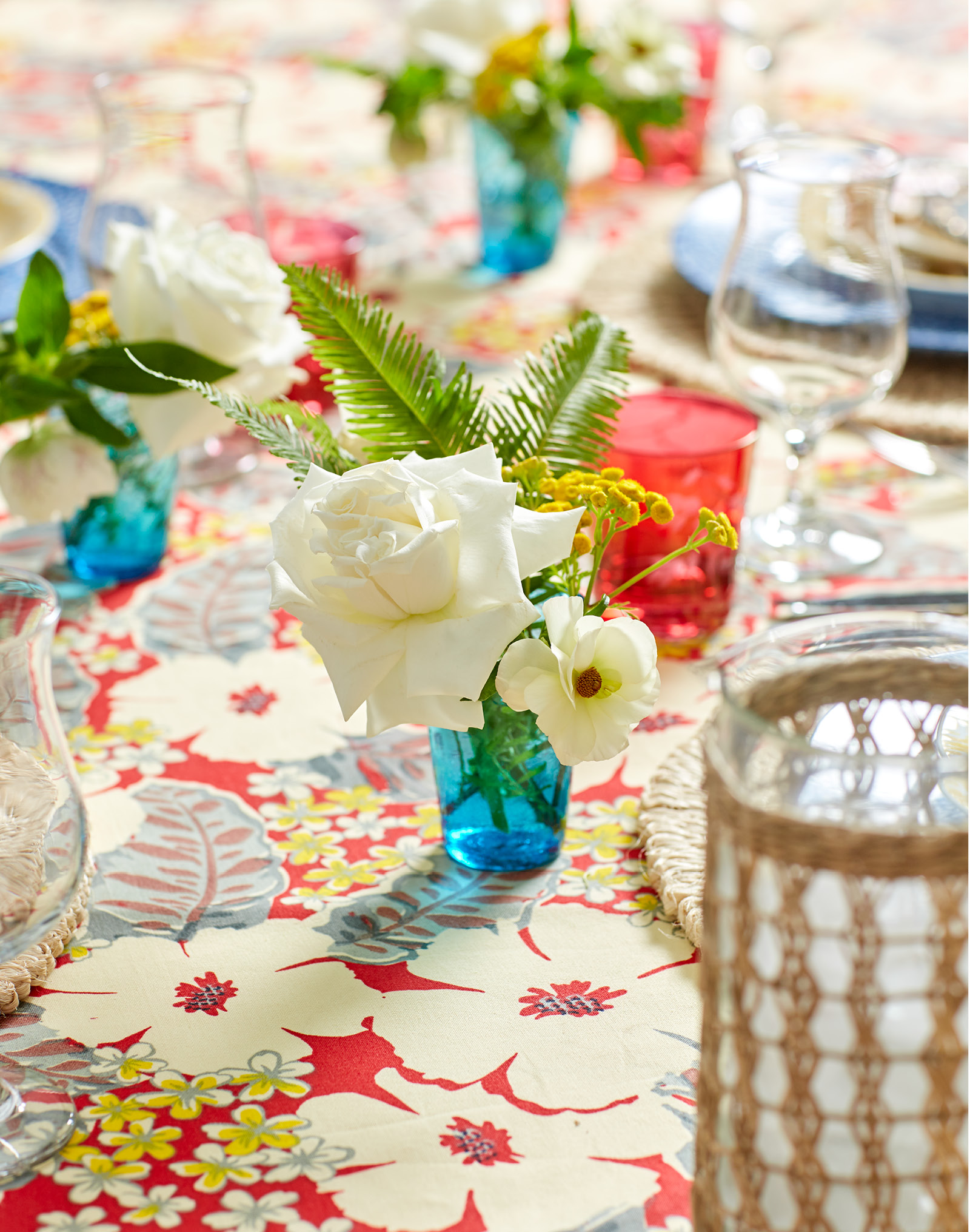
You may have read my post on my childhood friend Marina Purcell’s company, Aloha Marina where I featured her Hawaiian-themed lifestyle business on my blog this past July. The intensity of red on her “Kaimuki” tablecloth set the foundation for my all-American feast. The creamy off-whites in the pattern’s plumeria blooms keep the cloth from bearing a stark contrasting appearance that emulates summer’s brightness. Raffia placemats allude to the stalks of dried Indian corn and bales of hay that evoke the imagery of harvest time.

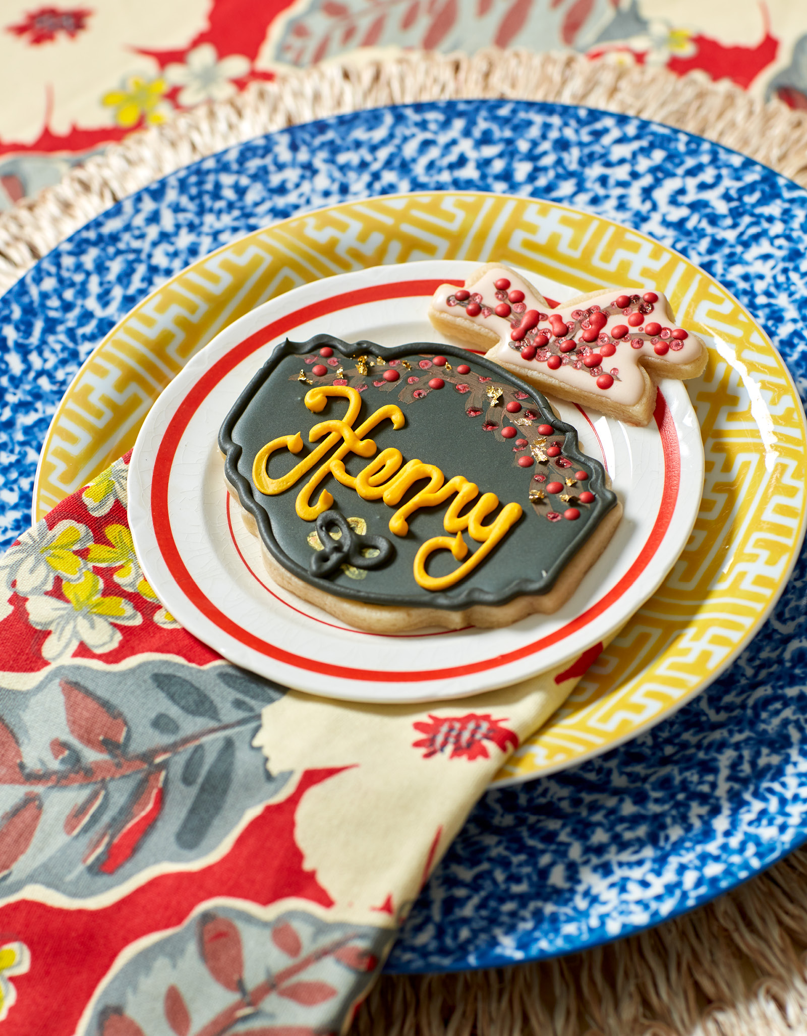
I can always find a place to use blue-and-white. This occasion was no exception. The random pattern of the spongeware dinner plates lent an active base for the yellow fretwork salad plates that remind of autumnal sunsets and fiery leaves primed for a graceful cascade to the ground.

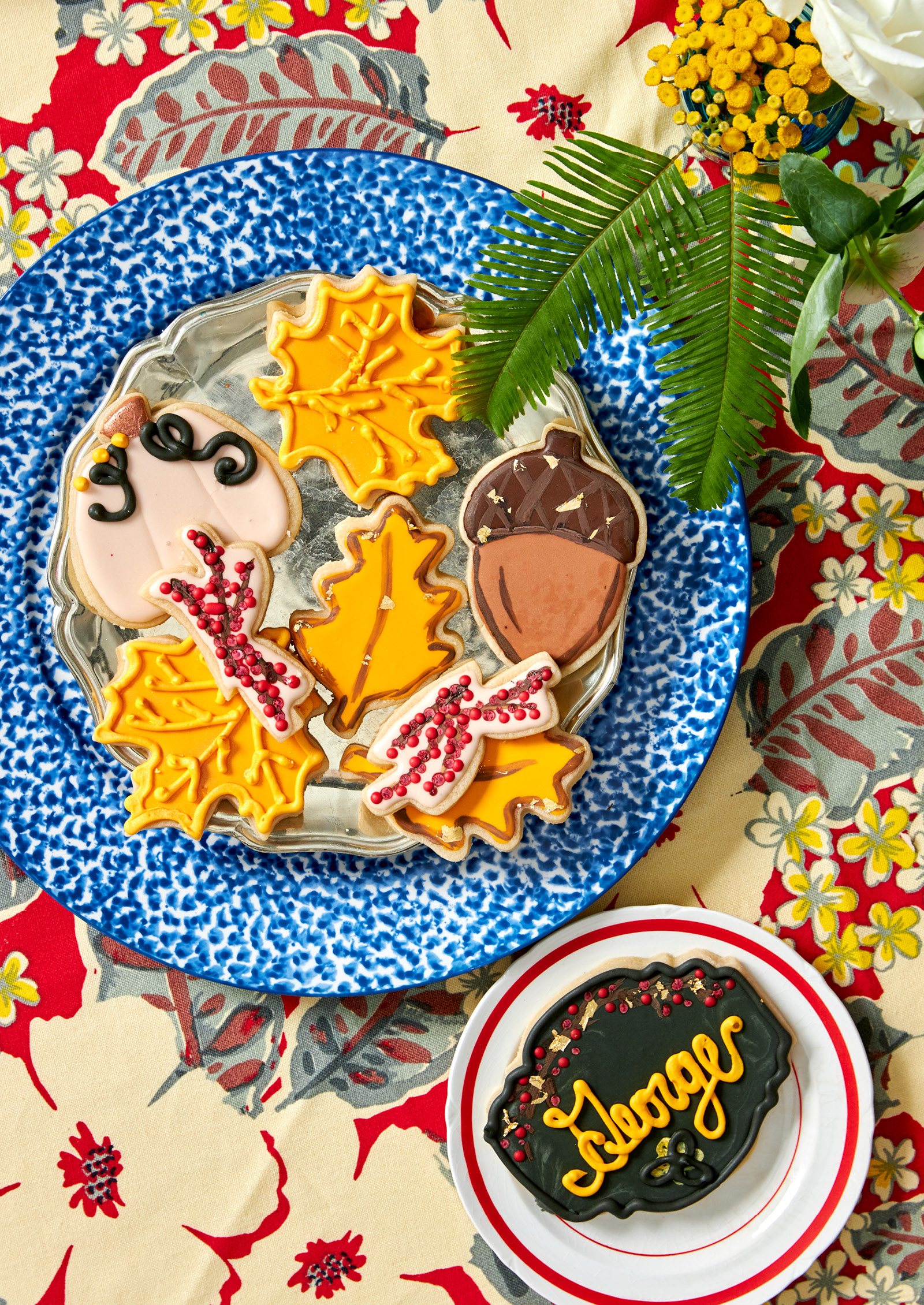
My key to transferring this color scheme to fall’s liking comes from the jewel tone elements that I layer onto the table for depth. They tip the table’s decorative spread to a sweater-wearing occasion instead of a swimsuit-wearing one. Ruby red glassware is at the ready to be filled with a robust bourbon cocktail, perhaps a Manhattan or an Old-Fashioned. Fall-themed cookies in shapes of oak leaves, acorns, and pumpkins, emphasize the season and recall the nostalgia of cookie decorating in years past. And who doesn’t love when the place cards are delectably edible? For this family gathering, I ordered cookies that are frosted black with scripted versions of our family names to determine who sits where. And yes, I understand that once everyone takes their seats, the place cards might “disappear” before the first course is ever spooned onto plates.

I always want my color palettes to inspire creativity. And I always want to have an open mind to the unpredictable when I build them. It doesn’t matter if I’m working with traditional colors or taking my design projects on an unconventional color spin, my goal is to do it with style and encourage a smile.


