Warm neutrals don’t always have to be designated as a “safe bet” design-wise. I look at them as an opportunity to use patterns with an edge that have just as much of a chance to wow a design situation as their prismatic color cousins. And for our formal Christmas dinner where I will take in the joys of the season with my husband and two sons, I used browns and blacks in a way that puts a spin on the vibrant road that I typically take to trumpet the holidays.

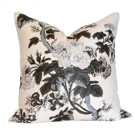
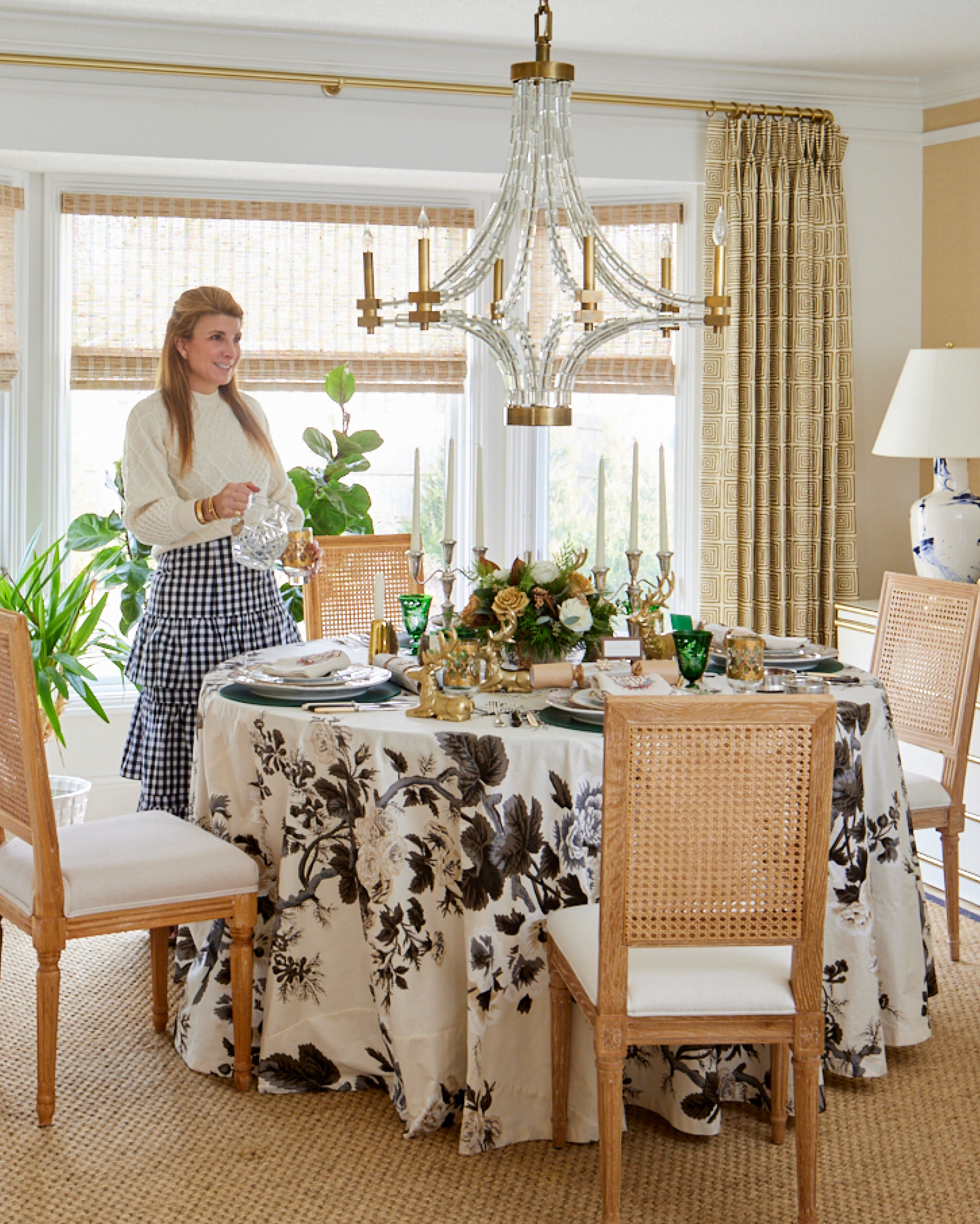
I know what you are thinking. The delight that comes from an intricate floral chintz has much to do with the myriad of colors that liven blooms, birds, and branches. That’s the expected approach. This year I knew that I wanted to offset the “return to tradition” red-and-green decorations that I was applying throughout my house. And I wanted to execute it in a way that was current. I went straight to Schumacher and had a tablecloth fabricated from its “Pyne Hollyhock” pattern. The black-and-white version shows respect to tradition but proclaims its own voice. And I think that’s what Christmases are about.
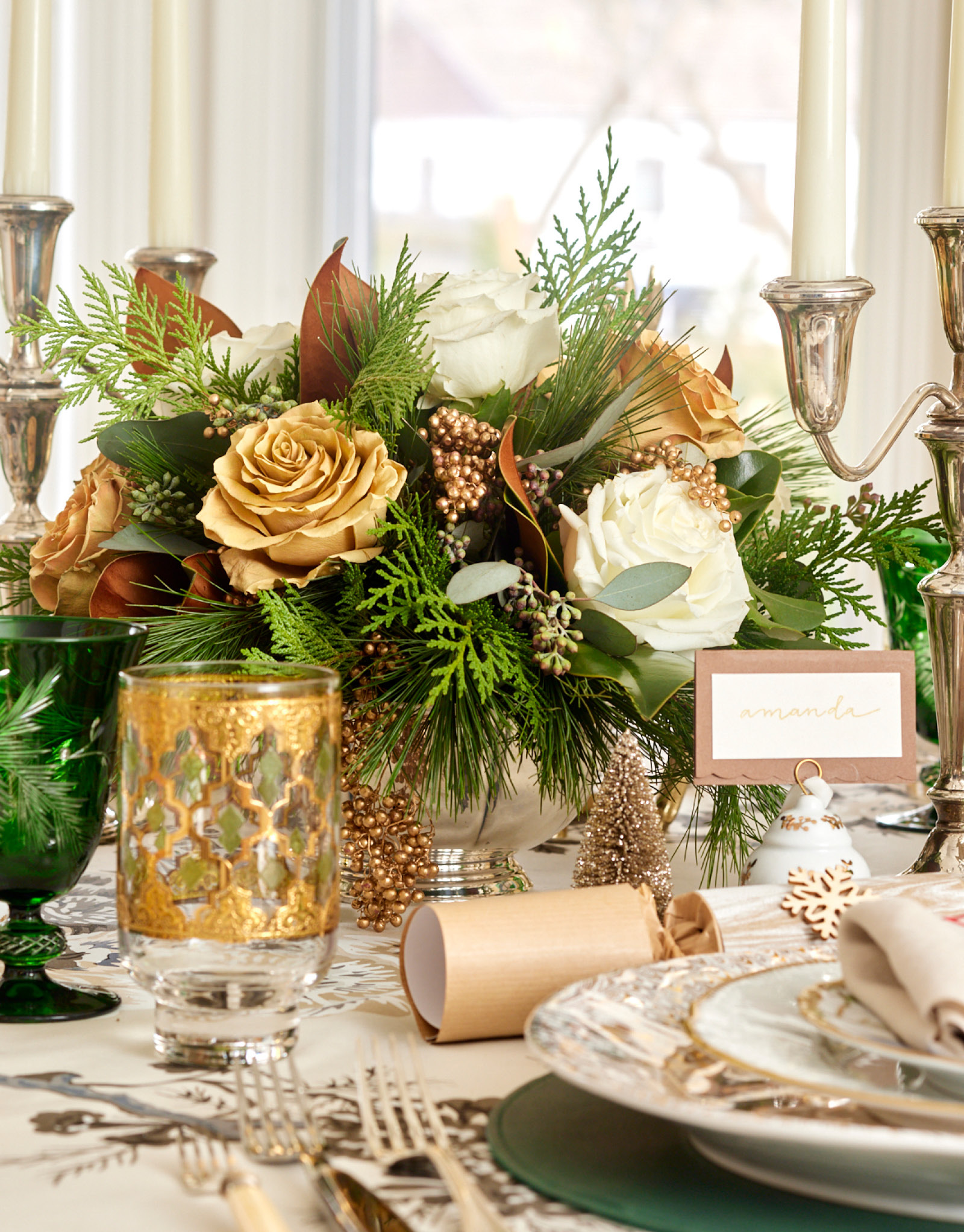
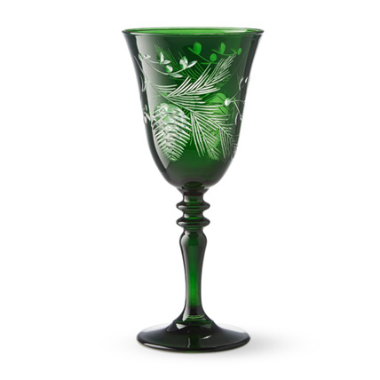
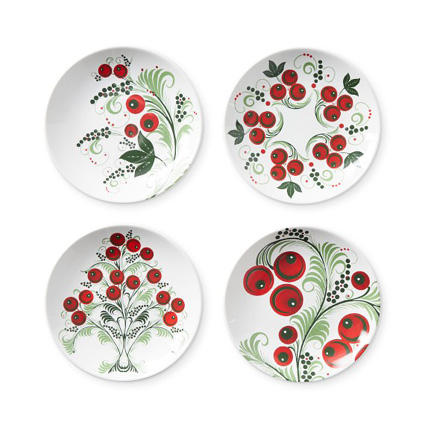
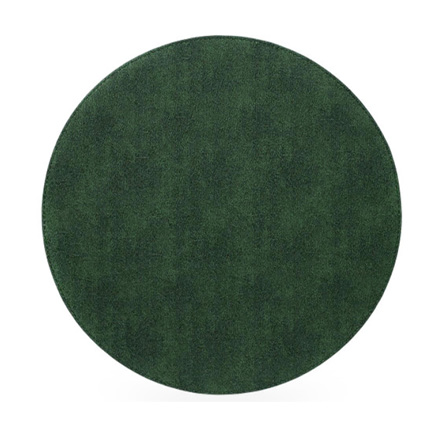
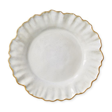
The abounding floral in black-and-white is palatable for men and provides the neutral base as these two shades in solid form always do. I teetered between red or green as my accent color. In the end, cut green-crystal wine glasses added the extra rich emerald tones to complement gold and silver. It was at that point that I knew that green would land the supporting role for our Christmas feast, and I followed suit with a forest green leather placemat. White-and-gold dinner plates and hand-painted salad plates by Anna Weatherly were pulled from our wedding china. The centerpiece fell into place from there. Is there such thing as too many Christmas greens? I made sure that they were shown in all of their glory by pairing them with two-toned magnolia leaves. Roses in ivory and a second variety in wonderful toffee tones ensure elegance, while tiny golden berries adorn the arrangement with festive sparkle.
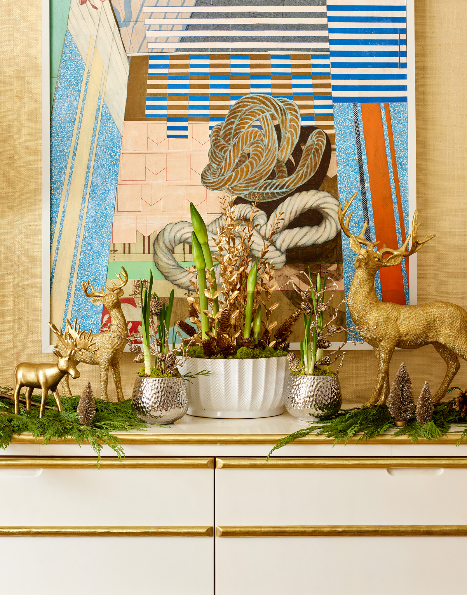
Speaking of gold, what’s Christmas without a little dazzle and glam? I made sure that the regal metallic was abundant. Gold candlesticks reflected the flicker of the flame. Grand charger plates mix both gold and silver and ground the dinner plate that’s bound in the daintiest of borders. I invited vintage glasses that are a family favorite of mine into the mix. The retro Moorish pattern in green-and-gold recalls a family trip to Morocco. Plus, we always have English Christmas Crackers at the head of each place setting to open with arms intertwined right after we have said, “Grace.” We lived in London for a few years, and it is fun to have little reminders of that history. However, not to dismiss Christmas red completely, I brought it to the table on my handsome linen napkins. They boast a wintery monogram created for me by my dear friend at Modern Monogramming. On my nearby sideboard, paperwhites are eager to make their appearance, and I am confident will do so by the time we are all sitting down to enjoy our dinner together.
As the saying goes, “it’s the most wonderful time of the year.” And for so many reasons, I think that it’s the most beautiful one, too.


