A successful project involves designing the whole home. Oftentimes, I share images of the significant rooms in the projects I work on. However, I also spend time on the very important details that go into designing back-of-house spaces such as laundry and mudrooms. When we moved into our current home 3 years ago, I thought long and hard about how I wanted this room that would greet us each time we entered the house from our garage, to work. I knew that the space would encompass many functions serving not only as a mudroom, but a laundry room, too. Plus, it would house an extra refrigerator that we would keep stocked with drinks and refreshments that are too plentiful to squeeze into the kitchen. I think we can all agree that it’s almost impossible for a family to settle on only one flavor of carbonated waters. And who loves the variety of kombucha and White Claws on the market as much as me?
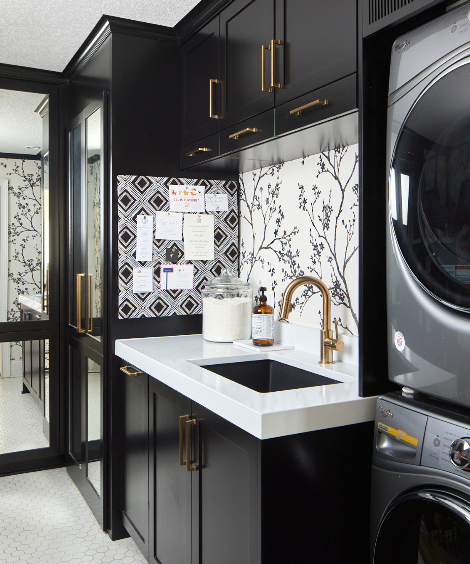
In the conventional “pretty” rooms of the house, I carefully craft the architectural details, select furniture, fabric, and palettes to seamlessly blend from room to room. This space was no different. I held it (and myself) to the same standards of design as I would elsewhere, especially because it is visible from the front door and anchors the vista from the other side of the house. The function came first, but there was no compromise on style. It was a visual must.
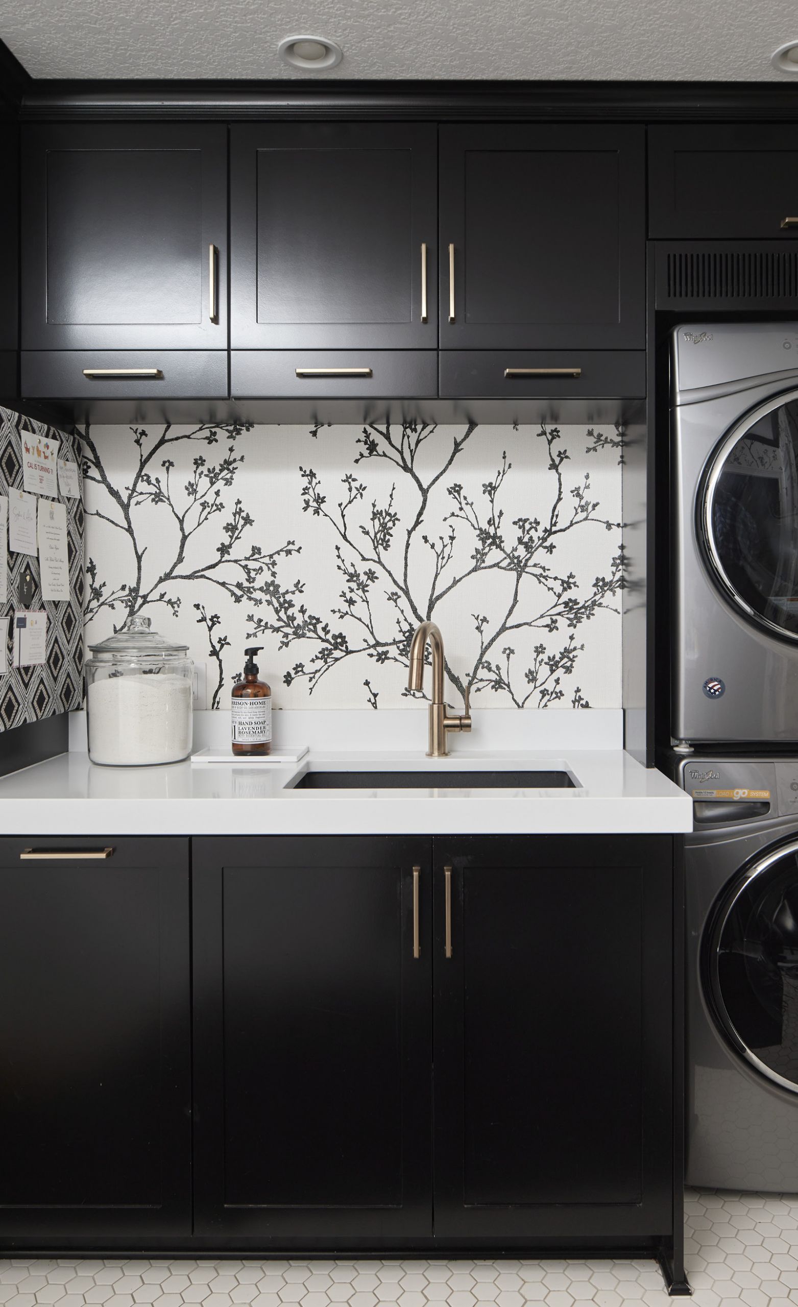
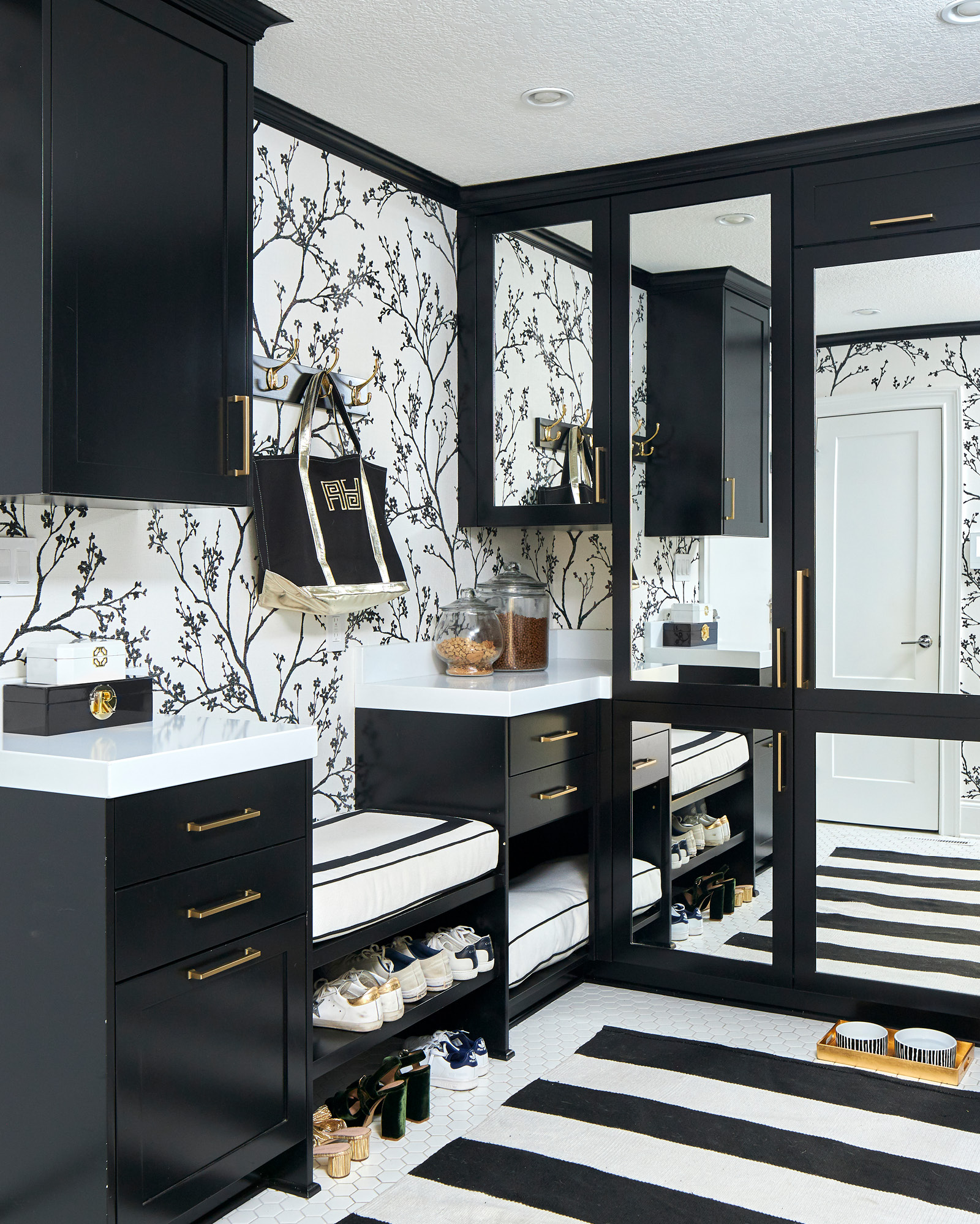
You’ve heard me express time and time again my affinity for bold schemes. True enough, but in this space, I decided to play the neutral card of black-and-white before diving into a world of vibrancy set by layered palettes and a joyful artwork collection. As basic as my color choice may have been, black-and-white wasn’t allowed to lay quietly as a safe neutral. The combo was called upon to wow with a graphic presence that was fresh, modern, and a chic intro to the jolts of saturated color to come.
I like the simplicity of black cabinetry and also like how the darkness of black hides a lot of the wear and tear that such a room receives. It outlines the architecture and is a springboard for infusing the space with patterns. Yes, that’s patterns plural. This room may be a jewel box compared to the grander spaces throughout the house, but I managed to pack a variety of patterns and geometry within its confines: A loose, airy floral that dances over the walls, a diamond geometric message board, and on the floor, hexagonal tiles that are topped with a striped rug. Then, in order to elevate the space and help it feel like an entry area as much as a mudroom, I chose soft, brushed gold hardware for cabinet pulls and the faucet. I turned up the shine factor on the refrigerator and cabinetry by facing them with mirrored fronts. The trick of using a mirrored panel in a cabinetry door is a favorite of mine as the reflections trick the eye into thinking the space is twice as big.

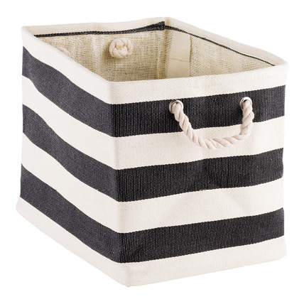
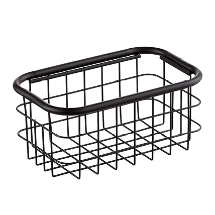
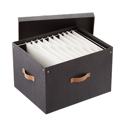
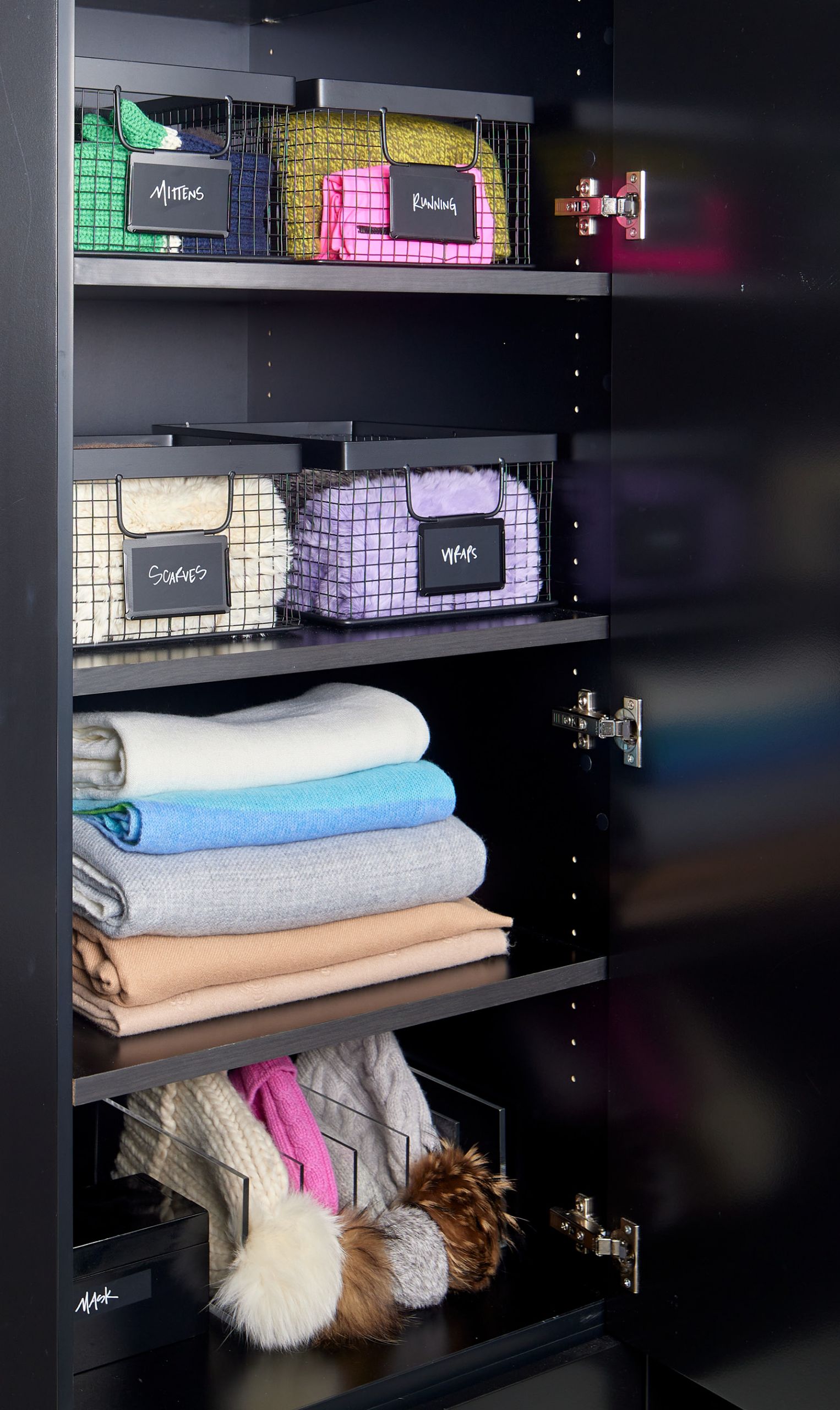
While I started off telling you how functional this space needed to be, I then delved straight into the pretty components. So, let’s talk about the working parts of this room, too. As I just noted, a refrigerator keeps all of our drinks cool and is an easy last-minute place to grab a bottle of water for the road. Near the fridge, a low-profile utility sink assists the stacked washer and dryer on its other side. Across the way is a bench where we slip on our shoes that are stowed underneath. Some cabinets organize everyday suspects such as key fobs and grocery market totes. Others are outfitted seasonally. Right now, we have containers for scarves, mittens, and caps. Come summer, you’ll see them exchanged for flip-flops and sunnies. And these days, there’s always a bin for masks.
I know that renovations and moves to new homes are high right now. And as you rethink your living arrangements, be sure to give special consideration to the back of the house. Organized and outfitted well, this space will make your trips out the door more efficient.


