The breakfast nook was once a place allocated to early mornings of waffles, eggs, and OJ. Of course, cozy PJs were the preferred dress code. Now the space is used morning, noon, and night for much more than the first meal.
These days, this classic kitchen companion serves as a spot for homework and other laptop activity, as well as casual dining, and midnight snacks during a post-party gossip sesh. Therefore, why not design the space thoughtfully when thinking about an update? Here are my 10 tips for incorporating a breakfast area into the kitchen so they are speaking the same language beautifully.

Reference Color
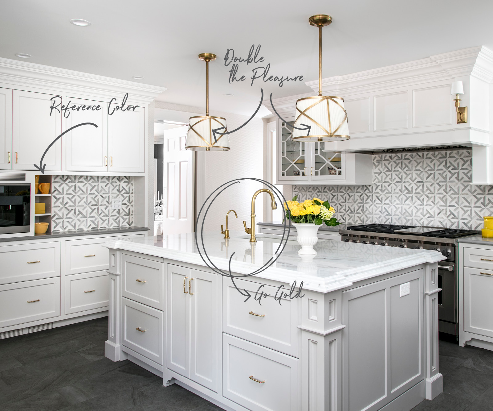
It might not seem like much, but in kitchens that are all-white, I always reference colors happening elsewhere in the house. And in this case, it made the most sense to nod to the color happening across the room at the breakfast nook. Ceramics show off in sunny yellow to emphasize the space’s primary accent. Lemons are at the ready to be squeezed and zested in the kitchen. Here, they just happen to match the décor, too. There’s nothing sour about that coincidence.
Double the Pleasure
Over a kitchen island, hanging lights provide a glow around the workspace. More than one fixture not only provides symmetry but gives the opportunity to repeat the style not once, but twice. Over this kitchen island with glossy polished marble, a pair of traditional drum shade pendants descend from the ceiling and provide movement with crisscross brass cages.
Go Gold
You’ve read it on this blog before. Brass and gold tones are not going away. The soft glow of this finish makes it perfect for a moment of warmth that is not overpowering or ostentatious. In this space, I capped the cabinetry with brass knobs and pulls, a color specification that repeats on both the pendant lights and on wall sconces.

Welcome Interruptions
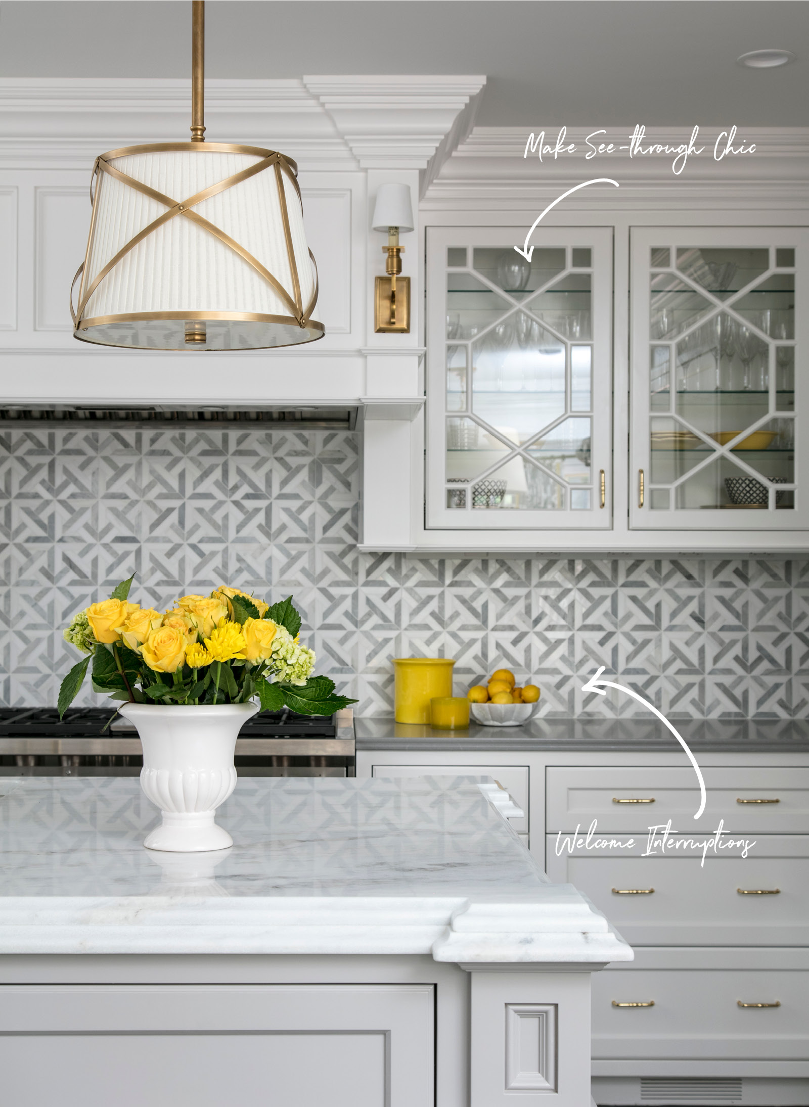
An all-white kitchen may be super chic and always of the moment. Its crisp palette suggests a sterile environment, which is ideal and necessary for places where food will be prepared. But an all-white space can also become severe. To avoid an unwelcoming environment, I applied a graphic marble tile mosaic to the backsplash. The white-and-gray marble has impact and adds warmth without overwhelming the space. And the motif here balances the bevy of pattern beauty that’s happening at the breakfast banquette.
Make See-Through Chic
Choose a cabinet door style that is appropriate for the period of the house. It’s also fun to see some of your favorite treasures through clear windows with an interesting textured glass insert. Consider layers that can top clear glass, too, like the fretwork that I applied to these door fronts. Since there is only one set of doors on either side of the stove hood, the decorative mullions are interesting and another opportunity to layer without committing to anything too trendy.

Mix It Up
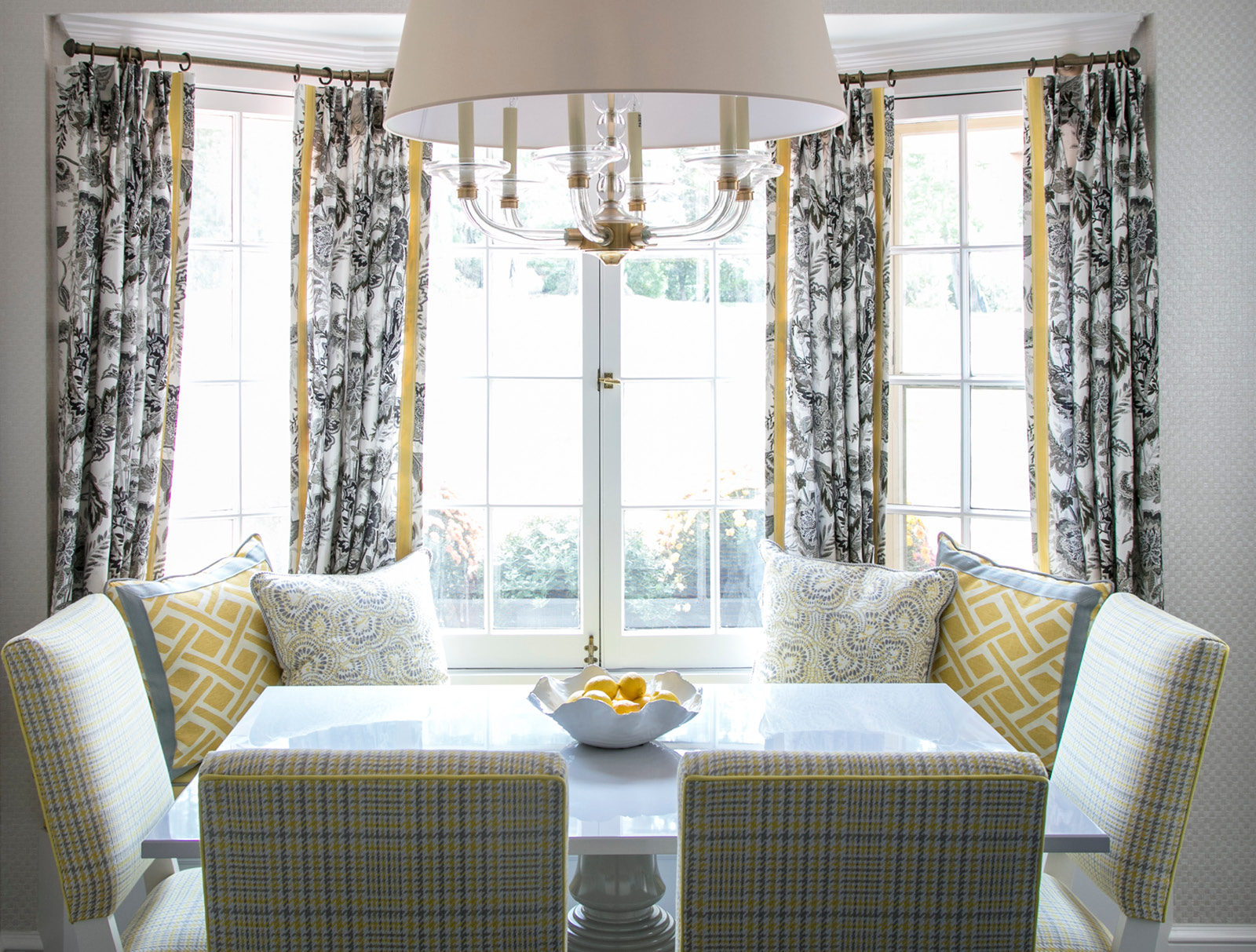
In design education, Mies van der Rohe’s classic “less is more” theory might be true most of the time. But Mr. van der Rohe hasn’t seen the latest crop of fabrics. I go for a “more is more” approach when it comes to playful and cheerful textiles. And who doesn’t want an assortment of happy coordinating patterns to greet them as they start the day? I used a sturdy yellow leather for the banquette cushion, but then had fun with plaid on the chairs, a geometric and abstract for the pillows, and a gray, brown and white botanical on the drapery panels.
Find Passion for Plaid
Plaid is making a strong comeback, and not in serious dens with leather-bound books. When produced in current groovy colors, plaids are hip instead of heavy. Here, lines of yellow and gray intersect into contemporary flair. I used this energized fabric to cover both the seats and the backs of the chairs. Plaid provides visual structure to offset the loose free forms of the abstract and botanical motifs.
Create a Quiet Moment
Not every piece has to be a star. In fact, not everything should. Here, I chose a lighting fixture that was graceful and beautiful, but in clear glass, doesn’t fight with the patterned elements underneath. This lighting piece is plenty interesting but floats above the table with refinement and elegance.
Design with an Edge
Details matter everywhere, not just in formal spaces. One way to layer extra oompf to a palette is with trims. I’m careful not to overdo it, but to add them here and there so that each element has that finished and polished appearance. Both the plaid chairs and the abstract are tailored with a simple self-welt. On the pillow especially, the self-welt is a tad dressier than a basic knife edge. The geometric lattice pillow’s final touch is a bit more daring. I contrasted the fabric with a solid gray border. The same is true on the drapery panels. The black-and-white fabric gets a happy smile from the yellow tape that upgrades its edges.
Style with Sculpture
The breakfast nook table anchors the entire eating and workspace. Make sure that it commands attention with a base that has a voice. To create charm, I selected a piece from Dunes and Duchess. Its turned base silhouette references history with a modern sensibility. In the glossy gray lacquered finish, the table reads current and fresh.

