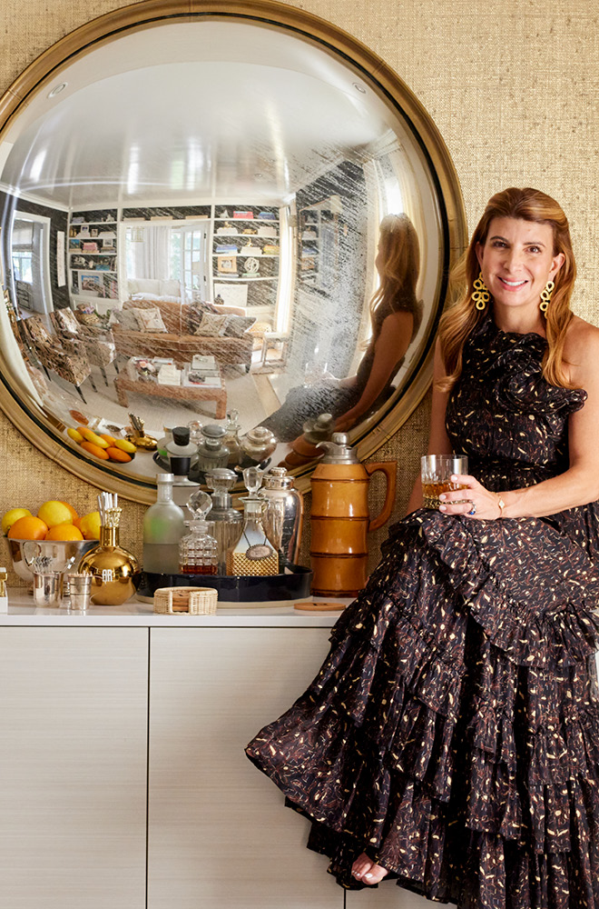
My short answer when asked if I like something that’s particularly beautiful is, “I Do.” After Mike proposed marriage to me 23 years ago, I discovered something during my registry process that was exquisitely crafted, and so lovely that I vowed to use it as the focal point of our most treasured family gatherings around the table. That something is the fine porcelain dinnerware that I selected before my wedding.
Picking a pattern that you know you will have for many years can be overwhelming. Tradition and simple marketing ushers most brides to formal dinnerware that is all-white, with maybe a band or other basic decoration in silver or gold. But remember, home accouterment with color and lots of it is my style. So layering all-white pieces on top of each other was not how I imagined the tables where Mike and I would celebrate each anniversary, our eventual family of four would honor Thanksgiving, Christmas, and Easter, and our friends would share laughter and good memories.
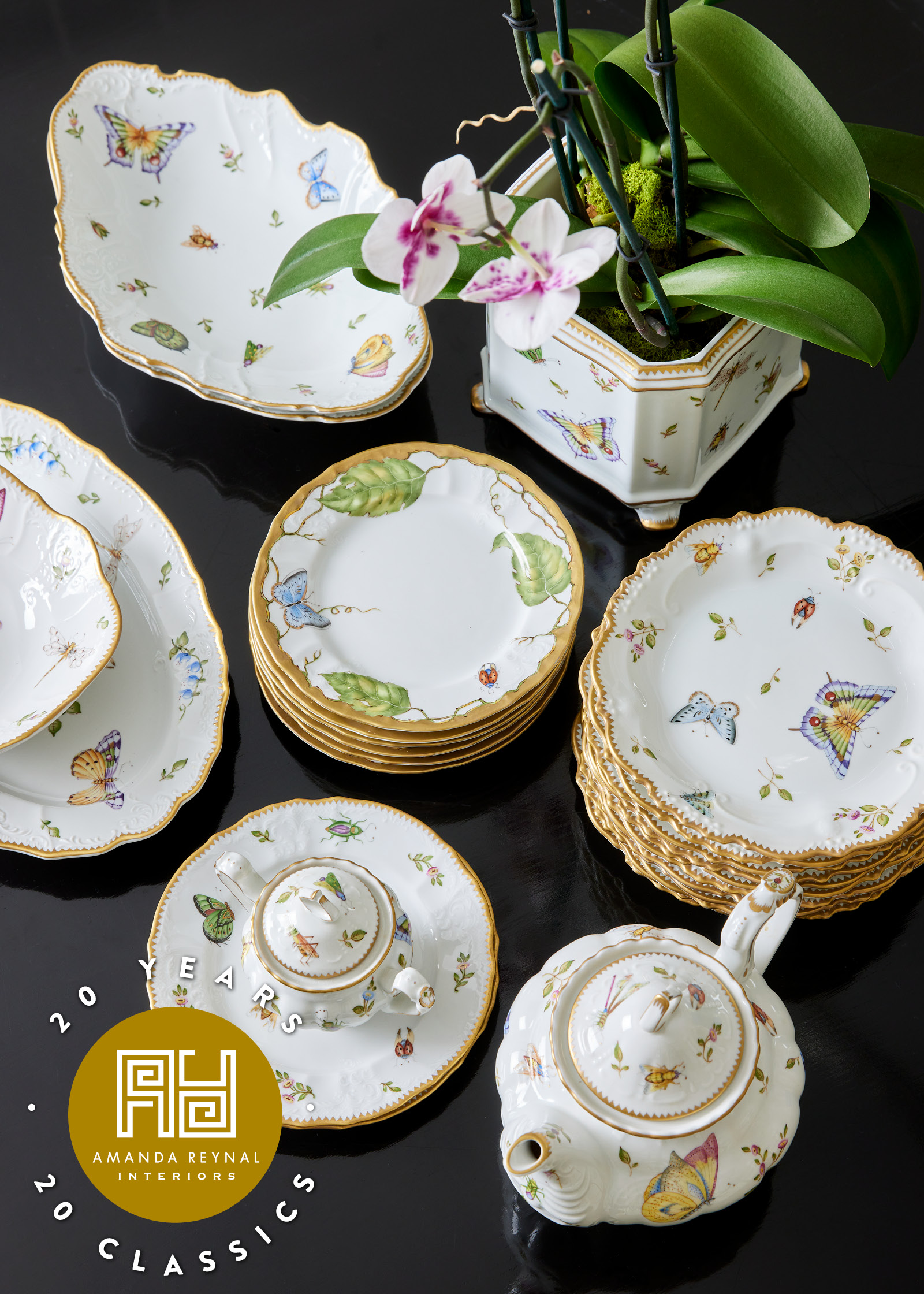
I met tradition somewhere in the middle with a lovely hand-painted pattern by Anna Weatherly. Yes, its ground is pure white, but what happens on top captures elegance, sophistication, color, and femininity. And with my design eye on-call to assist as I was making my selections, not only did I see the pattern for what it was, but also for what it could be.
The plates, all banded in gold, imply formality. But the motifs of floral and fauna—sweet mini buds, fluttering butterflies, and oversized leaves— make the porcelain versatile and ready to embrace a number of different looks based on the spectrum of colors that accents each piece.
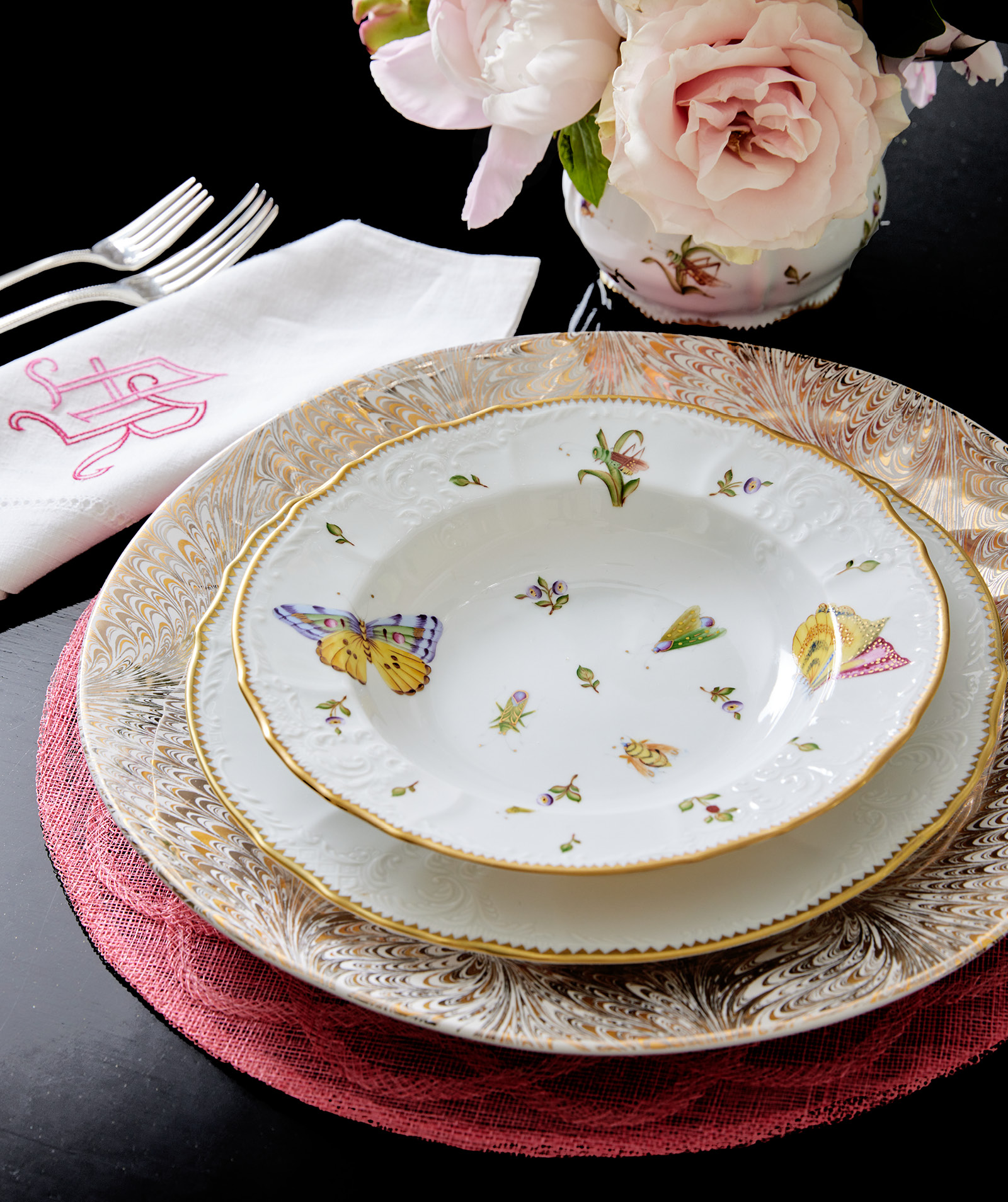
For one table, I amplified both glamour and girly. I pulled the pink from the butterfly on the rimmed soup plates and grounded the entire place setting with a jute placemat in peony pink from Juliska. On top of that was a moment of wow with Juliska’s oversized chargers that swirl both silver and gold around like the visually decadent marbleized papers that are a mainstay on Florence’s artisan scene. The fashionably metallic charger plates keep this setting from becoming too sweet and innocent and instead give it a vibe that implies confidence.
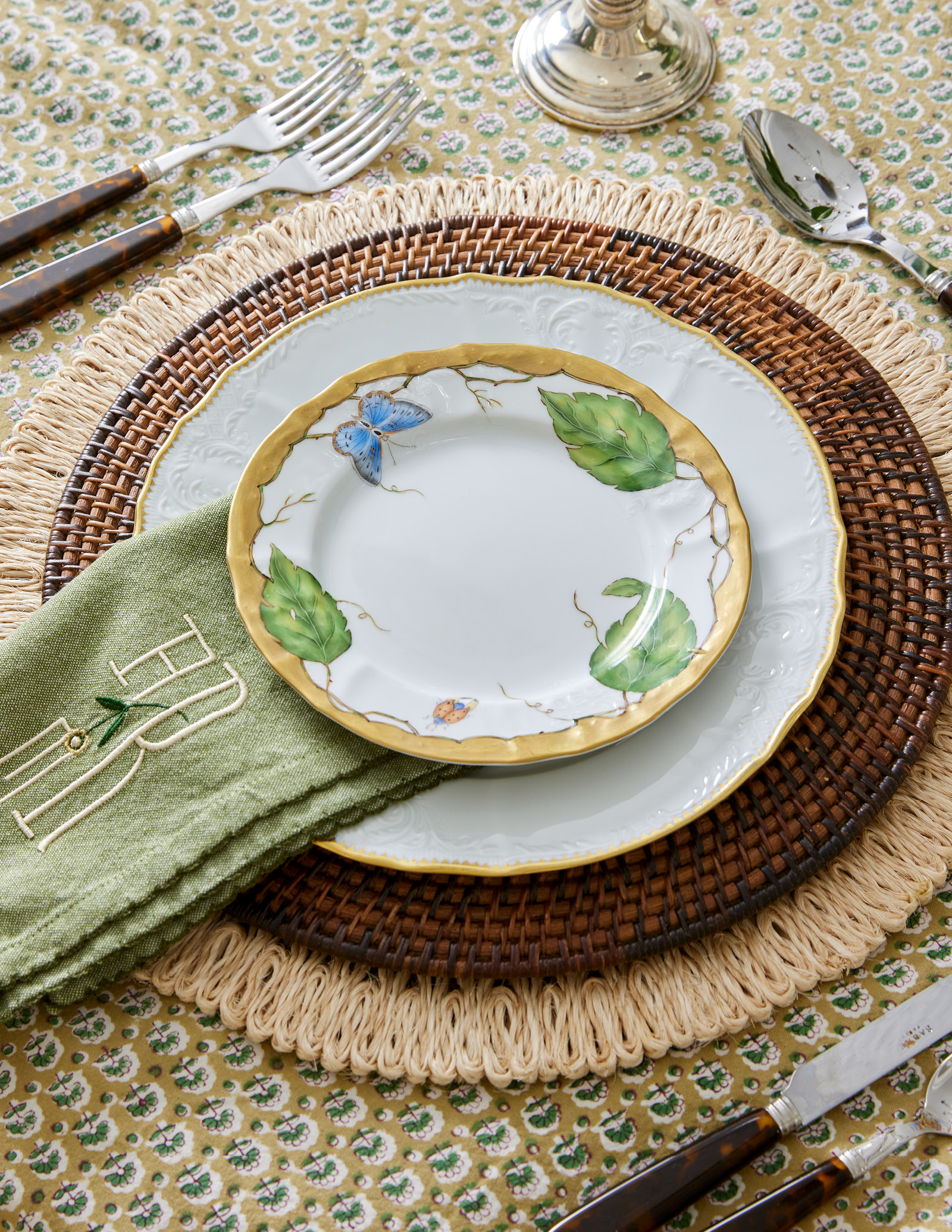
My selected china pattern can also tackle a more masculine look as well. When I want to keep the feminine veneer at a minimum, I lean on my collection of natural materials and tones to lead the porcelain away from a look that is too formal. In this case, an India Amory tablecloth hand-blocks two shades of green in a miniature flower motif. Without being a camouflage pattern literally, the palette of the cloth suggests sophisticated outdoor sporting and an informal country life vibe. Two placemats—a thick raffia that’s been bound into loops and a traditional rattan placemat in dark brown—enhance the more masculine vibe. A hunter green napkin bears a simple monogram. Faux tortoise flatware adds another material to the nature-themed look.
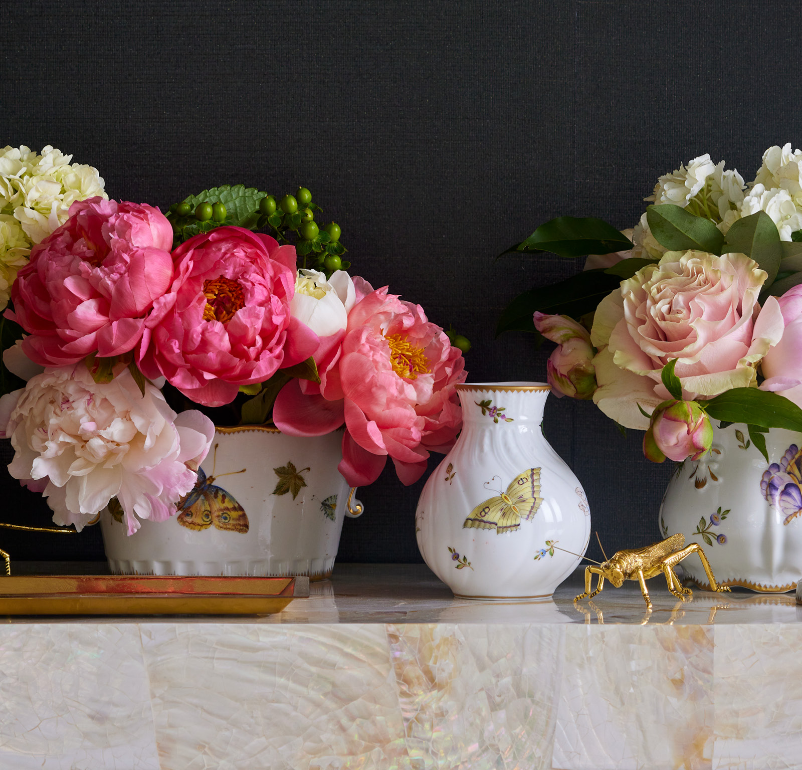
Finally, I know that not all brides and dinnerware lovers buy all of the accessory pieces as I do. But on occasion, I like the idea of having everything coordinate perfectly to let the pattern shine on its own instead of being assisted by other colors and materials. Especially during this time of year, when peonies, lilacs, and roses scent the air with sweet aromatic bliss, I like to use my vases and cachepots to display them. And when they aren’t being used to corral flowers, I’m always thinking about other uses for them. Remember, a vase can also make a wonderful pencil holder on a desk or a holder for make-up brushes on a vanity. Likewise, a cachepot serves as a gorgeous display for guest soaps or rolled hand towels.
Formal wedding dinnerware selection is a big decision. It’s a forever guest at your table and around your home for decades. It watches your family grow, and it shares your family’s joy. So whether you are a bride awaiting your big day, or a lover of entertaining and tabletop and want something new (or something vintage and antique that’s new to you), go bold, have fun, and make sure that your table like everything else, represents your style.