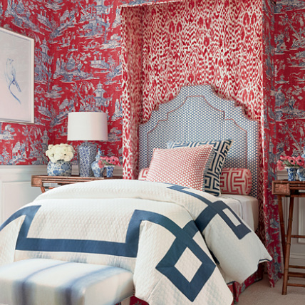
I love a birthday celebration. We are a week out from the day that marks #244 for the United States of America. It has me anticipating the visual feast of red, white, and blue—both for party purposes and decorative ones.
This quintessential trio of colors has its place in interiors. While I don’t frequently use this color scheme for a serene and sophisticated room, it makes for a happy and cheerful always-in-style color combination. This palette is a go-to for a bright happy white room with accents of wicker and colorful red and blue prints. The palette is also a natural for a welcoming summer house and outdoor rooms that surround us with warm-weather comfort among lush, hydrangea-dotted gardens and, even better, on the beach and beside the water. Add a flagpole that waves the Star-Spangled Banner and you’ve accomplished a coordinated look that Mother Nature is proud to support.
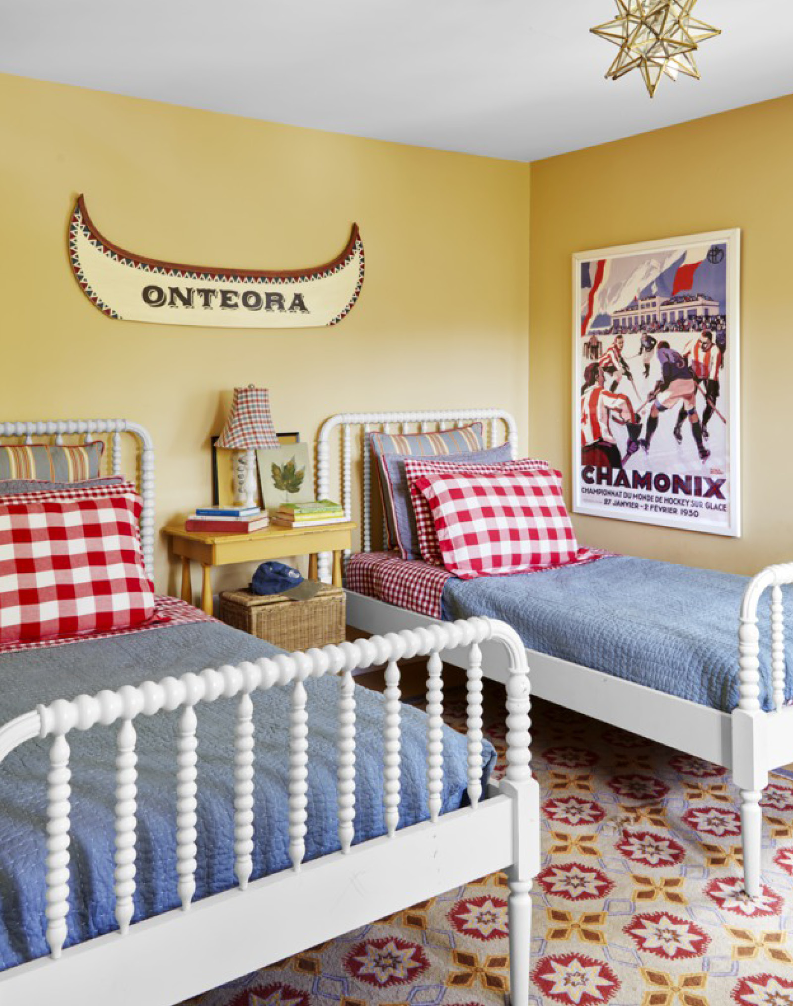
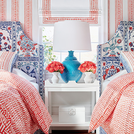
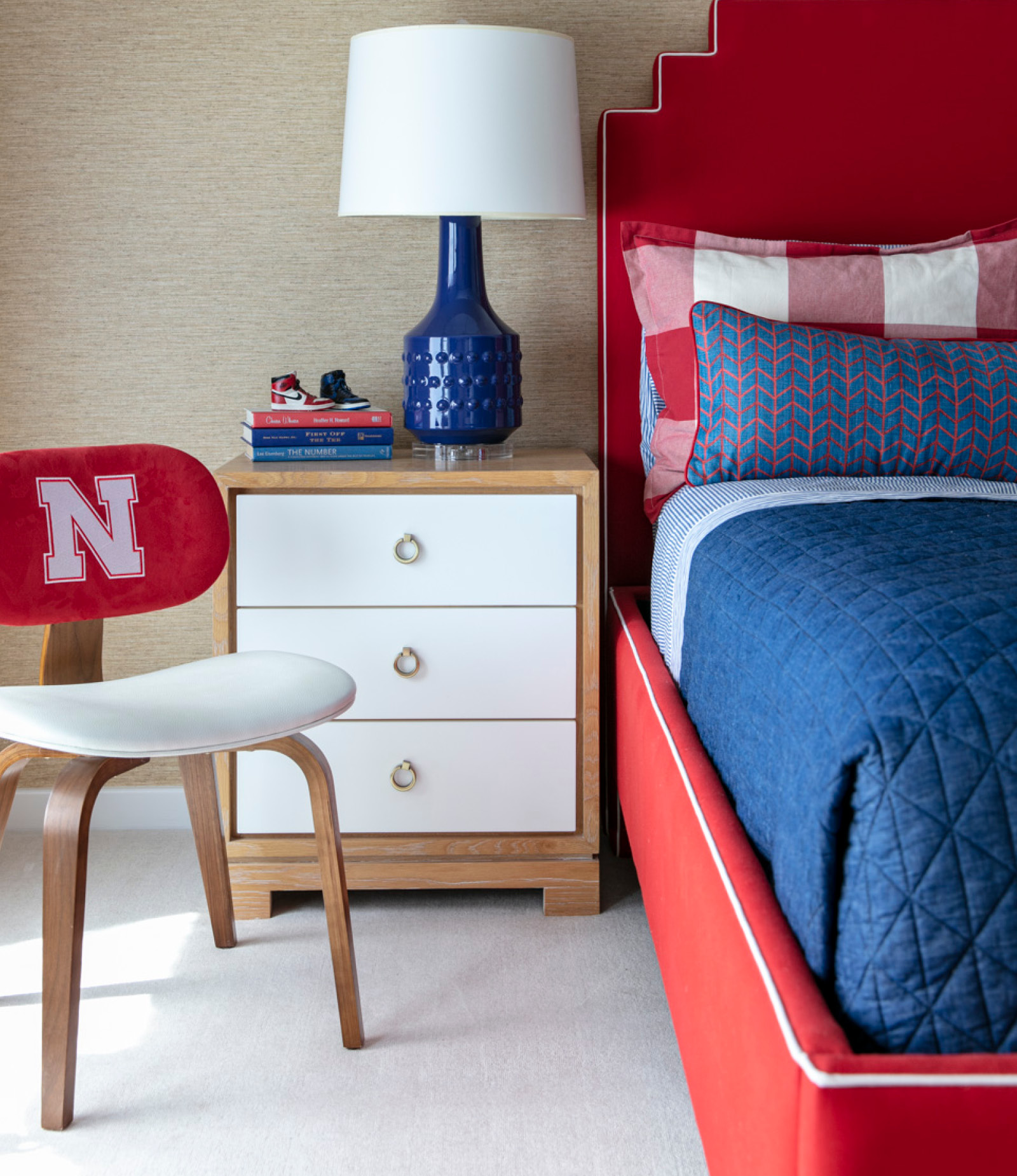
Often clients come to me for colorful and bold interiors and have confidence that I’ll execute schemes that might be slightly outside the box. There are ways, especially in kids’ rooms, that red, white, and blue can be featured in my projects without necessarily trumpeting the summer’s favorite holiday.
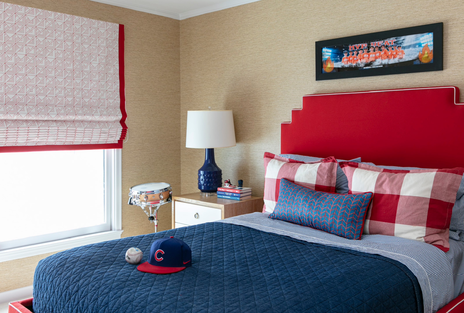
Color is a tricky balance. The combination of blue and white on its own, after all, is classic and beloved. It’s a neutral base for so many accent colors. Add pink, for instance, and you are destined for something that’s just pretty. According to color wheel followers, orange is the perfect complement. Any fashion maven who lives with blue-and-white interiors chicly accessorized with iconic Hermès boxes would agree. But if that accent color happens to be red, well, the look immediately becomes Americana. Red can be overwhelming, and even with gentle partners like blue and white, small doses can be the best way to make a convincing case for this scheme.
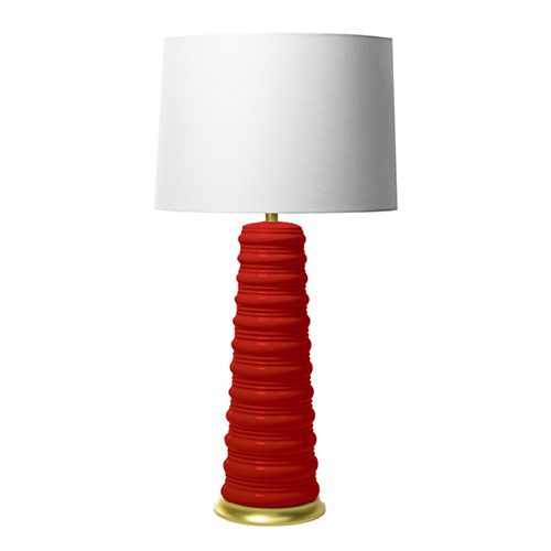
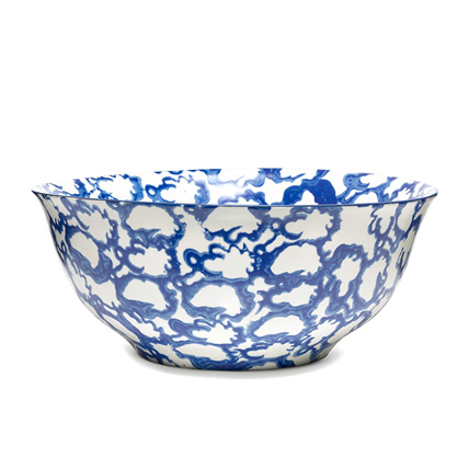
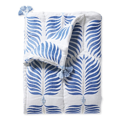
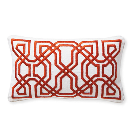
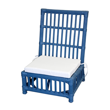
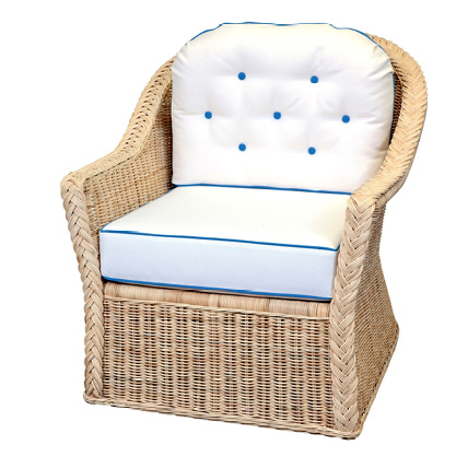
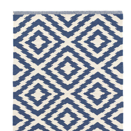
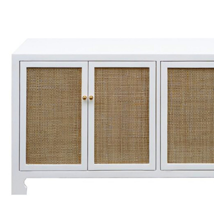
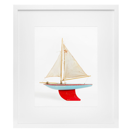
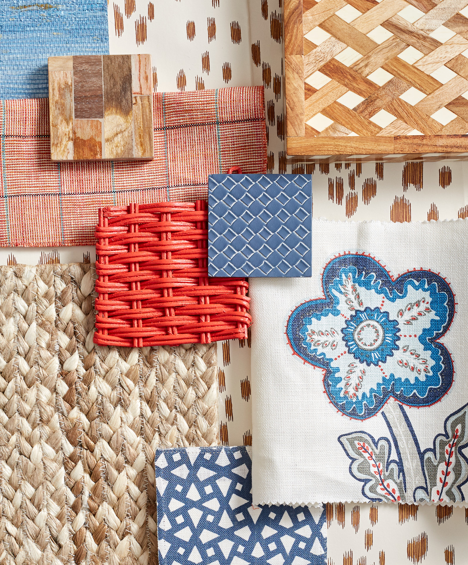
With this design board, I want to show you coordinates that whisper the colors instead of scream them. Blue materials in grass cloth and woven leather prove that solids don’t have to be boring. Fabrics in florals and geometrics contrast in both scale and style. For red, I dismissed elements that read too bright. The exception is wicker that I imagine to be used for a pair of chairs—the perfect seat for curling up with an easy summer read and a tall glass of refreshing honey lemonade. Red in a softer tone appears on a plaid textile that in pillow form would balance a room with just the right amount of color.
One trick I use to tone down a palette and prevent it from overwhelming is the introduction of natural colors and materials. Browns, camels, and warm ivories set this look down and keep it from appearing loud. The neutral tones deliver the idea of a space collected and layered over time. Consider a seagrass or jute rug. It is a practical flooring that also gives good texture over the base floor material. Bring in other tones of wood to add warmth.
