We all need a moment of quiet. I know I do. Sometimes that means time alone with my newest read in my favorite nook and other times it might be an early morning run in my neighborhood. The same is true within a home. There always needs to be a moment of calm to play off the more vibrant areas. And calm does not need to translate to boring.
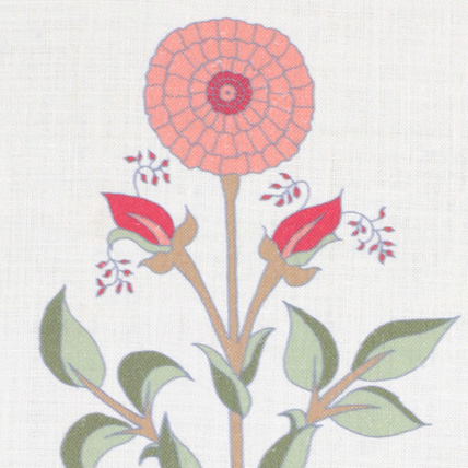
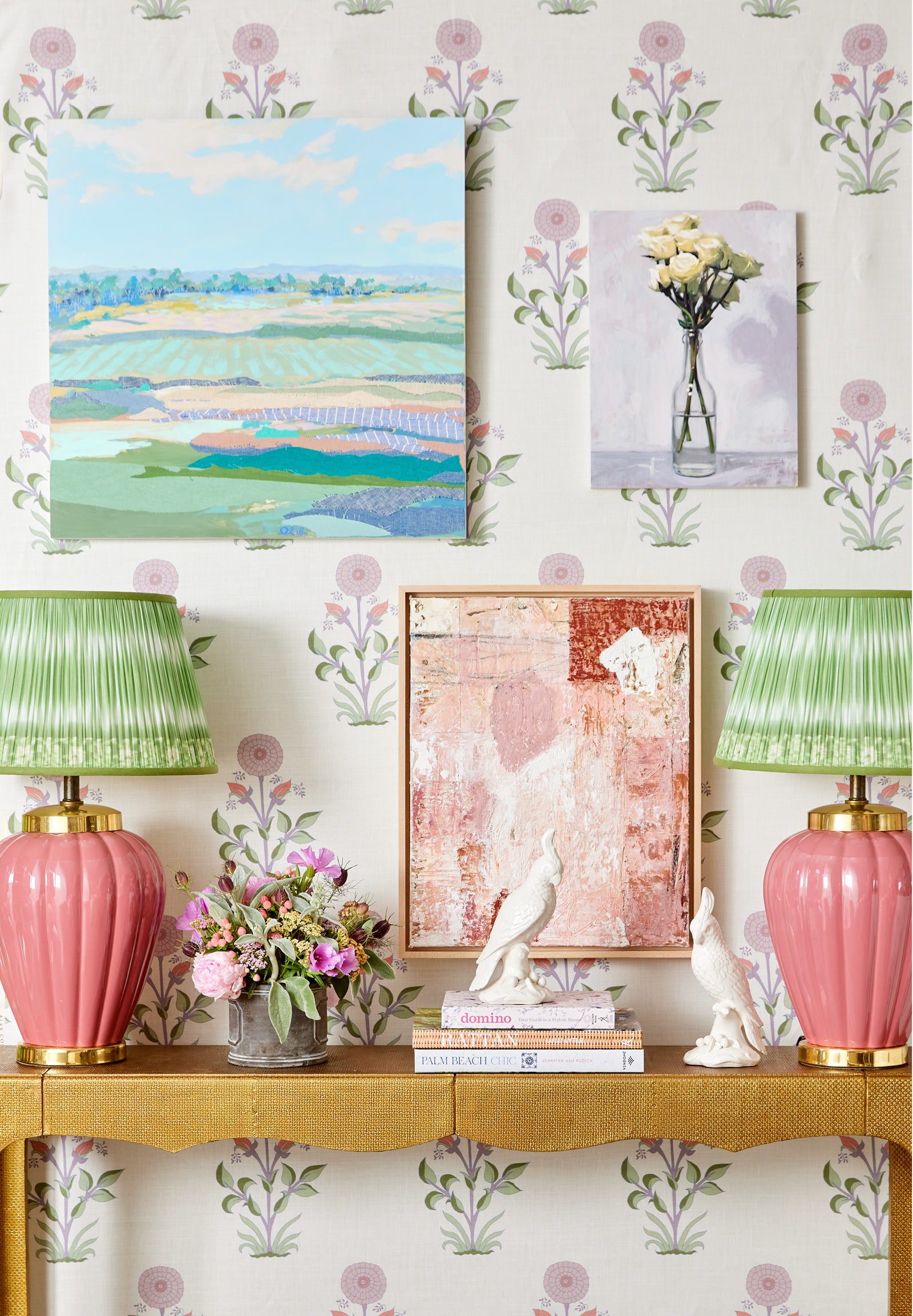
For this vignette, I chose a soft but colorful scheme. Yes, you can have both. It’s not quite pale enough to fall into the pastel bucket, but not intense enough to be considered bold either. It rests somewhere in the middle. The setting started with a floral fabric backdrop of graphic, stylized blooms in a soft azalea hue. That springboard allowed me to style in a way that kept with the pattern’s color value but was surprised with something dynamic as well.
Here are the tips I used to achieve that:
Create an overall “artful” display.
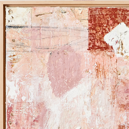
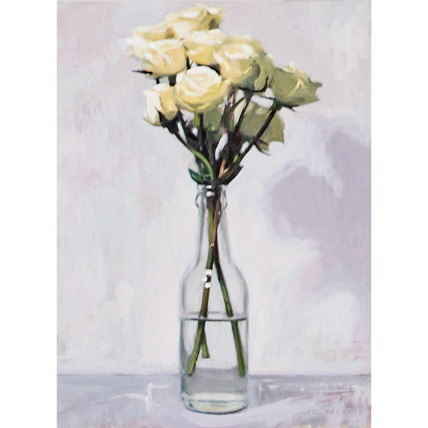
Artwork hung on top of a pattern. Plenty of folks might shake their head at this idea, but I find it to be so dynamic. The wallcovering motif gives dimension and texture to an array of paintings that don’t have to be displayed over a solid-colored surface. A residential gallery wall does not require an all-white background. Chances are your art collection is staying home and not heading to a museum anytime soon. Use it to layer the walls along with enjoying its subject matter.
Add something solid and dark.
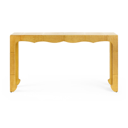
In this case, my golden console table is regal and is an elegant and glamorous anchor for the other elements. Its color reads darker than the other elements in the vignette which keeps the artwork from feeling like it is floating.
Give a bit of shock value.
Visual interest doesn’t come when everything is the same and matches perfectly. To achieve a bit of depth in this vignette, I placed lamps on either side of the console table. Not only does the pair create symmetry and relief from the staggered trio of paintings, the combination of vibrant coral and green frames the artwork by contrasting their soft colors.
Focus on form.
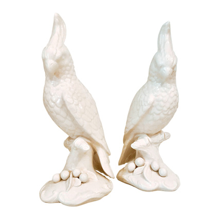
A pair of white porcelain birds offer beauty without overwhelming anything else. Perched on a small stack of design books, the graceful silhouettes are shapely, another contrast to the geometric squares and rectangles of the paintings.


