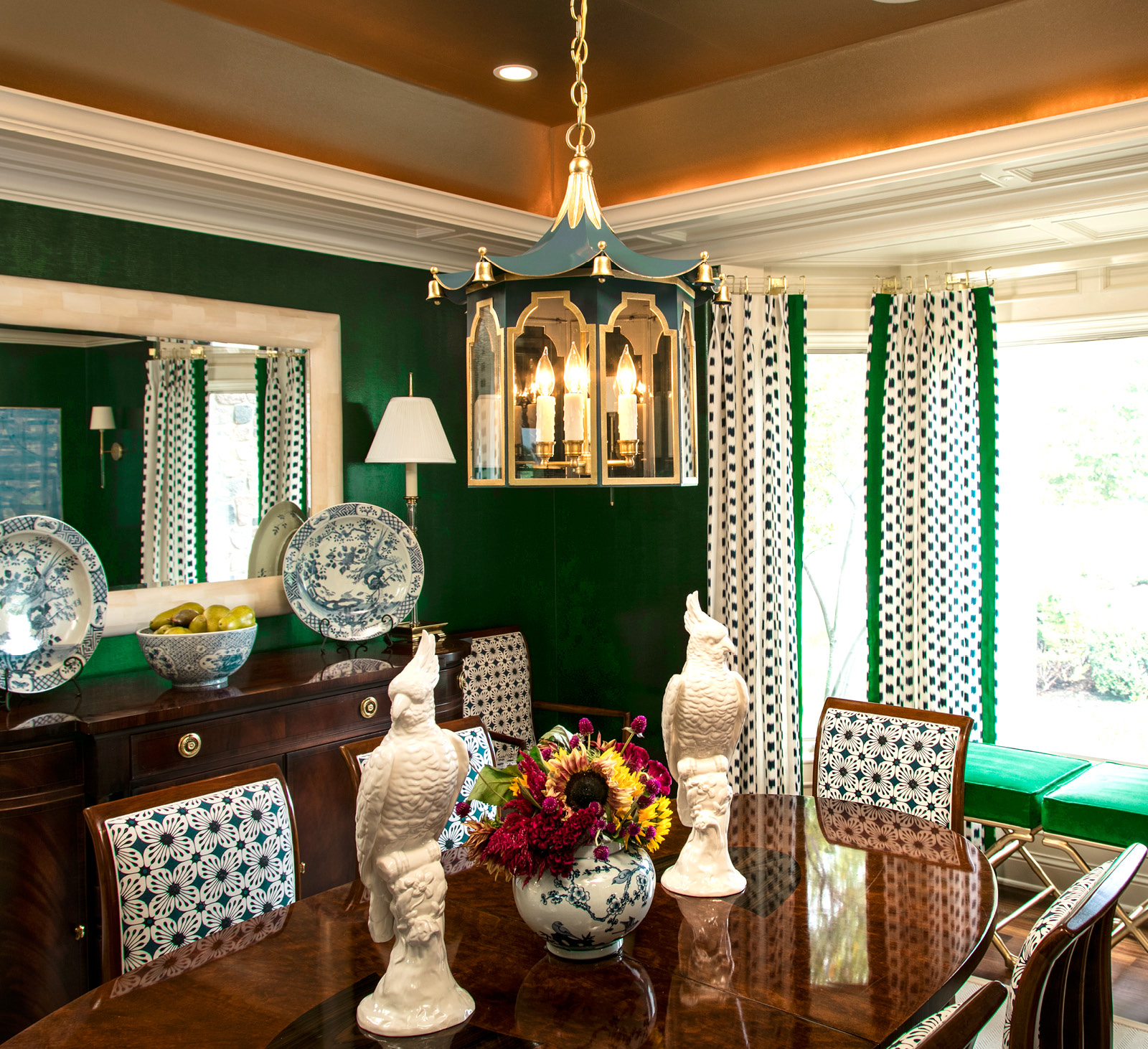
Emerald might make you think of springtime and rolling green hills. For me, it conjures mental images of the Catskill mountains in the heart of summertime, and of prim gardens with boxwood and holly bushes that keep their rich green color year ‘round. With nature as my springboard, I regularly design interiors with this deep and dynamic shade. And like the precious stone that is used to commemorate May birthdays, I want my interiors to sparkle with depth and soul.
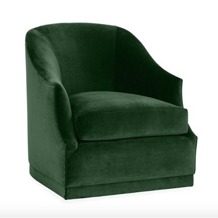
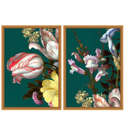
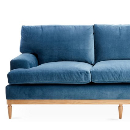
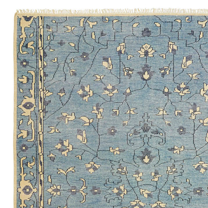
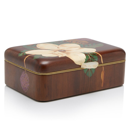
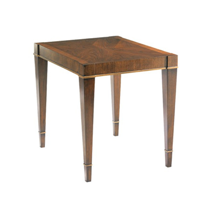
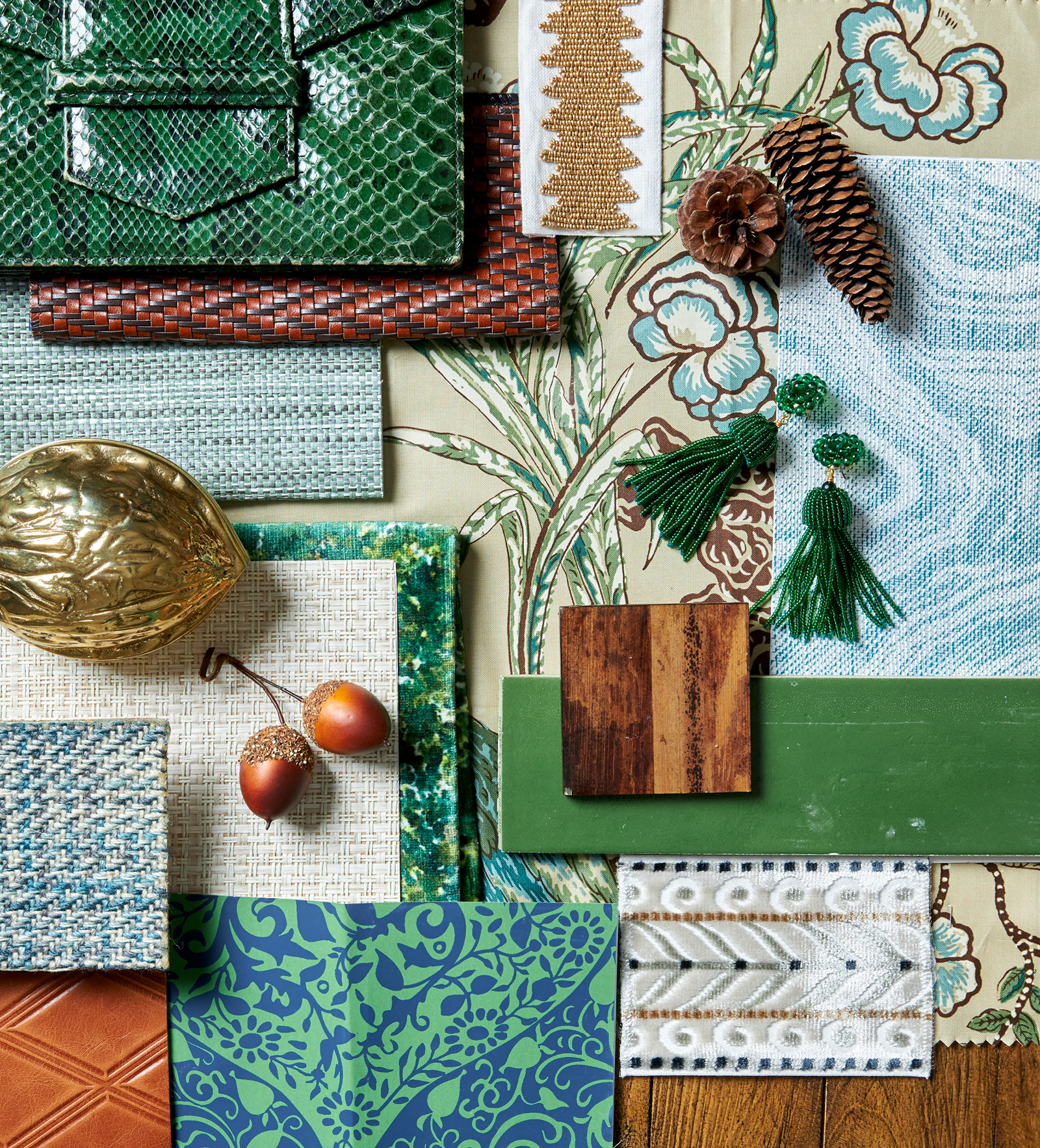
Right now, emerald green tones take me to November. It’s the time when chilly weather makes its appearance and feels far away from summer’s warm sun. It might surprise you then, that I’d select a traditionally cool color to satisfy my need for warmth, and pair it with a secondary cool color, blue. But they work. Imagine, for instance, a library that’s clad in walnut wood paneling. Variations of grain are set to boast a design spectacle before emerald and blue soft goods are ever called upon to layer. I envision curling up in a lush swivel chair so that I can escape into a twist-and-turn mystery or binge-worthy tv series. But this sort of setting isn’t meant to be minimal. The attitude of inviting-and-welcoming comes through building with many layers. I’m shameless when it comes to bringing printed velvet, statement patterns, and trims of beads and embroidery into the same design scheme. So that means a second chair and probably a sofa, too. Covering these pieces becomes a design puzzle. On one hand, a jewel-toned tweed that’s stretched over the frame of a wing chair is classic and harkens Chanel. But that hallmark perfume of leather—woven, embossed, or otherwise—also has a chance at winning me over as I create that inviting library. Especially if the leather appears in classic camel or cognac.
A quick walk into the woods offers a one-stop shop for accessorizing with texture. Gems of the tree including acorns, pinecones, and walnuts in their natural form or cast in brass, are ideal embellishments that hint to the season.
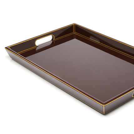
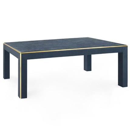
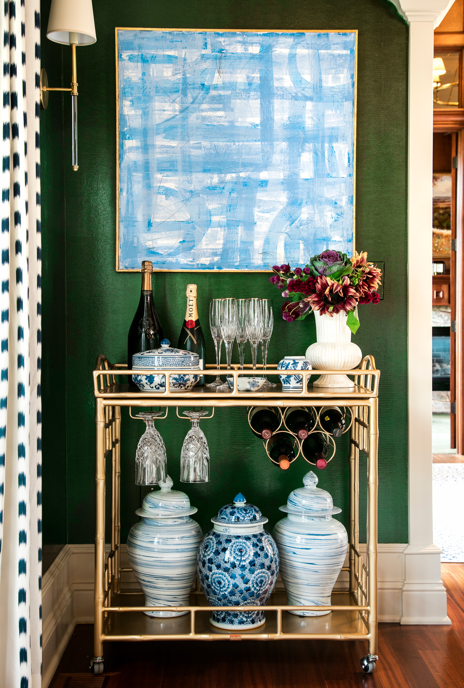
Emerald is luxurious on its own. With deep blues, browns, and touches of gold, it’s sophisticated and an inventive way to note the season. Add a crackling fire nearby, and this palette is sure to keep those chilly nights toasty.


