Design starts with the look, but it finishes with the feel. And achieving a feeling of warmth comes from texture. It’s one of my favorite design elements, and I love building texture through contrasting finishes. The combination of materials, surfaces, patterns, and colors all contribute to those layers that make a project personal, designed, and void of that too-perfect showroom appearance that lacks personality.
I’m introducing you to a project where I emphasized texture. I hope that by breaking it down into parts I’ll show you how you can add texture to your own schemes.
Mirrors, Materials, and Metallics
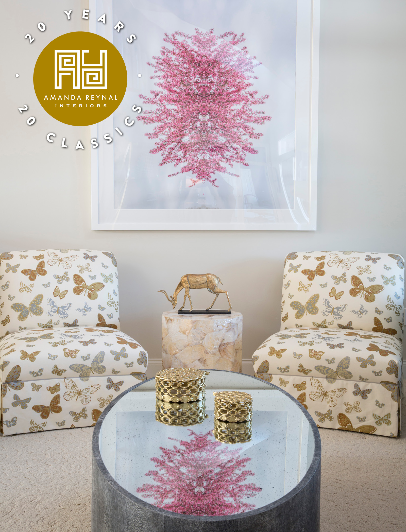
This side of the living room gains texture from an active moment. I love a pictorial pattern with movement and found this in the butterfly print on the pair of slipper chairs. The butterflies appear to be fluttering through the air due to the seeming randomness of the pattern repeat. But I think nature is always a reliable way to add texture to a vignette, even as a photograph. Here, a framed photograph of cherry blossom branches delivers the same dimension that is achieved by a live tree. A switch in materials to a stool-style table covered in capiz shells shimmers with glam, especially with a gold deer statue grazing its top. Don’t forget mirror. Hang it on the wall or use it as a table surface like the cocktail table, here, that finishes its shagreen form with light-refracting drama.

Rough, Smooth, and Shiny
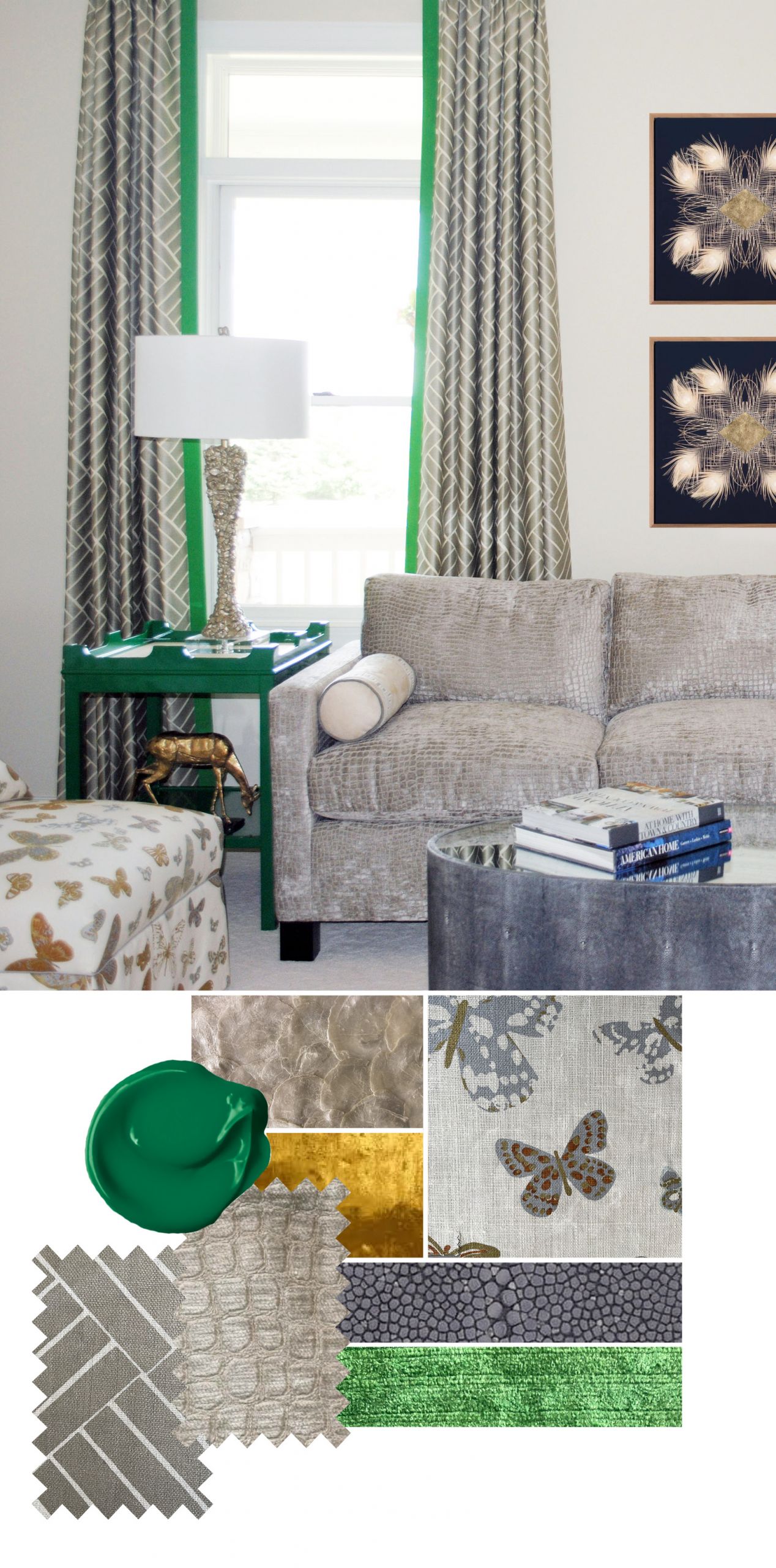
Texture to me, is all about opposites and contrasts. That’s why I try to create interest in every setting with visual tension. I chose a textile for this sofa that quietly walks on the wild side with a subtle print embossed on luxurious velvet. A subtle sheen continues on the curtain panels with a geometric print in toned-down silver on a natural linen ground. I oftentimes suggest highlighting neutral-colored fabrics with a strong color banding. In this case, I used a bright green fabric on the leading edge that pulls in the color of the side table. A lamp with a smooth finish would have been acceptable, but it wouldn’t have the same visual interest as the one I selected. Its base is covered in a textured metal finish that looks like rocks and offers a roughness that keeps the look from being too “perfect.” A piece of artwork that depicts white peacock feathers again, allows artwork, to provide texture.

Wooden and Wonderful
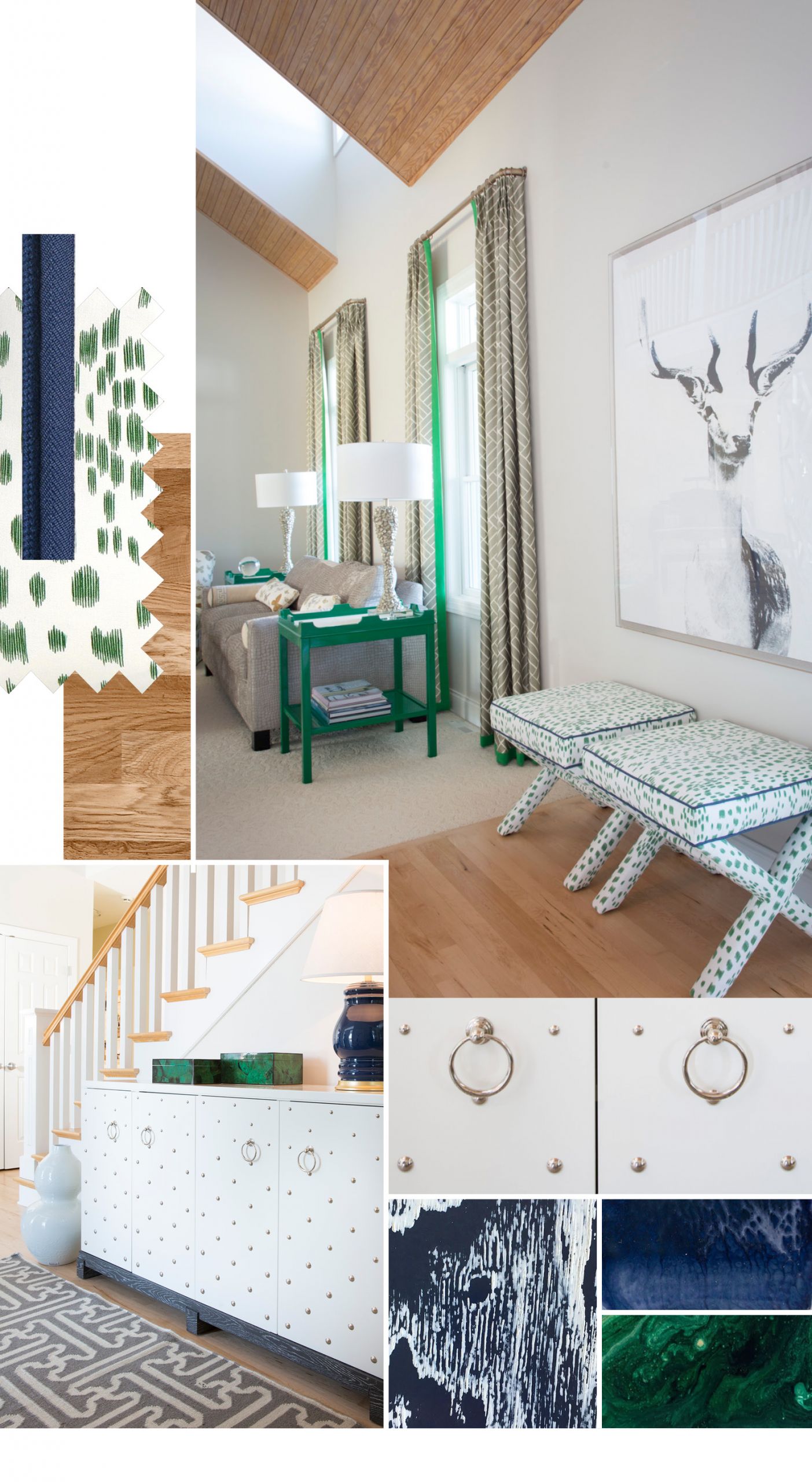
It’s simple. Wood adds warmth. It can be heavily textured from a visual perspective with a species like pine and its knotty complexion or oak with its active grains. Or it can be sanded to be like silk. Maple is good for that. Regardless, I always want a moment of wood in my settings. And it doesn’t have to be stained to a color that’s found in nature. I like the painted finish of a local company that is gaining national traction–Aronson Woodworks. They highlight the grain of ash with a contrasting finish of two or more colors, giving a modern vibe to something that is organic and brown in its original state. In this area of the room, I topped the wood floor left blonde with a pair of x-based benches that wear a sharp white fabric dotted in splashes of green.
Bejeweled and Beautiful
You’ve seen plenty of jewelry on this blog. I love to wear it, and I love to recommend it and introduce you to some of my favorite makers. In design, I manage to incorporate it into my projects regularly with knobs and pulls that I wouldn’t mind wearing with my favorite outfits. In this entry, I took it one step further on a credenza that is adorned head-to-toe with silver studs. Throughout my design, I find success with pieces that beckon you to run your fingers against the surface. The orderly placement of the studs on the furniture offsets the seemingly random pattern on the rug and the finish of the malachite boxes.

