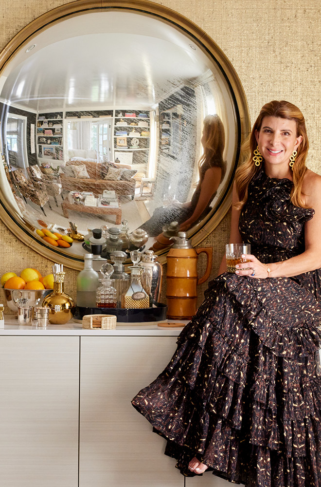
I’ve had a few influential mentors over the years, but one who remains truly meaningful to me is designer Ellie Cullman. Ellie is the founder at the helm of Cullman and Kravis, a storied New York design firm where I began my career in design.
My time at Cullman and Kravis left me with a deep understanding of the design process and how to work with peers and clients as a unified front. I also took with me a sophisticated and honed design sensibility with an understanding of the importance of every detail, as well as how to create a distinct but relevant personality in a space. I also learned that a supportive and positive culture within the office leads to more creativity and a strong and cohesive end result.
Twenty years after starting my own design firm, I still credit my time with Ellie as a major contribution to my success. I had a chance to reconnect with her about design and am sharing our discussion here.
You are known for managing not only a successful business but also an office culture that likely aids to that success. Each project is a team effort of creativity and detail, and you lift and mentor your design staff, so contributions are effective. Why is this type of office culture important to your business model?
Collaboration is critical to C&K design. When my late partner and I started our business more than 30 years ago, we just dictated our design choices to our staff. Over the years, I realized that our designs became significantly more interesting by engaging staff – senior as well as more junior- in making decisions and having them feel ownership of the projects.
This year as I celebrate my own 20th year in business, I’m talking all about classics, and you are a classic to me. Please identify a few classics in your work.
The elements which have become classics in our work include:
- Attention to detail
- Intense collaboration with architects
- Custom everything – carpets, furniture, fabric, etc.
- Consideration of the flow from room to room and flow from indoors to outside
- Character to all environments with the addition of antique and vintage pieces
- Art—either fine or more humble
- Inclusion of everything design-related in our scope such as bookcase styling, tabletop, and linens
What makes a classic a classic? It is the timelessness of the form? Or is it a design idea that has the capability to be reimagined again and again?
It depends on your definition of a classic. For example, to some people, a classic might mean a piece of 18th-century furniture, to others a classic might mean a Nakashima table. To me, a classic is simply something that is well-designed.
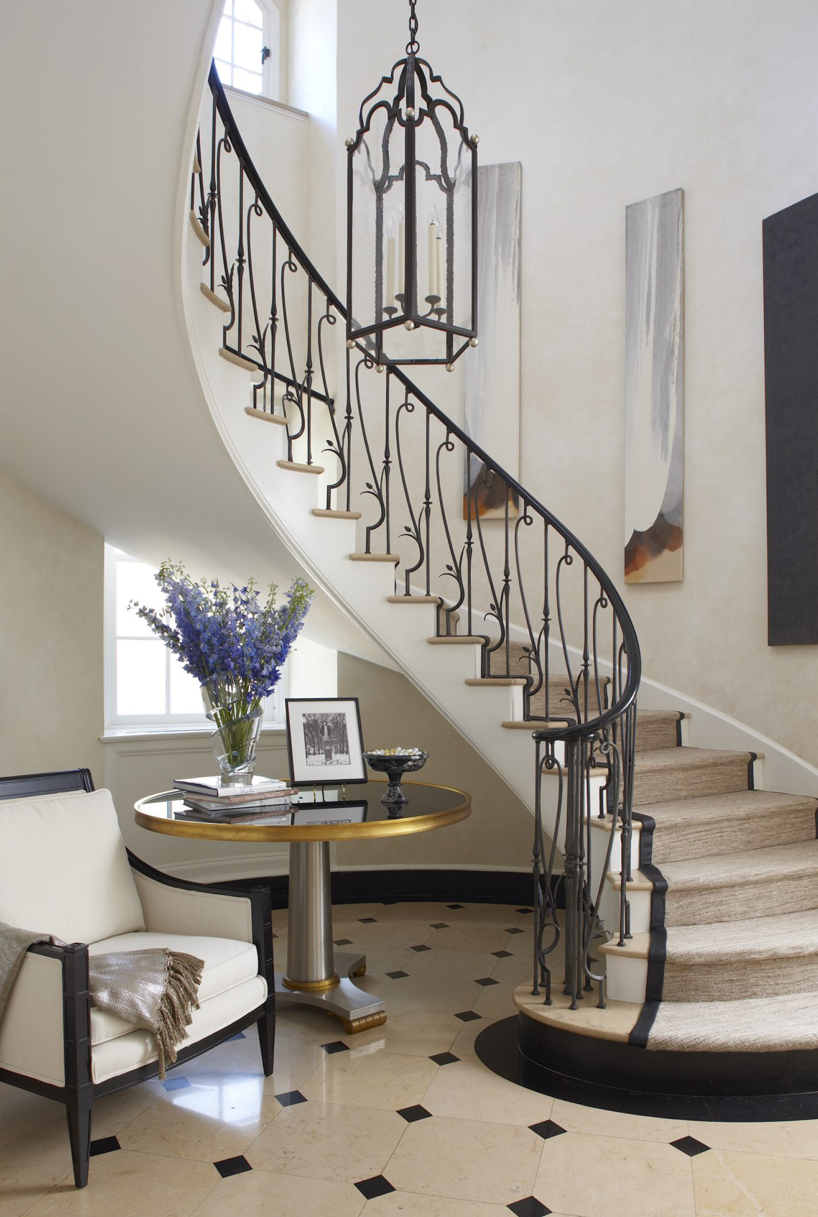
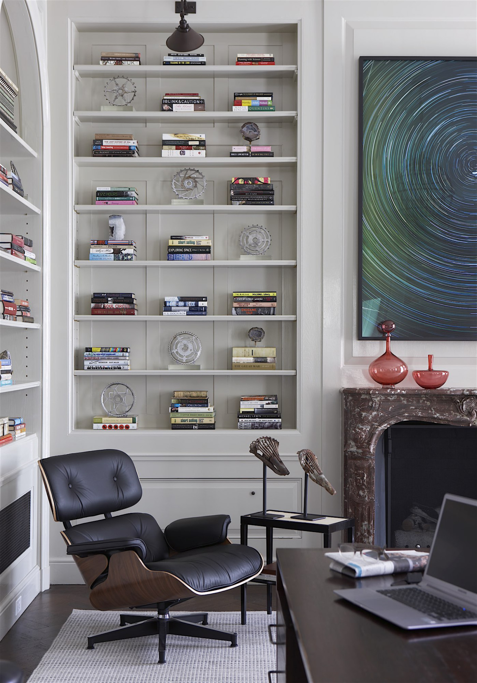
How have the classics evolved within your design? For instance, a hooked American rug or a chintz that might have been popular in the 80s could have been replaced by something like a more subdued Tree of Life pattern. All classics, but they too, undulate on the popularity scale.
I would be disingenuous if I said that classic design is not subject to current trends. All design must be refined and re-edited as we go along. The danger is that if designs don’t evolve over the years, designs become static, and we would inevitably become stuck in a time warp. C&K does not have a “signature” style, and we are committed to reflecting our clients’ aesthetic preferences. We continue to use many of the “tried and true” items but in a sparer way, with more vibrant colors. For example, fabric houses have reissued some classic patterns – but in clearer, more vibrant palettes. We are delighted to incorporate this kind of “modern” touch in our designs.
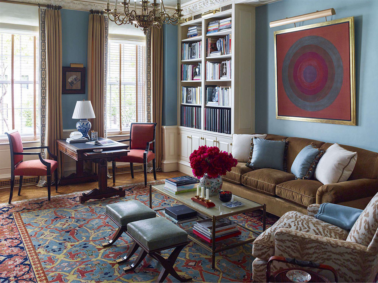
Please describe what amenities or details are your clients requesting the most now to improve their quality of living?
Our clients are very concerned with flexibility. This is what they yearn for, especially after everyone’s experience with the constraints of the pandemic. Our clients are eager to analyze how their interiors can be made to multitask to accommodate more than one function.
Performance fabrics are also very important now. No one can deny that decorating has become expensive, and these fabrics guarantee that a sofa, for example, will have a longer life. Clients can do without some of the bells and whistles of years ago. Take the pot filler for example. Yes, it is great to fill the pasta pot at the range. But how functional is that when the pot still must be walked to the sink to be emptied?
Is there a piece that you have repurposed that is a classic and has thrown an unexpected curveball in a room?
We regularly repurpose old pieces. For example, a period chest of drawers can be reworked to become a powder room vanity. This kind of vanity will have way more character than any contemporary vanity we could purchase. Also, we often buy salvaged architectural materials which we incorporate in coffee tables for example.
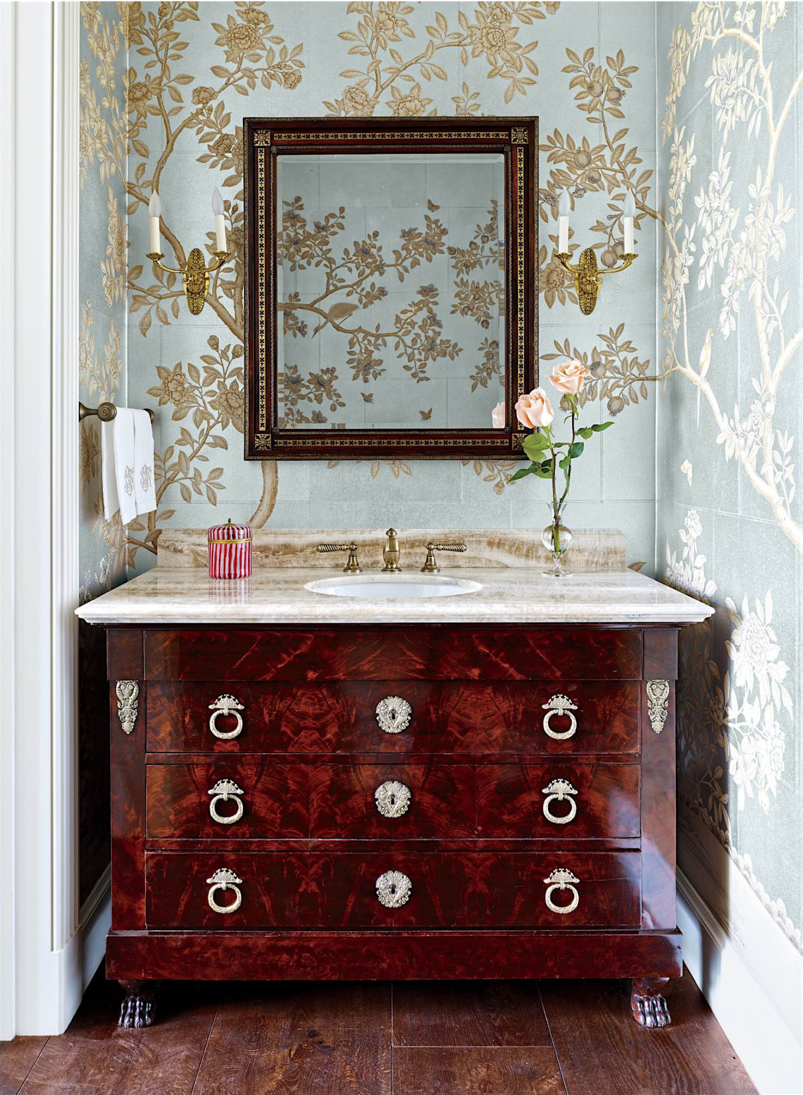
I realize that when some clients come to you and they already have what they consider to be their own “classics.” What types of pieces do you love to work with that are already a part of a client’s collection?
We are happy when a client comes with existing pieces such as art or furniture because this will make their interiors more personal and more meaningful.
The only time this is challenging is when the client brings a “sacred cow” as we like to call it, that is not pretty or functional or works with the overall design. If the only reason a piece is being included is that “Aunt Ida” gave it to you as a wedding present – we try to explain (gently of course), why the piece needs to go.
Explain how you create a balance between clients’ needs and wishes versus your own design aesthetics?
I would not still be working today if we had a signature aesthetic. I am intrigued by the journey that we take with every client —understanding their style and how they want to live and realizing their vision in the best possible way. The more diversity in our design the better!
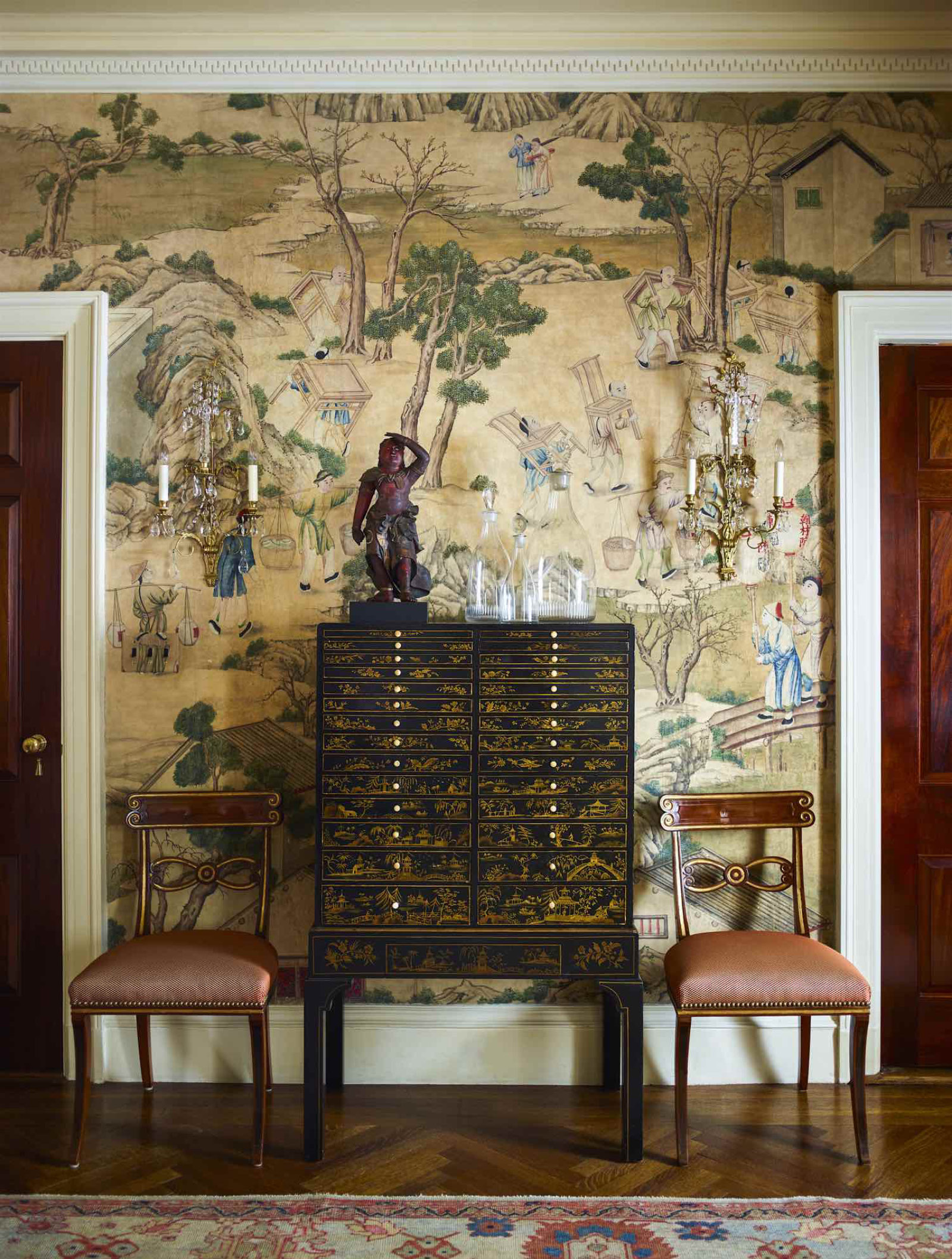
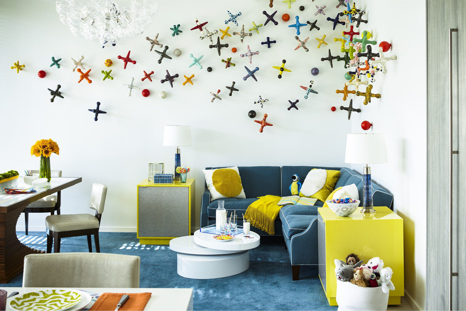
The Internet plays an enormous role in our day-to-day lives and has proven to be an all-day, every-day flea market for the design world. Its biggest advantage is the access to interesting pieces that are not in one’s backyard. How comfortable are you and your clients with purchasing pieces for their projects online without being seen?
I am not a big internet shopping fan. It is so important for me to see items in “the real” and to understand the flow from piece to piece. We do use the internet for our searches — but try to see everything (especially antiques) even if we must truck them to our office or a job site.
Technology comes with pros and cons. It speeds up the rate at which clients can visualize the design that is presented to them, but it also neglects some of those old-school principles. What is your favorite part of technology as it applies to design and something that you dislike about it?
My favorite part of technology is the speed of communication and the access to information. My least favorite part is that oftentimes the renderings produced are misleading. They convey an alternate reality that is very often less appealing than what the final product will be.
If you could work with any artist’s work in the world, what would it be?
I am a chameleon and love quality items from so many periods and places: Renaissance art, Asian sculpture, American Folk Art, postwar American art, and on and on.
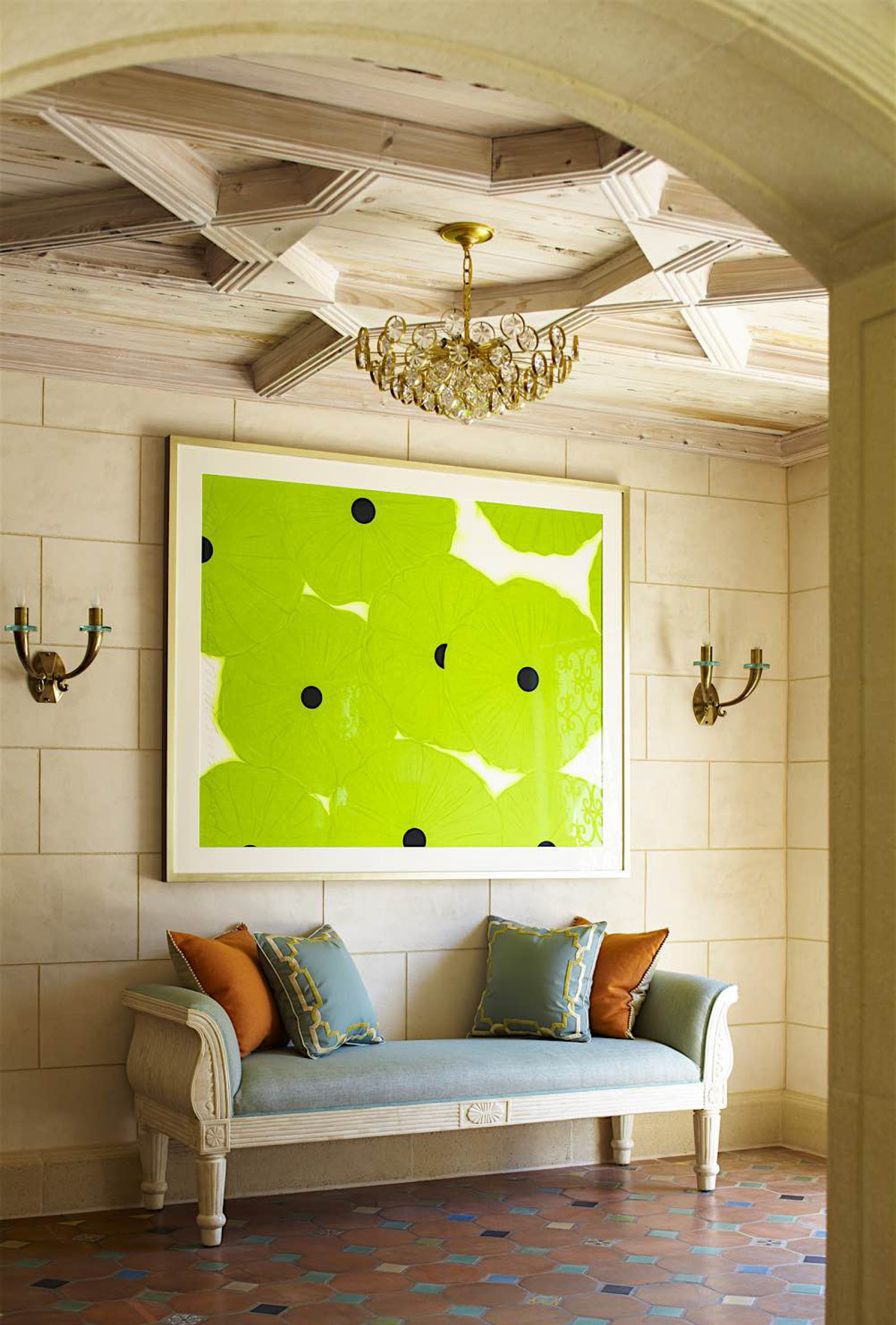
Fabrics are beloved by people, likely due to their tactile qualities. Do you have a favorite motif that you love?
I love it all, but most clients are preferring solid textures and geometric fabrics with patterns used for throw pillows or small pieces of upholstery. Recently, we used a traditional beige and cream printed floral fabric for walls in a powder room, but we outlined the elements of the design in a bright crimson thread which brought a lively contemporary note and added interest to the walls.
Color plays such an important role in design. What direction do you tend to lean when it comes to color and palettes?
Our use of color depends on the client’s preferences. We have worked with every “recipe” over the years, employing the various color palettes that were popular over the years – creams, greys, metallics, blushes, and now, lots of blues.
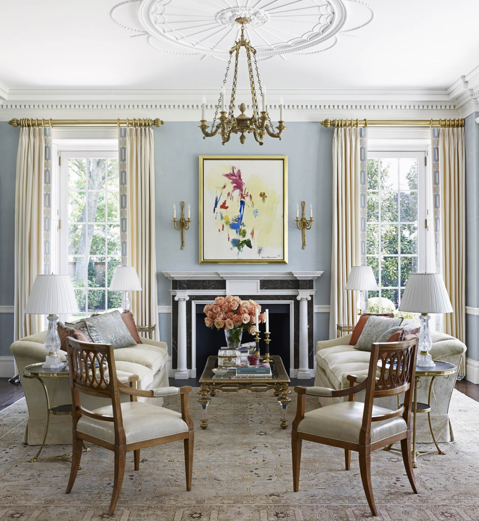
A coffee table is classic. It’s what goes in the middle of a seating arrangement and there really is no substitution. How would you update a coffee table to keep it relevant for today’s client?
The sky is the limit. I can say categorically that it’s been years since we’ve used an all-wood coffee table without any bells and whistles. Enhancements today might include – marquetry, metal, textured glass, gilding, etc. As you said, the coffee table is the center of a seating arrangement, so it needs to be a focal point of the design.
As for function, we are seeing two things:
- Raising coffee tables to 24” so iPads and dining can be accomplished more.
- Tucking ottomans under coffee table tops for additional comfort but keeping coffee tables with hard surfaces which are sturdier than ottomans and don’t require trays.
What are some of your favorite classic accessories? Has the way that you style your projects with accessories evolved over time and how?
Accessories are a huge subject! We always like to include something that twinkles such as silver brass or glass, and something that is sculptural and colorful such as 20th-century Swedish pottery.
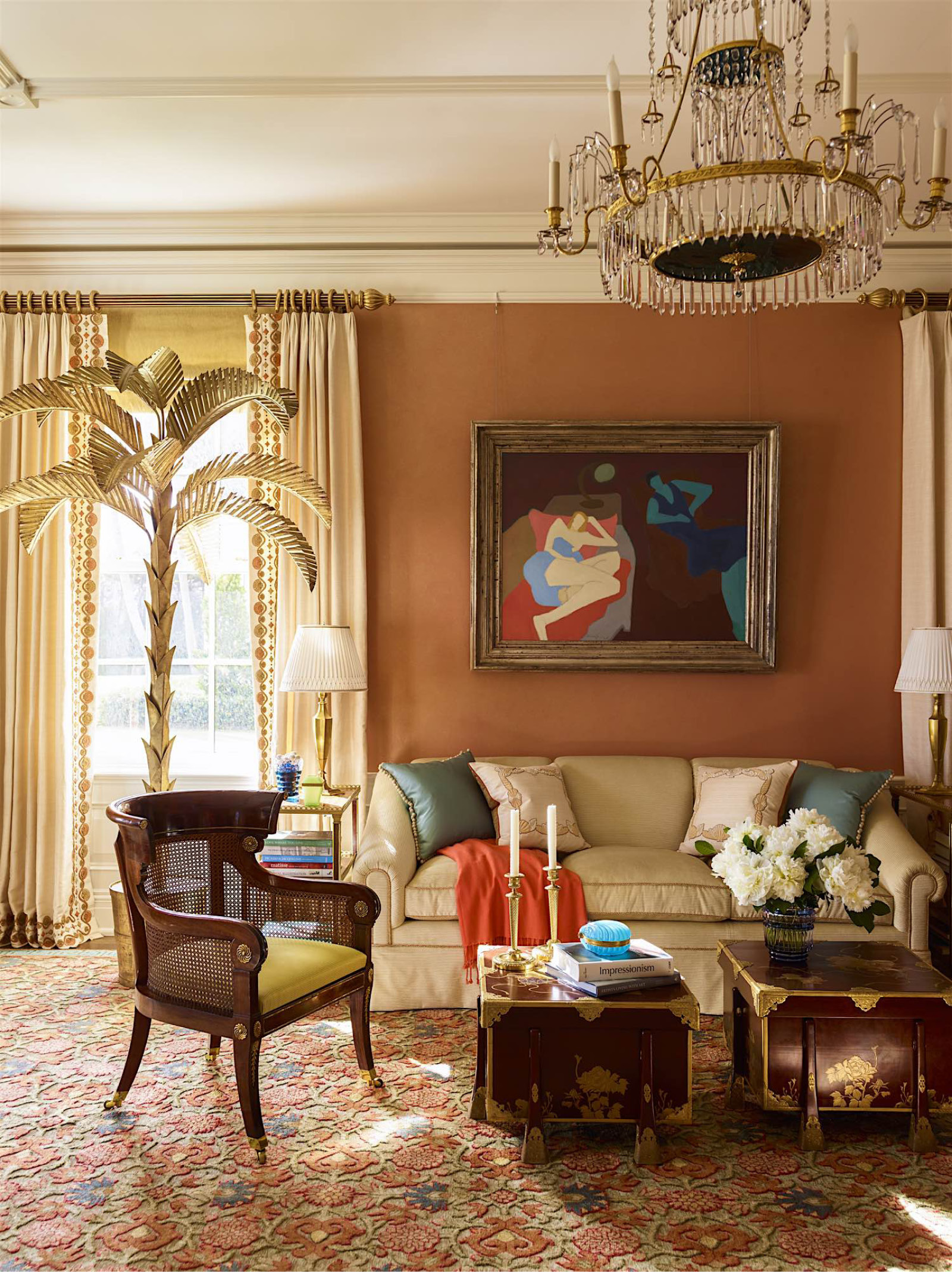
Is there a dream project that you haven’t been able to tackle yet?
A small sexy hotel in Paris would be a dream project as we’ve done a boat and a plane already.
So oftentimes designers are asked where they draw inspiration from. I would like to flip that question on its side and ask, how do you want to inspire others through your design?
We’re working on a fourth decorating book now, which I hope will be inspirational to others. Nothing makes me happier than having a potential client come to a meeting with one of our books or one of the articles about us, saying that our image was inspirational.


